Last week I covered some of the clothes produced by Liberty of London over the years and on show at a local exhibition.
This post complements it by providing some information on Liberty of London Prints – which was set up as a wholesale company in 1939 to supply other companies and dressmakers with fabric (they had already cornered the market in beautiful silk scarves). If you visit the store today most of the clothes are from major designers, some more unique and small scale designers, with a very small range of their own clothes – mainly blouses and shirts made in Liberty fabrics. Of course these days the demands of tourists and overseas shoppers is such that you can buy lots of souvenirs coated in Liberty prints from jam pots with fabric lids to note books and tea towels. You can pretend to be “English” as you sip your Liberty tea from a Liberty print tea cup, placing a dainty Liberty Print napkin in your lap. I can’t be doing with this fussy “National Trust shop” lifestyle but I guess it helps with the balance of payments.
Anyway back to the fabrics. Like Sanderson the company owns quite a few original WIlliam Morris prints, and many other designs from the Arts and Craft movement. The sale of beautiful Arts and Craft furniture covered with these detailed and beautiful linens, saturated with colour, became a staple part of the business. In addition they imported Indian block prints, Japanese silks and Chinese embroidery and mixed these in with more local craft work and designs. As time went on they often pull out vintage designs and reissue them. This was particularly the case in the 1960s and 1970s when the Art Nouveau designs were revived. For example Ianthe (a wallpaper design from 1902) was issued as a fabric in 1967.


However since 1970 these fabrics are no longer actually printed by Liberty print works – some are printed in the UK but many of them are produced in the Far East.
I can’t say I love Liberty Prints or I hate Liberty Prints because they feature such a wide variety of designs and colours. The exhibition shows a very wide range and there is definatley something for everyone. The Collier Cambell prints interested me. I met Sarah Campbell in about 1986. At the time I was running a Family Planning Clinic in Brixton. One of the visitors to the clinic was realted to her, or worked for her, I can’t remember. But as I was thinking of replacing the ghastly light green medical curtains that surrounded our examination bed I had the idea of getting some bright and breezy and oh so fashionable fabric instead. Sarah kindly gave me a whole role of lovely colourful fabric that I made in curtains for the clinic. One of things you find with their designs is it looks like a repeat and then it is subtly different. You can see this with Mercury, below. The skirt on the right is also inspirational – basically a very plain skirt made with a bold pictorial (50s influenced print). This gives you something interesting to look at when you sit down and also a wide colour palette that makes putting a look to go with it so easy. I can see this skirt with an orange jumper and red tights, or black, or cream, for example.


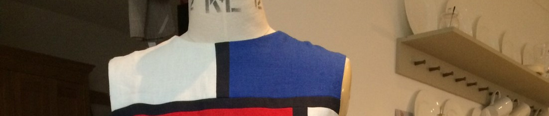
I was particualrly keen to go and have a look at the Yves St Laurent textiles on display – in fact this was why I had gone to the exhibiiton in the first place. There was one cabinet, and I have given a couple of close ups. The designs are very much of the 1970s (the pointed collar in the second picture for example), but gosh how appealing they are. Using simplified floral motifs, bold geometric shapes and loose brush strokes we have a folksy but stunning selection. The strong colours really appealed to me – sticking the primary colours together with a few secondaries, black and white they have an almost Matisse or Delauney-like intensity. Some of these designs could inspire silk painting or screen printing.


Many of the textiles and textile designs were enclosed in glass, hence the reflections on some of the pictures – sorry about that. It was interesting to see the development of the patterning over the decades, but I felt these three were rather typical of the Liberty print as we think of it today. Rather a small scale pattern, often a bit “ditsy” – romantic, traditional, petite feminine. If you are any of these things then today’s Liberty prints may be for you, especially if your colouring is muted. Although there is quite a following for the Liberty print in blogland I have my reservations. Mainly because they don’t really complement my classic style, clear bright colour palette or preference for a larger motif. Small prints can, at a distance (which is how you are viewed when wearing them) mix in the eye to create a greyish or brownish look. Fine if you suit a muted palette, but if you suit brighter shades you will be better sticking to a plain fabric, a larger print or perhaps colour on a darker background.


One of the nice things about the exhibition is that Liberty prints follow fashions – compare the 1970s “brownish” dresses featured in my previous post, with the vibrant shades of the 1960s.
For me textiles always go with fashion. You can’t understand one without the other. This exhibition, indeed this Museum, shows how it all comes together. And it is a delight.
Jay
Thanks for this resumé of the exhibition. There are some beauties in your selected shots.
Stephanie
Thanks for the YSL stuff – new to me. I used to like to wear Liberty print blouses sometimes under a pantsuit, to add a bit of interest.
Kate Bentley
Sigh. One of my great favourites..
Lynn Mally
Wish I were there to see it!
Jennifer Miller
Oh goodness, I know that patterns can appear muddled from a distance, but I just love anything William Morris…probably better on my walls than my body!
Megan
This reminds me I have tickets to this exhibition and need to go before it ends! I thought I was in the minority because I can take or leave Liberty prints, they are so busy!! but I’ve never been to an exhibition like this and your post makes me really eager to see everything in person.
Anne
I visited the exhibition this last weekend. I enjoyed it. I’m not going to review that or the Fabrics in India which I also visted but will link to your blog in my post as you have reviewed both so well.
I don’t like the ditsy Liberty prints, they just don’t fit in with my style, and would say in general I’m not a Liberty fan but I have bought a larger floral and two geometric prints, which do appeal.
SJ Kurtz
I do love their geometric prints, and some of the Raja themed prints were pretty sweet. I don’t usually make clothes from them; I use them as bias trim or little detail bits. An entire shirt of…oh, no. Reads like static noise.
Thanks for covering this show; I will not get to see it except through your photos. And lovely ones they are!
Demented Fairy
I’m not a fan of the teeny florals, but the stronger patterns and colours are lovely…you have to hunt! The tana lawn is wonderful though, I really love wearing it, so cool against your skin.