


More on women in politics
Remember the Blair Babes? The patronising epithet was bad enough, but the stunt of surrounding the new Premier with 101 women MPs was uncomfortable to watch. And probably worse to participate in; a cliché in which they must have felt used rather than celebrated. Despite the admirable drive to get more women into parliament, to the extent that Labour imposed all-women short lists on a number of constituencies, there is something sad about this group. Somehow their outfits – crafted by spin-doctors who required them to stand (or sit if they were a wheelchair user) around their waving boss – are a little bit off. They remind me of the Hillary-Angela look. Samey. Conservative. Overly colourful for the sake of it. FIve stayed away or had a good excuse but the rest are conformed. The individuality of each outfit is cynically crafted. Probably, for most women in politics, this is just how it is. It’s known as FIFO. Fit In or F Off. This photograph captures powerlessness.

It’s interesting to me that the candidates had been advised by Barbara Follett (now in the House of Lords) about the colours and shapes they should wear. I note there are two or three in camel and cream – generally good shades for red heads. A few dark haired women are in predictable but acceptable navy suits. But a dozen or so are in red suits. Have you ever seen a man in red suit? Probably not as can look a bit startling. Especially when there are several of them.The jackets are invariably long (even allowing for fashions) Very few wear trousers. Hardly any one is in a jacket and co-ordinating skirt. And no-one, as far as I can see, has been allowed out in a dress. Almost to a woman they are in knee-length or longer skirts, the plainest black court shoes and clear tights. I don’t think there is anyone with long or grey hair – it seems that putting the Clairol on was also required to get the “image” right. We have a safe, respectable look – the sort of clothes you might see at a golf club or on a head teacher from Glamorgan. Uniform. Formulaic. Safe. Inoffensive. This is essentially a photograph of women without authority – they are supporting Tony, not the other way round. While they lack real authority, they don’t seem sympathetic or approachable either. Despite the cacophony of colour they are just peas in a pod.
Let’s have a look at three of the women who were successful from that intake – Flint, Blears and Smith. They had important jobs in Brown’s government and their appearance is considerably better. Personally I dislike the harsh hair colours but otherwise I would say they pull it off. Caroline choses a black coat with leather trim, attractive shoes and smart trousers. She wears her hair long. I find the black a bit overwhelming, but overall it’s a flattering look. Hazel is tiny but she looks well dressed in her deep purple coat with a waterfall front, a nice silk scarf and an interesting brooch. Jackie is in trousers too – a classic blue-grey trouser suit with a cream blouse. They all look fairly normal, much more confident and individual. I wouldn’t restyle any of them but I would get their sleeves taken up.

There’s someone else I want to have a look at – Teresa May. She is senior Cabinet member of the present government and she is tall with slim legs. She has natural grey hair although I preferred it when she had a shorter cut. She sometimes gets it right but I fear she is a little too “fashion-forward”. She wears Vivienne Westwood, which is surely a cause for celebration, but somehow she doesn’t quite get the essence of the piece. I really don’t think you can wear statement items like this with Marks and Sparks accessories.


And finally let’s have a look at someone really interesting.
Mrs Thatcher managed to fit in and stand out. She wears an utterly classic, regal outfit – the simplest Tory-blue dress and matching jacket, pearls and a silver brooch, neat hair and court shoes. It certainly achieves the level of authority required in a Prime Minister. How do the Blair Babes compare?

This is an equal opportunities blog
Introduction
Beauty is a social construct. Ideas of beauty change over time, and between nations and races. More subtly perhaps, your age and sexuality may determine what and who you like to look at. However it appears that we are instinctively impressed by symmetry and balance, which it is suggested, imply health and fertility.

Below are some pictures of entrants in the Miss Universe Pageant 2005. None of these are real women, but rather composite photographs of the entrants. It stuck me that they all look much the same, especially with regards to the symmetry of their faces. These composites tell us about the kind of beauty which is celebrated by “beauty contests”. For example the African delegates appear to be fair-skinned Africans.

source::http://www.uni-regensburg.de/Fakultaeten/phil_Fak_II/Psychologie/Psy_II/beautycheck/english/missgermany/missgermany.htm
While the ideal may be symmetrical and balanced this covers such a variety of types of beauty it would not be true to say that the ideal man or woman is a certain height or weight. Very young, thin women dominate western catwalks because designer clothes often look best on bodies with little shape. For modelling clothes the face is less important and possibly a less traditional look is currently favoured. The Miss World type body is far more curvy, often requiring plastic surgery to achieve exactly the right shape. The athletic body idealises muscle tone and a lack of body fat, even though the overdeveloped physique is not seen as attractive by all. In a number of cultures weightiness is associated with beauty, in others maturity, in others still unconventional looks are prized.
Is the man below beautiful? He has chosen a blue shirt to wear with his stone linen summer suit and suede shoes. His thick hair is nice, with a good cut, and silver glasses flatter him. To me he is presenting himself well to the world even if he has too much in his pockets and lacks iPhone proficiency.

Bodies: love the one you are with
It’s not a good idea, in my view, to attempt a very radical alteration to your basic shape or physical appearance. Extreme exercise, dieting, plastic surgery, changing the colour of your skin, hair, teeth and eyes, wearing severely restricting garments like corsets or bound feet – not a great idea. Of course there is a continuum – having healthy teeth will sometimes require “cosmetic” dentistry, and surely no one can object to straightening or curling your hair, wearing make up, or using contact lenses. It is, after all, just a matter of degree.

So rather than being disapproving, or banning things, here is my philosophy. There is nothing more beautiful than natural beauty, even as it fades and degrades over time.
I have always been impressed by the following biblical (Matthew 6) text
27 “And who of you by being worried can add a single hour to his life? 28“And why are you worried about clothing? Observe how the lilies of the field grow; they do not toil nor do they spin, 29 “yet I say to you that not even Solomon in all his glory clothed himself like one of these”
The lily is perfect as it is! It doesn’t need perfume adding, as its natural scent is beautiful. It does not need colouring because its intrinsic colour is unique and cannot be reproduced – the way it integrates whiteness, greyness and orangey-yellowness. The green of its leaves perfectly complement its colouring. The same is surely even more true of humans – no one can manufacture the smell of a baby, or the peachy skin of a child. A happy person, or one exhilarated by a Body Attack class (with Siobhan or Rosie #VirginActive) – will glow with a natural pinkness that rouge cannot replicate. I maybe in a minority of one but I hate “foundation” as it knocks out all the variation in skin tone and produces a “blank canvas” – which then needs highlighter, shader, blusher etc, to try to bring back some shape. And I love natural un-coloured hair because it is so much more colourful than “coloured” hair. Bleached and dyed hair has a colour which is flat and lifeless even if you believe the advertising – “shining, healthy” hair.

Imperfections can be nice – gappy or prominent teeth, freckles, unusual hair colour or textures, very dark or very light colouring, facial hair on women, “beauty” spots, eyes that are different colours, a crooked or large nose. Of course apart from beauty pageants where the women profess they want to “help underprivileged children” or open a sanctuary for donkeys, it is personality and life that we admire in fellow humans rather than just their look.
And although it maybe true that our desire for symmetry and balance means we instinctively prefer tall and slim to short and wide, if you are fatter than average there are lots of things you can do to make the most of your curves.
Natural is best – but make the best of nature
I believe that a natural diet (avoiding manufactured food) and daily exercise will result in a good (enough) body. But even if you are ill, disabled or old you will feel better about yourself if you present your best self to the outside world. I admire and support a charity called Look Good, Feel Better, that specifically helps cancer patients find ways to make themselves look better, and therefore feel better.
So what’s an equal opportunity blog?
So here is my blog policy. I will
- always look for the positive in my own and other people’s appearance
- make suggestions of what I and others might do to look more balanced and harmonious and in tune with our natural attributes
- celebrate and promote natural beauty, especially of a non-conventional kind
- feature gorgeous men and women, older and younger, different ethnicities and sexualities, with a range of body types when discussing personal style
- show how dressing in specific ways, and in colours which enhance our own colouring, makes the most of our best attributes, and minimises the less beautiful parts of our bodies
- write about fashions, clothes, textiles and different approaches to design and pattern cutting, from a range of cultures
- add descriptions to my photographs to help partially sighted people enjoy the blog
This young man was dressed well for the summer sunshine with his toning blue button down and purpley pink shorts. He carries a grey sweatshirt that matches his grey jersey shoes. His black sun glasses and airline bag help the outfit come together.

Sporty Summer Sewathon – I finally reach the finishing line!
I have been working so hard on the contest dreamt up by Karen Ball of Did you Make That?
Here is my step by step progress report:
- Decide to make running shorts
- work out what sort of running shorts I want (classic cut, lined, not black)
- design the shorts
- find suitable fabric
- make the shorts

Version 1, Pink Lycra, revealing the lining with red elastic - redesign the shorts
- find new fabric
- make a second pair

V2, Purple Polyester with lycra, revealing lining with “baby” elastic - redesign the lining of the shorts
- print fabric with sublimation technique using a pixelated photograph of a peony
- make third pair of shorts with lining and new elasticising technique

V3, Sublimation print of my pixelated peony photograph on polyester jersey revealing cotton lining with shirring elastic - Decide I need a T shirt too
- design a T shirt
- make fabric for T shirt and make T shirt

Hand printed, self drafted polyester jersey T 1. - find the T shirt needs a dart
- make a second T shirt

Self-printed fabric, self drafted with bust dart T 2. - think the T may be better without sleeves so make a third T

Self-printed, self-drafted V neck, sleeveless T 3. - decide the sleeveless version is not as good as the sleeved version
- realise that the best shorts don’t match the best T-shirt
- nearly give up
- my daughter Esme passes her new baby due date
- as my sewing machine is still being serviced borrow Bianca’s Chinese machine

“Basic” sewing machine - I prioritise finishing my hand printed skirt for my evening class
- look at the stretch silk I bought for the best running shorts of all time (BRSOAT)
- know that the BRSOAT actually require pockets but don’t have time to redraft and test the pattern
- cut out and paint the silk early on Friday morning instead of going to the gym

Painting the silk shorts with silk paint - spend an hour rethreading the overlocker
- construct lining for the silk shorts using the overlocker which requires yet another elasticating technique
- finally finish the shorts

V4, hand painted, stretch silk shorts with cotton lining - Go for a test run. In the rain.

The exhilaration of finishing!


Fabric Printing – final show

My fabric printing course is over for the term. I took wine and snacks to our show and tell end of term celebration. And I wore this outfit. The T shirt has my pixellated peony on it, and the skirt is fabric is the printing samples made with heat transfer inks and the heat press. I didn’t use a pattern. I put the zip in the side seam, put the tube on “Camilla”, my mannequin, and arranged the two front pleats. I positioned the back darts, taped the waist pleats and attached a waist band in pink linen. It closes with one red button. The look of the outfit was inspired by Jil Sander’s evening wear.

How do you print fabric like this? First paint one or more sheets of paper with heat transfer inks. As you can see the colours look rather murky on paper but after they spend one minute in the heat press the white fabric is transformed into glorious colour. I found I could reuse the paper sheets three of four times although the effect got progressively lighter.

I also made up three T shirts – two round neck sleeved versions and one V neck sleeveless. They are towards my entry for the Sporty Summer Sewathon.

My shorts have had an outing already on this blog. And on the road. I took them for a run and they were the best shorts I have ever worn. Comfy, lightweight, gloriously colourful. I read on Karen Ball’s blog (interview with Fehr Trade) that the sportswear manufacturers who do womenswear say they “shrink it and pink it”. Very funny, and true. Except I find it’s mainly black.

I have a few little bits of fabric left. I made a hat but Nick and Esme thought I looked like a nutter in it, so I will need to work on that a bit before I go public. I may cover some books with the last scraps – it makes for a highly individual present.
Next term we will move on to screen printing. That gives me a couple of months to come up with some new ideas.
City and Guilds 780 Fashion Parts I and II
I studied fashion as a part-time mature student, at an Adult Education College in Battersea Park Road in London from 1985-1987. It was a fantastic course, but sadly now discontinued, and the building sold for luxury flats.
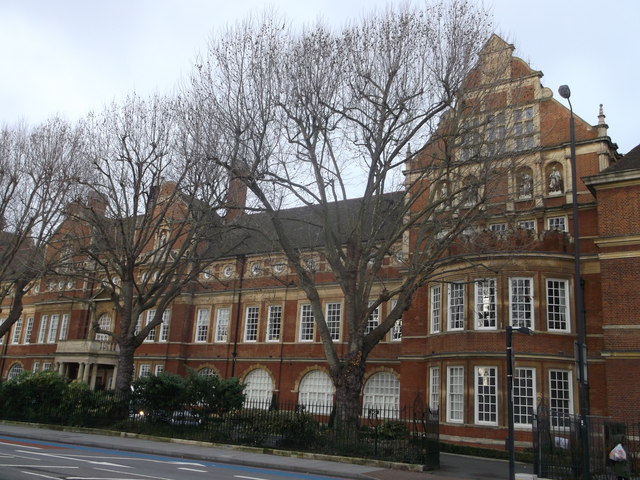
The building started life as a Polytechnic Institute, designed by E W Mountford in 1890. It was listed by English Heritage and this is a description from their website.
Long symmetrical Northern Renaissance composition of 2-storeys, attic and Dutch gables. Red brick, stone dressings, tiled roof. Frontispiece of slightly advanced twin gabled pavilions framing main entrance bay.
Four-bay recessed ranges 2-storeys and attic link frontispiece to gabled end-pavilions. Each end-pavilion comprises on plan an inner segmental bay and an outer and more strongly-projecting square bay. Doric entrance porch with quadrant wings and high parapet, balustraded over the quadrants. Entablature of main door has swan-neck pediment and is flanked by sashes with high entablatures. Behind the porch parapet a round-arched first floor window framed in an Ionic aedicule. In frontispiece and linking ranges, attic pilaster order pierced by bull’s-eye windows and capped in frontispiece alone by complex swan-neck pediments. In the gabled pavilions these culminate in aedicules with statuary. Gabled end-pavilions also have attic order, with statuary in niches. Steep-pitched roof with open octagonal lantern, ogival cap and needle spire.
What an incredible building, and inspiring for students like me who enjoyed studying in the library with its stained glass windows.
The course was two years – part one and part two, and we attended two days a week. The three main tutors were: Mrs Margaret Tree, Mrs Judy Tregellan and Miss Gwen Plascott. They were amazingly skilled at their craft and the most determined and wonderful teachers.
I would love to find the curriculum for the course. The following are modules I remember:
Year one
- Machine embroidery on a waistcoat
- making a skirt
- making a blouse
- pattern cutting
- designing and drawing skills
- presenting your work (mounting etc)
- common core (eg colour theory, health and safety)
Year two
- craft skills
- printing and dyeing
- challenging fabrics
- history of fashion
- tailoring techniques
- making a coat or jacket
- hat making
- glove making
- fashion show
- draping on the stand

The opportunity to study a challenging or difficult fabric in some depth was a key part of the second year. I really wanted to study elastane, Lycra, a modern fabric being used a lot by designers in the 80s. But Mrs Tregelles persuaded me to go with my second choice – Satin. This would enable me to study the history of silk. I had to do ten designs in satin, and this was the one I chose to make up. Inspired by the harlequin jacket I built the shaping into the patchwork, and flared the peplum by using godets. It was lined and bound in the blue silk.
The qualification enabled you to teach clothes-making classes in adult education. I kept my files and folders for years, but they were finally laid to rest just a few years before I became interested again.
I recently met Linda Powell who teaches pattern cutting at Morley college. She did the same course, in the 1970s, and we had fun reminiscing. There were about 20 people on the course when I was there and I would dearly love to hear from any of them.
Women in politics
I can’t stop thinking about Angela Merkel and Hillary Clinton.
Why do they wear the same, rather unusual clothes? What’s with the frumpy “pant suit”? And why get one made in every colour under the sun, including yellow and orange? Why as an alternative to the pant suits do they chose black trousers with a colourful, buttoned up jacket? What does it say and why do they do it?
This photograph of them together is interesting. Looking at the legs only, we cannot distinguish Angela from Joe. But while the powerful women are wearing the pants, Mrs Biden is obviously a “wife” in her feminine red dress, high heeled platform shoes, nail varnished toes, and long blonde flick ups. But the two powerful women have chosen to make a different statement with their outfits, and seem to following the same path.
Hillary, who visited the UK this week, and Angela, are both enormously bright, with great ability and determination. But women in world politics, especially at the highest levels, are rare, and they have to fit into predominantly male environments. At the same time they can’t just get a tailored pin stripe suit and shirt in case they look too much like a man, as Spitting Image envisaged.

Both Hillary and Angela are of average female height at around 5′ 6″. They choose bright colours because they need to stand out. In a sea of charcoal world leaders an orange or lime outfit will ensure that the media spot them, and their clothes will help them make an impact. (Think of the Queen, who invariably wears coloured dresses, coats and hats).


Men’s wear from the waist down (dark trousers and sensible footwear) with a high cut, colourful blazer has become a new uniform to replace variations on the 80’s power suit.
Kate Middleton will tell you that wearing a dress for public events is always a risk – one gust of wind and your underwear, or worse, is splashed all over the internet. Five denier “nude” tights and high heels don’t just make women look frail and in need of a hand. In fact they rule out most leader-type activities such as going on building sites, climbing a ladder or walking purposefully around a factory, for example. Practicality partly explains the Clinton-Merkel formula – flat shoes and trousers ensure you are ready for any eventuality. But while sensible clothes are important for women in the public eye, something else is going on here.
Both Hillary and Angela have hour glass figures. Their oddly shaped outfits are designed specifically to negate their shape rather than celebrate it. The high top-button on a boxy-cut jacket serves to hide both bust and waist. The dated, and very unflattering, jacket length combined with lose fitting dark trousers swamp the hips and bottom. Merkel and Clinton are trying very hard to look the opposite of alluring and sexually attractive. In my view, although neither is overweight, their outfits make them look both shorter and wider than they really are. They remind me of the Mao suit.

Are they saying they won’t conform to stereotypical images of women? Or that they are so powerful and important that they don’t care what others think? I sometimes think they are having a laugh.
Other female political leaders have worked on the same problem but come up with rather more attractive solutions. Take ChristineLagarde. She sticks to neutrals and invariably wears a suit or dress which emphasises her shape (she is athletic rather than slim, and she is as tall as many men at 5′ 10″). She matches her classic outfits with beautiful accessories, especially scarves in luxury fibres like silk or cashmere. She has natural, uncoloured hair, currently worn in a great cut, sensible flat footwear and simple silver jewellery that really enhances her complexion.


Christine wears feminine clothes in quiet colours using bright colours in her accessories. She looks fabulous. It’s a more typically French look, but it is an approach I think works well for powerful women. It’s a way to fit in (tailored, dark suits) without losing femininity. What do you think?
The right fabric for the job (or the job for the right fabric)?
My fabric history
I was brought up surrounded by cloth. My father, and his father before him, were involved in the Lancashire cotton industry.


Rainshore Ltd, Overtown Rd, Nordon, Rochdale, stared off weaving ribbons on narrow looms, later moved onto bleaching and dyeing, and then in the 1960s moving from cotton to manmade and synthetic fabrics. These fabrics and furnishing cottons were printed with heavy rollers and later with flat-bed screens bought from Japan. I don’t have any photographs of the factory as it is now, sadly, a derelict site.

Often during my childhood I would accompany my father walking around the noisy factory, watching vast Victorian machines fold, roll, print, fix and colour yards and yards of fabric. The noise was immense, the conditions hot and the smell was memorable. Fixative, urea, the hot smell of dye being cured. I am attractive to textile design partly to recreate these evocative smells that take me right back to being about 8 years old. The vats of sloshing colour enchanted me before I understood very much at all. I liked the design room too where I learnt that there were just three textile designs: Floral, Geometric and Pictoral (typical in the 50s).
-

Floral 
Geometric 
Pictoral


Although today we have photographic and digital too it could be argued that these actually will fit the existing categories, which is fairly amazing. Back then designs, that take two minutes with Photoshop today, took days of painting each colour onto cellulose sheets with matt maroon (light resist) paint.
There was always fabric around at the factory, and at home. There would be samples and bundles and opportunities to listen to discussions on composition and design when business contacts came round, or were spoken to on the telephone. At home every room had curtains made from fabrics from the factory, although I know my Mum longed for some Sanderson’s instead. Coupled with her interest in clothes and style I have been interested in textiles most of my life, and to some extent regret never going into the family firm.
When I showed my mother the fabric printing I had been doing recently she talked about my father and suggested he would have been proud of my interest.
Typography of Fabric
I think the task of marrying fabric up with the right dressmaking pattern or dress design is quite an art. Getting the right weight, drape and composition for the task can be challenging. Different fibres have different qualities and to some extent every fabric is individual. Sometimes different colours on exactly the same base cloth can affect the fabric differently. Here are some of the issues to consider when choosing fabric (apart from liking the colour or design printed on it).
- Smooth v Textured
- Light v Heavyweight
- Stable v Slippery
- Light reflecting v Matt
- Stable v Unravelling/fraying
- Heat-absorbing v Heat repelling
- Narrow v Wide width
- Natural v Synthetic
- Knitted (jersey) v Woven
- Patterned weave v Smooth
- Woven design v Printed design
- Special finish (eg fire proof ) v Plain
- Napped (eg velvet) v No nap
- Single component v Blend
- Stable v Stretchy/elasticated
- Transparent v Opaque
And so on….
This is just the fabric before we start discussing different weights, qualities, colours and designs. In other words the variety of choices is almost infinite and this make it hard to match a garment design to fabric.
Naturals v Synthetics
This is one of the most important divisions. The most common are:
- Linen
- Cotton
- Silk
- Wool

Personally I prefer natural fabrics because they just feel nicer against the skin. The top two are made from plants; the second derive from animals. Creasing, and therefore ironing is an issue, but luckily my husband does the ironing! They are traditional (Mummies were wrapped in Linen 3000+ years ago and the bandages are still in good condition), widely available, reliable, absorbent, fairly stable and nice to sew. They can be relatively expensive, especially silk. I feel if you are going to the trouble of making something up yourself then get some decent fabric to do it with. I especially like using silk for linings, wool for coats and jackets, linen and cotton for summer clothes and blouses.

Man-made fabrics. These start life as natural materials eg wood pulp, recycled cotton, and other cellulose fibres eg paper which are then transformed into fabric. The most common are;
- Viscose
- Acetate
While viscose feels nice and similar to cotton, it usually has a better drape. Acetate has been used in the cheapest linings, but it is rather horrid and melts if you get nail varnish or remover near it, or a hot iron.
Synthetics (derived from petroleum oil), such as
- Nylon
- Polyester
- Acrylic
- Elastane
Personally I have steered clear of a number of these since I had an Acrylic jumper when I was six that stretched each time it was washed until I could wear it as a dress.

However there have been big improvements since then, and many fabrics can be improved by the addition of synthetic yarns. Wool with some polyester for example, will be cheaper and stronger, with a faster recovery from creasing. Synthetics can also improve stability and add elasticity. As they are derived from oil they are easier to manufacture in industrial qualities – allowing the price to be reduced significantly. Most high street clothes are made from synthetics or blends for reasons of economy. Look at the labels before you buy, not just so you know how to clean the garment.
Choosing the right fabric for the job
Some fabrics go together with the garment or design – for example Duchesse silk satin with a wedding dress; heavy cotton/linen blend with a large-scale print for curtains; light weight chambray for a gathered summer skirt; a good quality but lightweight cotton for a summer shirt; tweed for a jacket; polyester crepe for a flimsy blouse, etc. You can break the rules but it is always a risk. If in doubt use what the designer suggests.


The designer will have made up his or her test garments in the fabric proposed, and the design will work best in these fabrics. I actually love the idea of making this nightdress in silk satin, and the “peignoir” in lace, but to be really frank I think the Ocado man might get the wrong idea. Could you recognise all these fabrics if you saw and felt them? If you can’t find, or afford, them (and making this set will need something like 8m) – the suggestions can be challenged.
What do the suggested fabrics have in common? All are light weight, opaque (translucent for the dressing gown), lightly coloured, cool, drapey, delicate. Then think of a fabric you can find that has these qualities. For example you could make the night-dress in a lightweight cotton, and the dressing gown in a polyester chiffon. Or make the short nighty in a light weight linen or viscose, and chose a transparent fabric with an embroidered detail for the dressing gown? Choosing non-approved fabrics like velvet, wool jersey or a cheap poly cotton would lead to something quite horrid; but if you are experienced you can go off -piste. Extra care will be needed during the construction and it might be a bit of a risk, but you may get a good result.
I meet people in Simply Fabrics or John Lewis with a “bought pattern” in their hand, carefully selecting an appropriate fabric. I almost always go the other way round. I buy fabric I like and then think of something to make from it. I wonder which is the more common approach?
Under or Over dressed?
I often see seriously underdressed people walking around. I am not talking about seeing too much flesh (a woman on the tube the other day had a pleat in her cleavage!)
No, “underdressed” describes a woman in a purple jumper and a pair of black trousers, and apart from her shoes, that is it. No jewellery, scarf or bag to bring the two colours together. Boring hair and no noticeable make up. Or a man wearing old jeans and T-shirt he got from work. They don’t spend too much on clothes, buying their clothes in M&S, Primark or somewhere undemanding. They have made too many mistakes in the past, perhaps buying something they didn’t have the confidence to carry off. They don’t think clothes matter, and dress for comfort and ease.
Clothes do matter. They are the first thing others see when they meet us. Other people will make a judgement based on what you look like, even if you believe this is shallow or unfair. Wearing a nice outfit which enhances you will make you feel better, will make a good impression on others and will also be much more economical. We really don’t need to spend a lot of money on clothes. I think most of the money we spend is wasted as we don’t wear or enjoy our purchases (or makes, if you sew).

Here are three Chief Executives who are well dressed, in my view. I am wearing one of my Curvy Pencil skirts, a turquoise business shirt, flat but brightly coloured shoes and a blue belt. My jacket was the VW copy in teal with a big silver insect brooch. Nick Horne from Knightstone wears a grey blue suit, an open white shirt, trousers the right length and good glasses. He also has yellow socks! Sasha Deepwell, the Deputy CE at Wulvern wears a lovely red linen blouse and matching shoes with her conservative navy trousers. She had a beige jacket on that day, and a turquoise handbag.
I am amazed at the disconnect between the huge sums we spend annually (£21bn in the UK) on our clothes and the lack of any pleasure in viewing people on the streets. It looks to me like maybe one in 20 has actually thought about what they are wearing. And unfortunately half of these have got it a bit wrong, and its obvious, and that discourages the others from even trying.
Know what I mean? The overdressed will always have highly coloured hair. It will be set, or straightened to within an inch of its life. They will have a full face of make up, including lots of mascara or false eye lashes, lipstick and bronzer. A tight outfit, often black and invariably with some animal prints too. On the other hand they love colour and it might be red, or turquoise or purple that floats their boat. It will be matchy-matchy. They invariably wear high heels and shiny leg wear, and jewellery, and a handbag that probably cost more than many earn in a week. They like shopping at TK Maxx where they go for the “designer” item. I know this group are trying – but probably too hard.
What stops all of us getting it right is lack of confidence in dressing. And this is hard to acquire if you don’t have it. So here are some guidelines which might help. All the “models” in this post are people I just met in the street!
Wear some colour

When you see someone in something colourful it will catch your eye, in a sea of blacks and grey. I spotted this lady and asked to take her photograph. She has put two bright, contrasting colours together, added a silver necklace and red lipstick. She has chosen a white phone and a nice big silver ring.
I love to see a yellow cardigan or a pink coat! Or green, or light blue. These colours put people off because “black doesn’t show the dirt”, and this is true. But its not nice wearing a dirty coat even if it looks OK. However a neutral coat is just fine if when you take it off you have on something other than black, or another neutral. Why not wear a green or red dress to work? You will be washing your dress after every wear or two.
Avoid black unless you have black hair
Black does look great on people whose natural colouring is darker. As a rule of thumb it is a good neutral for people who have naturally black hair. But for most others it is just not nice. It washes us out and makes us look older and tireder than we really are. If you suit darker colours try darker browns, reds or blues. If you suit muted colours try the deeper blue greys. And even if you choose a black coat because it suits you try wearing some of your colours underneath.

This lady looked stunning with her black blouse with the collar turned up confidently, well-fitting grey linen trousers, paired with grey Converse shoes. She is also wearing earings, a silver bangle, natural hair and a neutral bag.
Enhance your natural beauty rather than fake it

This is an artist I met on Camberwell Green. She made the jacket and the sweet flower brooch she is wearing. Her glasses are a nice shape for her face and she has a leather handbag across her body. But I took the picture because I love natural hair. I love the shades in it. Jacqui’s hair has lots of different colours in it and it looks marvellous with her bright blue eyes and light pink jacket.
The variety of colours in natural hair means it looks shiny and lively rather than flat like coloured hair. I know because I coloured mine for about 40 years (I should have had shares in Clairol). I love naturally red hair. I love shiny Asian hair. I adore natural African hair and wish that more women celebrated it rather than straightening it with strong chemicals (I was influenced by Malcolm X). I love looking into people’s eyes and seeing so many colours. My own eyes have yellow in them as well as blue, grey and green! This is why seeing someone with coloured lenses is so shocking. Their eyes look flat. Fake tan, breasts, whitened teeth all look horrible at the extreme. In my opinion.
Wear make up


I didn’t wear make up until I was about 50. It made me itch, it rubbed off and I didn’t have the time. Now I find some products are so good that they will stay in place most of the day (I am talking about MAC). I usually manage to get some subtle eye make up on, and if I am trying, some lipstick too. As with the general advice – just a little to enhance you, to give a little definition to your features, but not so much that you look like you are wearing the colour card.
Use accessories

OK – a bowler hat is a bit of a statement, and could go into the “overdressed” category, but I felt worn with the vintage sunglasses and a modern, trimmed beard this looks just great. A nice blue, slim fitting suit (with just the top button done up), the dark tie to stop the hat looking too dark, with a toning pocket handkerchief.
Here is a list of accessories you might select from
- shoes
- gloves
- hat
- scarf
- belt
- jewellery (brooch, earrings, necklace, bracelet, rings)
- glasses
- good hair cut or neat facial hair
- hair ornament
- and for men – shoes, tie, pocket handkerchief, watch, cufflinks, wedding ring
For goodness sake don’t wear the lot (spectacle chain plus flower in your hair, anyone?) because you will look like a children’s activity centre. I just listed them to show you where you can add a little detail, to bring your outfit together.
Chanel-type cardigan jacket

The internet made me do it! Lots of ladies, worldwide, have re-created a Chanel-type cardigan jacket, Vogue 8804, using the finest tweeds, silk linings, buttons and braids.
Here are some I most admire: Corecouture, Manuela, and Ann Rowley.
Two Chanel style patterns created by Claudia Shaeffer, an expert on couture techniques and Chanel specifically, are available from Vogue. This enables the amateur tailor to produce either a cardigan jacket, or more recently a mandarin collar version, featuring some of the same techniques as used by couture houses. Her newer pattern Vogue 8991 (shown above left, in black and white tweed) is very similar to the out of print Vogue 8259 and is on my list to try in the future.
After having a reasonably good outcome with Vogue 7975 I thought I would try at Vogue 8804, following Claudia’s instructions to the letter.Claire Shaeffer’s instructions are incredibly detailed. She has a collection of vintage couture items, many by Chanel, and she promotes the construction methods that have historically been used in Paris couture. Much of the jacket is hand-sewn which is enjoyable if you put some time aside to do it for pleasure.
Design and alterations
The pattern is multi-sized and there is only one “view”.
Having said I would follow the instructions, I ignored her first suggestion to make a toile – a preliminary version of the jacket in stable cotton, in order to check the pattern fits. As I had recently made a similar jacket, in navy, I figured that I would transfer most of the alterations and measurements. The main thing was to reduce the boxy look, and ensure the jacket fitted me in the upper chest, bust, waist, back length, overall length and sleeve width. I was able to do this by using the multi-sized lines on the pattern.I got a nice close fit where it matters – across the upper chest, arms and waist, with sufficient ease and a slight flare at the hips. I lengthened the torso as I usually do, but found the style of the jacket rather short. It is a design feature, and makes it feel more “cardigan” like. I had never made a three piece sleeve before, but this was one of the main attractions of pattern, allowing apparently a better, closer fit.
Materials and other supplies
Like everyone else I bought my fabric from Linton tweeds, the UK company based in Cumbria, that produced fabrics for Coco Chanel herself. They still produce fabrics for Chanel and many other couture houses and designers. Jigsaw have been incorporating the tweeds into T shirts, skirts and casual jackets over the past few seasons. I chose a light blue and beige fabric, with flecks of silver, as lighter cool colours suit me. Also I wanted a spring/summer jacket, and something that would look nice with jeans as well as more formal items.
I decided to make my own braid and chose a beige tape to sit it on. The lining is a bright blue silk twill. I bought silver buttons, and after a trial button hole (with both beige and blue button hole twist) chose blue for the buttonholes. The wax (ironed into the buttonhole thread) makes sewing smoother. Lots of the seams are taped but there is minimal interlining (I used Simply Fabrics organza) – the stability comes from quilting the lining to the jacket fabric, with a chain to weight the hems. This explains the use of quilting and chains in Chanel handbags, in reference to her techniques. I also bought some coloured basting thread. When so much is hand-sewn it makes sense to use different colours to indicate the markings on the pattern. For example I used pink for the Centre Front, button holes and other balance markings; yellow for all the seam lines; and white to baste with.

Construction
I generally enjoy following the instructions. One of the things I like about “bought patterns” as opposed to ones I make myself is that I don’t have to think too much. I get in the zone and just do as I am told. Sometimes it’s something different, or new. Sometimes a technique is badly explained, and I enjoy the challenge! This pattern has very extensive instruction and 94 separate stages (compared to say 10 with an average pattern). I did most of it, and am pleased to have done so. Three things were completely new – the three piece sleeve, the quilted lining, the handworked-and-bound buttonholes. The aspect which didn’t work for me was the shrinking of ease. I have shrunk tailored sleeve heads and even skirt waists, but I am sorry to say it didn’t work with this particular fabric. I can only think that it doesn’t have much wool in it, or it is somehow preshrunk, or felted. I don’t know what happened but I couldn’t get it to shrink at all. Instead I added a sneaky little bust dart, but got most of the shaping into the seams.

The whole process took me a month, mainly working on the jacket at the weekends. I found the extensive hand stitching nice and relaxing.
Making the braid
The jacket has four appliquéd pockets which are first decorated with braid, then lined, then applied. I didn’t try to get a matching braid as I was keen to make my own. The Linton tweed include a multitude of yarns and colours and I spent a happy Saturday pulling out several stands of the predominant blue nylon pleated and over-stitched, dip dyed yarn, and twisting it with other less flashy threads. It made a bulky yarn, which didn’t like being crocheted (one way to make a braid). The only thing I could do was to twist, then couch the thread onto the base. I actually really liked the effect and it lifts the jacket from being a bit bland. The brighter blue in the ribbon works well with the lining and with denim.

Its a nice jacket. Its easy to wear (probably better not done up over a T shirt and jumper), goes with lots of things, and is both lightweight and warm. I don’t expect to make another one with this pattern, but I am keen to try the new one as I do like a mandarin collar.

How to create a colourful wardrobe
Introduction
In my experience the best way to think about wearing colour is to start with the idea of harmony. What colours go together well – like notes in a phrase or tune? Look at nature and you will see colours which harmonise – a setting sun set, the plumage of a bird, or a peony where the particular pinks blend perfectly with the particular greens. Or a human face – where your natural hair, skin, eyes and lip colours work together well. In all of these examples light and life make the colours shimmer.
Colour in our clothes
When we reproduce colour in our textiles it is flatter, and more artificial looking (and to the textile designer, often disappointing). Just compare a piece of black cotton with the black of the night, or a ladybird’s spot or a blackbird’s feather. Because textile colours are “deadened” we need to be more careful with how we put them together. We are able to see 2.4m colours, but creating a harmonious look when you are getting dressed in the morning can be challenging. Also colours are on a continuum – when exactly does a red purple become a blue purple, for example?
Perhaps the easiest way to do it is to break down each shade in to the following categories. Colour has three dimensions. Value (depth/light), hue (cool/warm) and chroma (brightness-clarity/muted purity), and therefore can be compared with their “opposites”. And while there are obviously some colours are in the middle, I find it a helpful approach. I think it is fairly easy to see these difference. Decide if a colour is:
Deep or light?


Cool or warm?


Bright or muted?


Colours are often in more than one group. For example mustard is both warm and muted, mint green is both cool and light.The basic idea with dressing in colours that suit you is to determine your own predominant look. If we are seeking a harmonious palette that will suit an individual and make them look their very best we can usually identify one of the above groups which will work best. If your colouring is very light for example (a natural blonde or light redhead for example, with light eyes) you will look your best in lighter colours. Which group of colours enhances and supports your natural colouring?
For me it is cool shades. My natural colouring is predominantly cool – ash blonde hair, blue eyes, purpley pink lips, cool-light skin tone. I’ll always look my best in shades which are cool. This doesn’t mean blues and greens rather than red or pink. I can wear every colour but it will be a shade of that colour that has blue (rather than yellow, which is warm) undertones. The pinks that look good on a person with cool colouring are bluish pinks rather than yellowish (peachy) pinks. These pinks will harmonise well with other cool (blue based) colours. Greens that work with my colouring, and with my wardrobe, are bluer greens rather than yellowy greens (pea green) or muted greens (khaki).

Before I identified my own shading and cooler direction I had clothes in every single group. I bought clothes or fabrics in colours I liked (tobacco brown, or peach, for example). I instinctively matched warms or muted shades together but as a result there were lots of items which didn’t match or harmonise with each other. And a lot of them didn’t really harmonise with me (cool – bright – light) either. This theory of colour is really helpful in terms of streamlining your wardrobe and ensuring that virtually everything can be worn together.
Colour Analysis
Because I am so interested in colours that enhance people rather than drain or age them, I qualified as a colour analyst. I will blog about how this works, but if you are interested please get in touch.
You must be logged in to post a comment.