


Do you like how you look?

Some recent research has shown how most of us dislike how we look, leading in some more extreme cases to a number of serious mental health problems.
Yet our body and facial features are more or less givens, and all we can do is feel ashamed, or simply try to present what we have in the best possible way. Despite acres of print and digital media, TV and advertising suggesting, advising, selling, demanding and insulting, very few people seem to know how to improve the way they look.
It is worth a little effort – to make ourselves feel better about ourselves, so that others see us at our best, and to save us from wasting money while we chase impossible dreams.
A healthy body is very important. Or as healthy as you can be (accepting that we are all ageing and many have health issues). Eating food that we have made ourselves seems old fashioned but if we do this we are unlikely to seriously overeat. There is a reason why the recipe for Coke is secret! And we were made to be active – to walk, run, work and dance. Sewing and blogging, reading and seeing friends are also more enlightening, and less passive, that watching TV. Feeling good about your body is the foundation to feeling good about who you are – being fit prolongs your life, improves its quality and makes you happier and more attractive.
In addition to good health, there are three things we can focus when choosing what to wear.
- Clothes that suit us. This is not fashion, although we want to be stylish. Each of us needs to work out what our body is like and how to enhance our best features and disguise the less attractive bits. The human brain admires symmetry unconsciously and this is what we are aiming for. If your legs are relatively short you want to make them look longer. If your hips are big for your body you want to minimise them. Its a simple theory and something you can work out for yourself. The What Not to Wear books are pretty good; trial and error works to some extent; and honest feedback is ideal. We tend to pick up “looks” that we like – on others. I love to see long tight skinny jeans, or tiny skirts on girls with legs like arms. Very pretty, but not on me! Unfortunately most of us cannot help others because we tend to advise them as if they were us. Have you ever been shopping with your Mum or a friend who insists you would look “great” in something that is absolutely wrong for you?

Legs that look like arms - Clothes that fit us. Basically this rules out clothes that are too small. Tight clothes make us look bigger, while the opposite is true. Sufficient ease in your clothes has the effect of making you look smaller. And it is considerably more comfortable. This allows us to avoid wearing clothes merely because they are “comfy” – leggings, loose t-shirts, trainers – outfits which do have a place, but it’s usually the gym. Modern stretch fabrics allow manufacturers to get away with murder as they “stretch to fit”(e.g. “comfort waistband”).

Sorry love, it’s just too small - Colours that flatter our natural colouring. By natural colouring I mean your eyes, skin, lips, and most importantly hair. Natural hair and eye colours are amazing – which is why it is a shame that as many as 50% of women change their hair colour hair with bleach and dye. This explains why many of us find choosing the right colours difficult – we are trying to match them to an artificial hair colour rather than our own natural colouring. Which, I think, is why most of us avoid colour altogether it by wearing a lot of neutrals – mainly black, grey, dark blue, (or beige if you are a pensioner!). With a bit of white, or occasional pastels. Other people, who love colour, go to the opposite extreme, buying colours that they like and finding they need lots of clothes because not everything “goes”with everything else. Like shape and fit there are some rules that can be adopted.

Beige. Don’t fade away!

Put together these three elements are all it takes to look great.
And these are the three reasons why I like making clothes. While the shops and the internet heave with choice, it is difficult to find something you really, really like, that you will enjoy wearing often.
If you find a dress you like it will invariably be too short. Or too baggy. Or with a silly collar. Or a cheap exposed zip. Wrong style.
Or you may find a pair of trousers in a good colour, and nice shape, but they just look terrible on because they don’t fit. Poor fit.
And to top it all it will only come in black. Or poo brown. Wrong shade.
Even if two elements work there is invariably a third that doesn’t, meaning buying the item is a complete waste of money.
Remember – don’t choose styles, shapes and colours that you like. Rather choose styles, shapes and colours that like you.
This is where tailor-made clothing comes in. So long as you know what shapes suit your body, and what colours suit your colouring you will be able to make, or commission, outfits that are wearable and suit you. Clothes that help you look your very best.
A Rose by any other name is Pantone TPX 15-2214; Hex: #E38FB7; RGB: 227, 143, 183

There are two main ways to talk about colour. One is use language such as “rose” or “forest” and “maize” – giving us all an imaginary shade based on our memory of the colour (usually based naturally occurring shades); the other is to use the number which denotes the colour in an established colour system, eg Pantone, web colours, paint numbers or the Munsell system. I like the Munsell system, developed in the 1900s by an artist and professor of Art in Massachusetts, which recognised the three dimensions of each colour – the hue, value and chroma (in that order). He thereby designed the system that makes determining colours more rational than naming ever could. His system is still in use in selecting tooth shades, and the forensic analysis of human bodies.
For example a purple (the hue) of medium lightness (the value) and fairly saturated or bright (the chroma) would be described as 5P 5/10 with 5P meaning the colour in the middle of the purple hue band, 5/ meaning medium value (lightness), and a chroma of 10. If we were giving this colour a name it might be called Violet, Lilac or Lavender, or indeed Merry Berry, or Sugar Plum or whatever you like.

Names are of course very evocative – I heard that Revlon’s pinky-red lipstick called “Cherries in the Snow” is a best seller due to its wonderful name. Conversely I have a joke with my friend Alison that the colours that suit her best are mould, bruise and sludge. As a child I remember my brother James refusing to wear a colour my mother called “donkey brown” – he said it was “poo” coloured.

There are certain colours, or combinations of colours, that I cannot abide. For example I have always associated maroon and yellow with scabs and pus (sorry!). Colours, let’s face it, have huge emotional content and meaning for all of us. And their names are associated with our feelings. A friend who has the lovely job of naming the clothes in her company’s collection came up with “ginger nut” for a shade of orangey-brown. Hmmm. No wonder the world needed a numbering system to take all the feeling out of naming colours. I can imaginatively distinguish between mandarin and orange; mint, jade and sea green, but my mint may be your jade. Clearly we need a more scientific approach.
As an aside I wonder why some things are known by their numbers -cameras, cars, computers, mobile phones. And other things have names like Jessica or Peace – women’s clothes, shoes, flowers, lipsticks – for example?


Men in shorts – for work?
OK. It’s been really, really hot in London. Today it was 30 degrees. Is it ever OK for men to wear shorts to work?
In my opinion men certainly can go to work in shorts, but they need to be careful of appearing too casual and weekendy when wearing shorter trousers. I think is important to be a bit more formal with shorts to avoid that under-dressed, slightly unprofessional look. Here is what I suggest:
- tailored shorts – tailored pockets, a proper waist band and belt carriers.
- decent fabrics like lightweight wool, linen, or a heavier weight cotton
- work colours such as navy, grey, beige, brown, camel or black
- knee-length
- not tight
- worn with a complementary shirt that would usually be tucked in
- a nice leather belt
- semi formal shoes (not sportswear)
- no socks
Let’s have a look at what cropped up at Notting Hill Housing this week. Here is Andy Lord, one of our senior Asset Managers – he looks after our homes. His shirt is fine, and the shape and length of the shorts work well, I think. Personally I would have tucked the shirt in, and worn a nice belt, perhaps picking up the red, navy or white from the shirt. But I think he should have gone with better shoes. Maybe black or navy sandals, navy suede loafers or even those kind of boating shoes?

Soon after photographing Andy I bumped into Nick Mawley who is our corporate designer. He is a creative Kiwi, but I am not sure that he has got the look quite right. While the shorts and shoes are certainly acceptable, and the trainer socks in a narrow stripe are spot on, what the outfit is crying out for is a nice button-down shirt that ties the blue shoes and navy shorts together. Maybe a stripe including grey, navy and muted blue? Or a white, short sleeved linen shirt, tucked in, and a navy or mid-blue blue belt. Or a chambray shirt with the sleeves carefully folded up and a brown belt. I don’t think wearing a branded, creased up T shirt is doing a lot for this good-looking man.

My third photo is of Ashley Beaton, who is a manager in our temporary housing Home Options business. Ashley is very tall (6’4″ I think) and was my PA until June. Here he is at a friend’s wedding. His jacket and shorts are not a suit, but they are a similar shade. The white shirt sets off the beige, and he wears a pair of neutral pumps. Bravo – Ashley nails it! This is the sort of look that would make shorts an acceptable look for men to wear in warm weather.

Skin, flesh, nude; dressing undressed
Representing or approximating skin
When I was at school the pinky-peachy colour that looked a bit like girl’s ballet shoes was labelled “flesh”.

In today’s primary schools this shade probably has another name such as “light peach”. And I have no doubt, reflecting the much greater variety of ethnic backgrounds in schools today, that there will now be a full range of skin tone pencils available to our children.

But the point of the pencil was to enable children to draw people – “My family”, “My holidays”, “Mummy”. And if you draw people you do need some skin tones. But “flesh” crayons or paints have little use outside primary school as capturing a likeness requires a wide range of shades.
However hard it is to draw or paint skin, there is a “flesh” colour for everyone. Of course you will never find one colour that exactly matches your colouring as your skin tone is made up of so many different harmonious colours. Our skin colour changes during our life, and according to the season. It also changes quite considerably if we are ill, shocked, suntanned, embarrassed or fit. Even the food we eat can affect the colour of our skin. It is a living organ, supplied by blood, able to excrete perspiration and oils, and it cannot be compared to a colour – crayons, paint, photography, print, or textiles in our clothes.
Van Gogh Self Portrait 1887
Here Van Gogh creatively uses yellow, grey-blue, brown, white, green, red and pink to give an idea, an approximation, a sense of his own flesh tone.
Nude celebrities
Over the past few seasons we have seen film stars falling in love with “nude”. At very first glance the person appears to be naked, but perhaps naturally rather than sexily so.
The best effects are colours which suggest nakedness, rather than being too “in your face”. The answer is to chose a nude that complements and enhances your own natural pigments. What we are trying to do is find a shade that harmonises with the shades that are already in our skin.

I am not going to judge the choices made by the film stars at the Golden Globes. It is impossible to know what colour direction each individual has. We can only really know our natural shading if we are analysed in natural light, without make up and in reference to our natural hair and eye colour. Film stars – in films and on the red carpet – are something of a blank canvas on which the studio paints the required look. Even at award ceremonies they will have a manufactured, unnatural look. They are wear heavy make up for the cameras, and their hair colour is normally dyed. In fact it is likely that their faces and hair will be coloured to complement the dress rather than vice versa.
Done badly nude can be really unpleasant. But if you work with your natural beauty then you can look more amazing than a film star. And I believe that everyone can wear nude, but it has to harmoniously flatter their natural colouring.
Deep or Light?


Although all these nude shades look like a pair of tights I am just trying to show that whatever your skin tone there is a better nude colour. Although many black women obviously have deep colouring many nude shades are unflattering on them. Marks and Spencer do tights in Cocoa which, I believe, are far preferable. They are actually a dark brown and I wear them with dark brown shoes rather than ubiquitous black tights.
Cool or Warm?
If your skin includes cooler, bluer shades your nude will be pinker. And conversely warmer colouring will suit a more yellowed nude.


Bright or Muted?
Again if you know your primary colour direction you could use that to determine your nude. A Bright complexion can wear a fairly strong peach or pink, whereas a Muted complexion would look better in a slightly greyed off pink.


Virtual colour analysis
Now I am going to have a go at guessing the colour direction of a singer in the public eye, Leona Lewis.I think she looks her best in Bright shades. She has a clear, dazzling complexion, and looks gorgeous in strong turquoise, bright purple, red, black and white. She also looks really great in a well fitted jacket.
Leona Lewis
For the Grammy awards, somehow, a stylist has persuaded her to follow fashion, and have a go at wearing a revealing nude dress. Below she appears in nude and her skin just looks unhealthy and dirty against a beige-nude dress. The shape of the dress is wrong too. Even gorgeous, rich, famous people get it wrong sometimes. Is there a better approach to nude dressing?

Not a good nude for Leona Lewis (at the Grammys)
A different approach
Nudes can be very nice, and actually the Warm Lighter skinned ladies are really flattered by the light peachy pinks of my old school pencil.
But for other colour directions I think it may be best to look for elements of your skin colour and go for something a bit more off piste. So if your Warm is Deep then browns could work nicely. And if you are a Bright Warm then gold will look beautiful. But these shades are not colours that flatter a Cooler complexion, where the hair, skin and lips have a bluish undertone. Here the nude that looks best maybe a cool pink, but it could also be a cool light yellow, or a cool neutral like stone, light beige or grey.
If you want to wear nude colours think about suggesting nudity, or reflect an aspect of your skin colour, rather than being drawn to the primary school pencil shade. Don’t reach for the obvious – something that has the word “flesh” or “nude” written on the label. Your best nude could be deep brown, purple, light grey, icy pink or yellow. The idea of the nude dress, for me, is to enhance and amplify the shades in your skin rather than a shade someone has designed to reproduce generic flesh.
Will you join the Flat Shoe Society?
It always catches my eye when I see a high-heeled woman in the street, as she is invariably having trouble walking. And I take pity on the girls at work who can’t afford a mortgage, but have a few pairs of Louboutins (at around £400 a pair) knocking around under the desk.

Here is the truth: The world could not continue, work would not be done, children would not get to school, and public transport would cease if women habitually wore high heels.
Look at any photograph of a catwalk show, or a red carpet event, or a posh opening party and the models and celebrities wear nothing else. Open a woman’s magazine and high heels will be the norm. As we soak up fashion “advice” we get the subliminal message that high heels go with everything. We are told that women look “elegant” and “leggy” in high heels. And a similar school of thought suggests that heels make us “powerful” as we can see eye to eye with men. We are shown platforms, “sky-high” heels, spindly stilettos, strappy Jimmy Choos, shoes with jewels or spikes or made out outlandish fabrics and we are asked to join the fetish. High heels had their very own TV programme and ever more ghastly, vacuous films called “Sex in the City”. The breathy worship of inanimate objects – those shoes that are “to die for”, worth eating beans on toast for a month because they cost about £500, or more. But of course these actresses wear slip ons, trainers or lace ups most of the time – the heels are just an image thing. Let’s start being honest about this.

I know I am shorter than a lot of men. I accept my legs are of an ordinary length. I understand that higher heels actually create a flattering lengthening, and once in a while I wear them, but you know what? Stop gushing. High heels are actually footwear designed by the devil himself. Worn frequently they can permanently damage your back, knees, calves, toes and heels. And models, who are in fact trained to walk in them , frequently fall over. Walking awkwardly in them looks far worse than wearing a nice pair of loafers. Don’t be a victim.

In response to high heel hell I have formed the Flat Shoe Society.
I invite you to make the pledge with me today:
- I will not wear clothes that hurt me
- I will not buy bits and pieces to wear in my shoes to mitigate the pain
- I won’t voluntarily deform my feet
- I will walk at a reasonable pace
- I am prepared to run in an emergency or if I am attacked
- If I need to be dominant or powerful I will rely on my brain not my appearance
- I will not waste any more money on useless clothes
- I will wear flat shoes with pride and style

Women!
Commit to wearing flat shoes!
Men!
Encourage and admire women who wear brogues, pumps, flat winter boots, summer sandals, and stylish sports shoes!
Fashion Designers, Editors, Educators, Journalists, Stylists, Film stars!
End the conspiracy. Design, make, sell, feature and promote beautiful, comfortable Flat Shoes!
A virtual colour analysis – what do you think?

Hello Joyce! Joyce is from Canada and we met through this blog. Joyce does a lot of sewing including covering her own sofa! She paints and sculpts. She has two daughters, a grandson and another one on the way. And she is learning to play the piano!
Joyce mentioned that she is somewhat confused about what colours suit her best. In the past she had a ColorMeBeautful analysis where they said she was a “Winter” and suggested she wear the jewel colours (ruby, emerald, garnet, sapphire) with black as her neutral. Joyce says she is getting bored of black and in particularly asked which neutrals are best on her.
Let me briefly explain the CMB seasons approach, as I understand it. It groups three directions together so that someone who is a “Winter” would have Deep-Cool-Bright colouring and would suit colours that were all three of these. Looking at Joyce now in this photograph I can’t agree with that view. Let’s try a virtual colour analysis of Joyce using our dichotomous colour directions approach. Firstly is she Deep or Light? This question means are the colours which flatter her saturated – do they have a lot of pigment in them, or are they “watered down”?


Even allowing for the fact that Joyce colours her hair I think it is fairly clear that the deeper palette is more flattering on her. These are perhaps the jewel colours that have been proposed before. They look good, and considerably better than light colours.
Now let us consider if Joyce’s colouring is cooler or warmer. Cooler colours have the sea in them (blue undertones) whereas warmer colours include the sun (yellow undertones).


Again I think you can see how the cool colours are much more flattering to Joyce. The warm colours don’t look very good at all.
The third part of our analysis is to consider whether brighter or more muted colours bring out the best in Joyce’s natural colouring.


And this is where I part company with Joyce’s previous analysis. I find the Bright colours unpleasant and overpowering against Joyce’s delicate complexion. So, in my view, Muted colours are far better for her.
At the end of the day we have three possible winners here. But which is the best?
In my opinion the Muted palette is the best of the three for Joyce – precisely the one that was omitted in her previous analysis. While I agree that deep and cool direction are also present in Joyce’s complexion and eyes I don’t support the Winter colouring , wear “jewel shades with black” suggestion. I think Joyce would look better if she wore softer, muted shades (colours with a little grey in them), but chose also from deeper versions of muted as I believe her secondary direction is deep. Deep greys and grey blues would flatter her colouring a lot better than black (which I would avoid) – so these would be the neutrals I would choose for Joyce.

I would think Joyce would look most lovely in the deeper, softer blues and purples, she would also look nice in taupe and strong teal shades, deeper khaki, and most shades of grey. With reds I think ox blood would really flatter Joyce but also the dusty pinks. Lighter muted colours are fine too, although I think they need to be worn with deep shades. it In terms of white – I think she should chose an oyster white rather than creams or brilliant white, and wear silver jewellery rather than gold. If Joyce is prepared to send a photograph of herself wearing muted shades we can offer some more feedback. If you don’t have muted clothes in your wardrobe Joyce a cheap T shirt would work fine (before you splash out or spend time making new clothes) or put on an outfit in a shop and take a photograph in the changing room! I would suggest a slightly purpley lipstick such as Plumful by MAC.( It looks deep in tube, but it is pretty sheer on). Over time, if she wants, Joyce could let a little natural grey come through in her hair which would provide more softness near her face and I think it would lighten her look in an attractive way.
Disclaimer. The correct way to analyse someone’s personal colour direction is to do it in the flesh, with natural light using real textile, precision dyed fabric swatches. I don’t wish to disrespect other colour analysts who may take a different view and I would welcome feedback from others on the advice I have, tentatively, given here.
Are there some colours that suit everyone?

My dear Daughter in Law Bianca is struggling with a strange request. She has been invited to a wedding where the guests are required to wear Lilac dresses. This is apparently quite the thing in a number of cultures and I was interested to see how she gets on. Lilac is not a fashionable shade this season and she couldn’t find anything in the shops. She ended up buying an inexpensive 100 % polyester Chinese dress on the internet in just the right shade of lilac. It is a glamorous, weddingy design, with a built in bra, boning, back lacing (to accommodate different shapes), draped bodice and full length lined skirt. Bianca has Muted-Deep colouring so light lilac is not her best colour and she doesn’t feel entirely comfortable in it. In the meantime, encouraged by Manuela from Hong Kong, we are considering dying the one she wore for her own wedding.

This got me thinking about co-ordinated weddings which, to my mind, are a bit of an odd concept. But if you wanted to launch a fleet of airlines, or choose bridesmaids’ dresses to match your flowers, what would be a sensible choice?

This Camberwell church group has gone for a print in turquoise and green, teamed with natty apricot and brick head wraps.
So, are there some colours which would suit absolutely everyone, whatever their natural colouring? Well, apparently, there are.
These are known as universal colours – shades which while they may not be the best colour for everyone will be fine on your wedding guests, choir, cabin crew, or congregation – whatever their colour direction. Most of them work because they combine warm and cool colours in roughly equal measure, or because they have a balanced/middling quality to them. They are also medium in value (medium-light, medium, medium-dark) – they are not very dark, light, bright or muted.
- turquoise (blue with some yellow in it)
- teal (blue plus green)
- violet (blue plus red – a balanced colour)
- beige (the ultimate middling colour)
Some other colours have been suggested which seem to work too
- watermelon red (light mid red)
- maize (muted light yellow)
- soft rose (a pink that is neither yellowy nor bluey)
- chocolate brown
- aubergine
- mid-gray
- stone
- oyster white

Does this make sense? Anyone out there look ghastly in aubergine?
Architectural clothes, anyone?

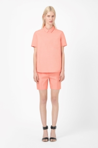
All outfits from www.COSstores.com
London’s skyline is becoming dense with silly shapes with sillier names – the Cheesegrater, Walkie Talkie, Shard and Gherkin.
With a career in property development it is no surprise that I work with many architects, all of whom who I greatly respect and admire. They work hard, listen carefully, think about the people who will live in our homes, and exercise enormous creativity. I am also in awe of the work of the most celebrated contemporary architects such as Frank Gehry who make a statement and a show with their buildings. And yet there is something inherently reassuring and calming about buildings that don’t shout at passers by. The elegance of our Georgian, Victorian and Edwardian buildings form the “wallpaper” of my daily life. These building are classics. Well proportioned, stylish and practical. Take the Georgian house – how clever that the frontage is scaled so that it looks balanced and harmonious from the street, with windows which decrease in scale as we ascend. These tried and tested designs still work well today, and they worked well 300 years ago. We still use and enjoy these homes and find them adaptable and flexible, and their human scale appeals.
As technology has got more sophisticated architects have been able to design ever more complex buildings that mark a very radical departure from the straight up and down look, with a pitched roof on the top. Computer aided design has reached new heights and they can create buildings of the most intricate design, especially producing very tall buildings with curved surfaces and non traditional materials.
It is not surprising that dress designers have stolen some ideas from architects too.
I am not picking on COS, because actually some of their clothes are lovely. But they are known for their Scando-architectural shapes, and this post is about architecture and clothing design.
The 1920s
The 1920s silhouette flattened the bust and created interest at the hips, disguising the waist in the process, with geometric styling and a small head at the top. Ladies started to resemble buildings. It is worth mentioning that women were to some extent emancipated by the looser dress, shorter skirts and a somewhat masculine feel.

The Art Deco approach to building design continued this trend, with weight at the bottom, geometric detailing and a small delicate, curved and decorated summit. Here is the most iconic Art Deco building – The Chrysler – for comparison.

The 1960s
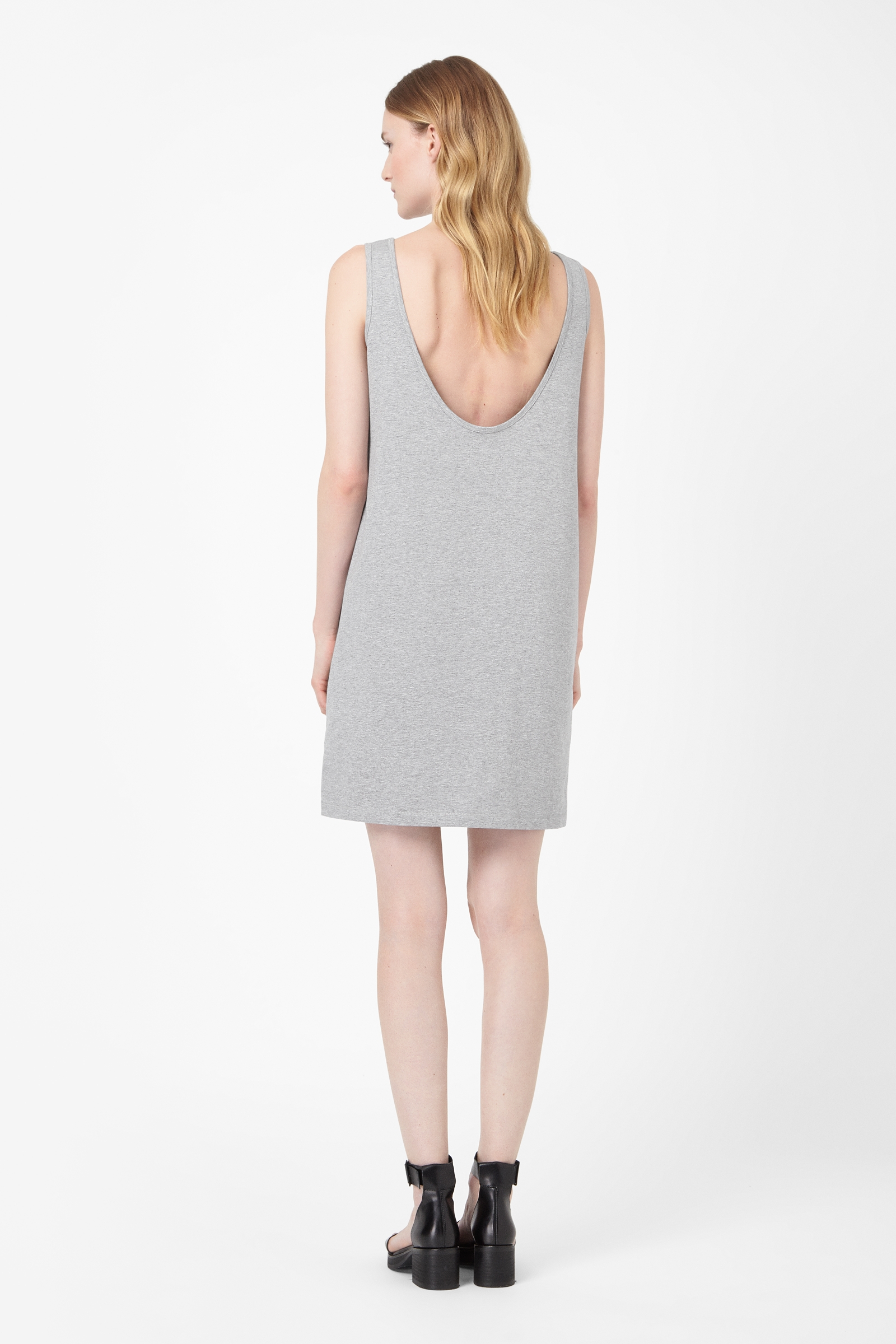
The next time very straight lines returned to fashion was in the 1960s when first the “trapeze”, then the “shift” and structural fabrics became fashionable. At this time too – the so called swinging 60s – young women asserted their freedom from conservative styles of dress and chose somewhat “childish” or “boyish” silhouettes. I love the YSL 1958 Trapese line, for Christian Dior. In the photograph below we have an A line dress in grey tweed with a very exaggerated structural flare. It manages to be flattering due to its beautiful cut, but I think it looks better on the stand than it does on a female body.

©The Kyoto Costume Institute, photo by Takashi Hatakeyama
2014
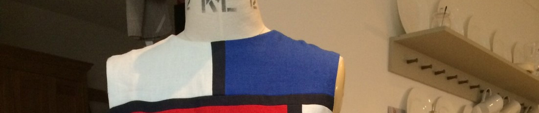
The more modern advent of “awkward” clothes is exemplified by COS and other retailers. Here again the hourglass shape is disguised and negated by the most brutal of lines. The body is made to fit into a box. The basic design principle (in my view) of emphasising the waist is subverted by ignoring it completely. In addition the shoulders (normally smaller on women than their hips), are exaggerated to make the line straight or even taper towards the hem.
Flattery of the bust – by darting and other shaping – is eschewed so that the bust is first accommodated and then ignored. The opportunity to emphasise the slimness in the middle is ruthlessly avoided with dresses that refuse to bend. The curve of the derrière is skirted around and the strongest lines are often horizontal. The hem is designed to cut across – of course – the least flattering point, often the mid calf. Add some outlandishly wide sleeves and a pair of low slung clumpy shoes you have the awkward look.
I enjoy variety and experimentation, and at one level these designs are nice and orderly like my beloved Georgian facades. But even on the tallest, slimmest, blank faced model with invisible lips, these garments look aggressive and unattractive. They draw attention to the emaciated girls, who appear lost in a diagram.
A new granny dress for a New Granny!
Its been a tough week for my daughter who was due to have her new baby on 2 July. I was expecting a call every night from the end of June and I am delighted to tell you the baby arrived safely yesterday – 12 July.
While waiting I ran up a couple of frocks.
The first was for Esme to wear to the wedding yesterday of her best friends Gemma and Bren. She wanted a retro 50s look, with buttons at the front for easy baby feeding, and chose some yellow, blue and white striped fabric. Its a bit like seersucker and it was not an easy sew. I had to avoid steam as it puckered when ironed, and I expect it may behave strangely when washed.
Esme expected to attend the ceremony with her new born tucked in a sling. She asked me to make a suitable dress, which was quite a tall order. At no other time would a woman’s waist go down from something like 40″ to 25″ over a few days, while the bust measurement might go from say 32″ to 36″. I went on Artisan’s Square to ask for help.
Dress 1 Design and Construction
I used a tried and tested blouse pattern (size 12) I had used for my SWAP, Vogue 5569. It has a kimono sleeve which means I can take it in from just the side-and-sleeve seam. For the skirt I dithered about pleats and zips and panels, and in the end decided on elastication. I left the safety pin in the elastic so that it could be tightened to fit. It is fairly full and I plan to turn it into a pleated skirt with a waist band once her body returns to normal. I figured she could wear a belt or tuck it in or wear it loose, or even wear the blouse over a T shirt, as a jacket.

None of this happened.
Instead of going to the wedding Esme woke up feeling really down as the midwives had booked her in for an induction tomorrow morning (Monday). She knew she couldn’t travel to Nottingham for a wedding at “41+3″( as it says in her notes). I suggested a nice lunch out and we met at the beautiful Skylon restaurant on the Southbank and had a splendid meal.
Esme was in the early stages of labour and having a few uneven contractions thoroughout our three courses, tea and petit fours. The sommelier gave her odd looks as she went a bit vacant and started puffing from time to time. Anyway it was all very manageable and we spent a couple of hours taking, eating (boy – has she got an appetite!) and laughing hilariously at Tommy Cooper jokes. We went for a walk around the “Love Festival” (how appropriate!) in the glorious sunshine, she pausing from time to time to have a contraction. At around 4pm we decided to walk home as she did not fancy taking the bus. As we navigated the Waterloo area her contractions got more serious and she held on to me or grabbed some street furniture and swayed during each one. I realised we needed to get her home asap, so I left her propped up by a pub while I tried to find a taxi. Luckily a passerby asked if he could help, and by standing in the middle of the road he managed to flag one down. What a relief! We were driven home carefully by a cabbie who claimed he “had seen it all before”. Esme more or less crawled out of the cab to her front door and prepared to give birth on the floor of the sitting room, with Shane in attendance. The community midwives arrived, and 90 minutes later the baby arrived too. Esme’s step-sisters Lily and Rosa turned up with flowers from the garden and you can see the unworn wedding outfit on the peg rail.

Dress 2 Design
The other dress I made this week was for me. My concentration levels being somewhat lacking I chose a pattern described as “FAST and EASY”. I sent a picture to Esme wishing her a “FAST and EASY” labour (and so, thank God, it was). The fabric I chose was a remnant from Simply Fabrics – it’s a viscose crepe with a retro pattern. Although my pattern was a size 10 (b32) I measured the pieces and concluded it had adequate ease to fit me. I made the torso an inch longer and did not adjust the length.

This look sums up the 1970s for me, especially the 70s doing the 40s.
Here are some typical 1940s dress making patterns. Generally a very flattering look for the average woman. Some emphasis on the shoulders to balance out the hips and on the waist, often belted. Fitted around the rib cage making the torso appear lithe, aided by the wrapped look, a V-neck and the flared skirt. This look was rejected in the 50s and 60s, but rediscovered in the 1970s. Most women will look good in the designs of the 1940s and 1970s, in my opinion.


Dress 2 Construction
This was indeed a nice, fast and easy make. I lined the bodice rather than use the facings, and probably should have lined the skirt too. The fabric I chose had a medium sized floral motif which, in an ideal world I would have matched. I didn’t have enough fabric and I didn’t have the time, and I am happy with the look. The sleeves are gathered bell sleeves, known as Bishop sleeves for obvious reasons. The suggested method was to use bias binding to create the channel for the elastic, which I did. It’s nice and easy to wear, so I may make the sleeveless version too.


Doing a colour analysis
I have suggested that understanding your own colouring is very helpful in choosing what colours to wear. Here is Andrew Muir – he is one of my senior Director colleagues. Andrew has really light colouring – his hair is strawberry blond and his eyes are a lightish greeny-blue. There is very little contrast in his features – his eye brows more or less disappear into his skin. While his colouring is also warm his primary direction is light. His greyish-green gingham shirt looks great with his light colouring.

When someone has light colouring the shades of colours that they wear should also be on the lighter side. Here is a palette of colours which would suit Andrew. Although I have selected a range of shades here to illustrate the point it is true that any lighter colours would look good on him. The shade of his shirt is not illustrated below but it is complies with the light direction. In fact any small-scale gingham would probably suit Andrew as the effect of the white checks simply makes the colour appear light from a slight distance.

Andrew has not had his colouring analysed. He instinctively knows what looks good on him and generally looks great. And I am just having an educated guess. Colour analysis is a more intense version of this. Let me explain what happens.
I am grateful to my dear step-daughter Charlotte for allowing me to use her as my model.
Charlotte arrives without make up and with her hair tied back so I can only see the natural roots of her hair. She sits in good day light, and I hold different shades of a colour close to her face and look very carefully at the impact of the colour on her own unique shading. It is a remarkable process and I believe it is highly accurate. The best colours (light or dark; cool or warm; bright or muted) have an almost magical effect on the person. Their eyes become the focal point of their face. Their skin looks much more even, less “tired” and more glowing. Dark shadows and small lines seem to vanish.
After an hour or so of trying each colour direction, and comparing each with the other, I determine that Char suits Muted shades best (elegant colours that are not too bright, with a grey component). Char also has cool shades in her colouring so looking for cooler muted colours is the way to go.

In this photograph I have put muted shades of taupe and teal near Char’s face and you can see how lovely she looks in them.When she wears muted shades they really bring out the shades in her eyes, hair, lips and skin. She looks much more integrated as a result.

In this photograph Char is wearing a muted shade of mauve and a couple of greyish “airforce” blues, with a little Cool blue as well. These two photographs imply she can work the layered look where a range of toning shades are worn together. It would look better on her than wearing lots of contrast. As Char has natural medium ash brown hair, with greeny-grey eyes she is complemented by the muted shades (below), and any shade that is slightly ‘greyed-off”.

When you wear colours that really work with your natural colouring you bring forward what is already there, so that your clothes (and make up) complement rather than compete with you. Your clothes and make up exaggerate that beauty but allow others to see the real you – not a packaged ideal or colour palette sold as “fashionable”, “designer”, “looks”.
Next week I will try to do a “virtual colour analysis” of someone I have never met in real life. This is an experiment and I have no idea if it will work, but I thought I would explain the process first, and let you be the judge of it.
You must be logged in to post a comment.