


Finally knitting a skirt – or rather crocheting one
Alongside my desire to make a cardigan I have wanted to make a skirt for a while.
Mrs Zimmerman’s skirt pattern
Here is Elizabeth Zimmerman’s take on it.
i make very few skirts, as not having the figure to wear them without embarrassment, I am not too interested. But they are really very simple, being just a tube made on a circular needle, straight or flaring as you wish. (Knitting without tears)
Most pics of the lady are of head and shoulders. Shall we presume she wore trousers? Or maybe skirts, just not knitted ones. Here she is in a nice dress with Swedish botanical prints or similar.

Her method is simple. Measure your generous waist (a) and hip (b) measurement and multiply by gauge. Cast on the stitches corresponding to a), then at 3.5″ down start to increase to the number of stitches required by b). Continuing straight or flaring until you get a skirt that is about 3″ shorter than you want. Let it settle on a hanger for a week to see if it stretches out to the length you want. Otherwise knit a few more rounds, then do the hem finish that we used for the Elizabeth Zimmermann jerseys. She doesn’t bother with explaining how the waist-line is finished, but we can guess that it is folded down and some elastic is threaded through.
It doesn’t sound very appealing does it? Maybe in a very chunky yarn, or something stretchy? Or with a good bit of texture such as cables down the CF? Anyway it’s a simple process if you want to knit a skirt and don’t mind it clinging around your hips and thighs.
Mr Fassett’s skirt pattern
Kaffe Fassett includes a skirt pattern in Glorious Knitting.
Starting at the lower edge with 3.75mm circulars, cast on 330 stitches. He creates a hem by doing 13 rounds of stocking stitch, then a purl round. He goes up to 4.5mm circulars working 220 rounds, change to 3mm needles and decrease every 10th stitch (300 stitches). Then Mrs Z’s “brutal decrease” K1 K2tog to the end, leaving us with 200 stitches. Finally its 24 rounds of K1P1 ribbing. The top is turned down and elastic threaded through, and the hem is turned up.
Simples?
But not that nice. The Kaffe Fassett skirt certainly includes some pretty colours but the idea of having gathered knitting around my waist is enough to make me come out in a sweat. It is hard to see but the bright pink, grey, red and blue is the bulky waistband.


The other skirt pattern I had considered is in one of my old Vogue pattern books.
Carolyn Smith’s skirt pattern
But I have to say to Vogue, Elizabeth and Kaffe – Australian blogger Carolyn Smith has come up with a skirt that I prefer! It’s colourful, yes, retro, yes, involves crocheting and knitting, yes. Looks cool. I especially love Carolyn’s colour scheme – she who suits the richest, warmest colours. The length is nice and there is no horrible gathering around the waist, She has made a small yoke with 1×1 ribbing and used elastic to keep it up. All the details of how to make this skirt are on her blog Handmade by Carolyn.

I will be using up small pieces of left over yarn, so my colours maybe a bit more mixed up than hers, which works well as a patten. I will be using dark green DK to pull it all together – yarn kindly donated by my friend Jo.
The other reason I chose this project is that it involves crocheting. I did learn the basics from Mopsa when making the wig for my Dalston Dolls.
But just because I am a Granny doesn’t mean I knew how to make a Granny Square!
Although Carolyn provides very accurate and always helpful information in her blog about how to do things I tried following the recipe and made a bit of a mess of it. In part because the Americans and the British call the stitches different names. In the end I reached out to my friend, tenant activist and Board member Linde Carr. On the way back from a meeting I thrust some yarn and a crochet hook into Linde’s hand – before the train even arrived. She also showed me a baby blanket she was crocheting and how the pattern is made up. Looked very complicated, but there is always more to learn.


My first attempts were a bit poor as I didn’t know what I didn’t know. I changed down to a smaller crochet hook. While the squares are smaller, and more will be needed – 144 compared to Carolyn’s 78 – I think it will look nice. If I can find the time. Each square takes about 20 mins. 48 hours just to make the squares. That’s a lot of box sets. Thankfully Game of Thrones, Narcos, Orzak, Happy Valley, Narcos, and Dr Foster can sustain me for a while. And a couple of marvellous podcasts – Malcolm Gladwell’s Revisionist History, and This is Criminal.


Why I gave up alcohol
A brave friend of mine recently blogged about why she didn’t have children. Or rather how she deals with people who challenge her very personal decision.
It got me thinking about how anyone who stands against the norm is often questioned and regarded as a bit odd. To be honest I have quite a few friends who find the fact that I make or knit my own clothes something of a surprise. Why ever would you do that? they wonder. But they rarely feel uncomfortable or threatened.
On the other hand when I decided to give up booze for good I got a whole range of surprising reactions.
I don’t know how to describe being alcohol-free or a non-drinker without it sounding judgmental. Teetotal, on the wagon, don’t drink, abstemious, stopped drinking last year, prefer not to …. it all sounds defensive and somewhat peculiar. One can make excuses or come out. I have said general things like “no thanks, big meeting tomorrow!” or “I’m driving”, and have even tried holding a glass of wine which I never touch. In the end I have decided to come out and tell people that I am over it, which may seem a bit strong and unnecessarily final and definitive, but my friends have adapted and stopped offering me drinks.
So I thought I would set out my reasons in a short blog post and invite your responses. I know this is seriously off-topic for me, which I don’t do it very often, but it might strike a chord with anyone who is “different” for whatever reason.
- I was never a big drinker, so that’s the first one out of the window. Many assume abstinence is what you do when you are an alcoholic. In fact you are, according to Alcoholics Anonymous, still an alcoholic even when you haven’t partaken for years.
- I like alcohol. I enjoy the taste of wine, especially with food. I prefer red to white, and I am not keen on fizzy drinks including champagne, never took to gin, vodka or whisky, but I have nothing against the stuff per se.
- I am not refraining from drink for religious reasons.
I don’t fear or hate alcohol. My kids and my Mum all like to have a drink, but as these photographs demonstrate we are not a very boozy family. We will offer you alcohol when you come round to visit us. But when we make a tea or pour a glass of water for ourselves we get an aghast reaction.


“Aren’t you drinking? What? Good God – why ever not? Go on! Have one! It will do you good! ”
I stopped drinking for six good reasons.
Health
I adopt a healthy lifestyle. I want to live into old age and to be fit in my 80s. This is a strong motivator for me. I go to the gym and eat healthy food. Not drinking alcohol supports these choices, not drinking helps me stay slim. After a boozy night I would experience a strong desire for sweet or fried things. Crisps and salty nuts are the perfect accompaniment with a glass of wine, but pair less well with tea, juice or water. I have no idea if this is psychological or physiological. But I find it much easier to stick to a healthy diet if I avoid wine altogether.
I may be prejudiced and judgemental but drinkers sometimes have a puffy, reddened and lined appearance. Those that don’t drink often have better skin.
I felt ill the next day
I suppose this is the main one. Most of us get a hangover if we have more than one glass – although I know quite a few people who do not suffer from any aftereffects – but feeling unwell later doesn’t seem to be a big deterrent. But not only has my headache/feeling sick feeling intensified as I have aged, in addition I cannot afford to be under the weather at work. I want to feel lively and energetic, not queasy and bad tempered. So it had to stop.
Regret
Alcohol helps get a party going – no doubt about it. Reducing inhibitions and loosening the tongue can encourage sociability, laughter and fun. Unfortunately alcohol can loosen the tongue too much. I have, on occasion, said stupid or hurtful things when drunk. Which I regret.
An act of solidarity with my husband
Nick gave up alcohol a few years ago because he felt he had had enough. He was drinking heavily. It had become a habit and he wanted to be free of it. For a while, although he abstained, I would drink at social events, when people came round and at dinner parties.
A friend told me she had learned Hebrew and converted to Judaism on marriage. I thought if she could do that, the least I could do for my husband was to join him on the wagon. Giving up the booze was just a little sacrifice I could make, to stand by his side.
Cost
British families spend about £11.40 on alcohol and cigarettes each week. This is down from nearly £20 per week at the beginning of the century, implying I am not alone. In fact 20 per cent of young people are completely alcohol-free.
Social reasons
Like other drugs alcohol is harmful in large quantities. Yet it is such an intrinsic part of our culture that “having a drink” means alcohol. At work (we sell homes) we always laugh at the cliched images of new home owners drinking champagne before they have even unpacked.

Why is “having a drink” such an unchallenged part of our lives? Let’s “meet in the bar for a drink”, let’s “celebrate your exam success”, let’s go on a pub crawl because you were made redundant. Shall we leave money in our will so everyone can get drunk after the service? Shall we toast the Queen, the Chairman, or the happy couple? Or the sad couple who sit in the pub “drowning their sorrows”? What about the divorced man going on a binge, people boasting about how many drinks they had, or how sick they were, or how they can’t remember what they did last night, or how they ended up in Sudbury? I hear students talking about Jager bombs, young lovers drinking ever more ludicrous cocktails or drinks that involve salt, dares, lime, downing in one, lighting things up and so on.

The alcohol craze may be a bit of a con. We are encouraged to drink to celebrate success, to deal with sadness and to make every social activity to go with a swing. Weddings, funerals, birthdays. retirements, naming boats – whatever it is we have been conditioned to believe it needs alcohol to help it along.
What do you think?
Getting closer to Chanel
Gabrielle (Coco) Chanel is one of my style icons. She always knew how to dress, but never more so than in the period before the Second World War.


If you copy an outfit she put together or designed in this period you can’t really get it wrong. Any of the above looks would be fine today – or anyday. This is one reason why I sought to copy a 1937 Chanel jacket. And I have worn this item almost daily since I finished it!
The jacket got complements. On Instagram it got 288 “likes”! I wore it for a recent interview with Inside Housing. One stylish lady at a conference said: “I love your jacket”. “Thank you!” I replied. “It’s a copy of a 1930s Chanel, and I made it”. She said “You made it – well you would never know!” I guess that is a complement, but it felt odd. A bit like Marijana’s friend’s being told that her homemade butter cookies were “as good as Marks and Spencer!”
Inspired by Chanel I used very plain matt black buttons although I had sought out dark brown or navy. I used fairly big buttons on the cuffs and I have worn them undone and folded back. In all respects this jacket is “me”. At the moment I am loving it with navy and a cheeky little deep pink silk handkerchief. It works really well for me. It is soft and curvy and easy to throw on. It looks nice buttoned too although I prefer an informal look. My main negative feeling arises because it is too pink. It is a nice colour. It suits me. It is lively and perfectly acceptable for work. But people mention the colour.


Design
But when I initially saw the Chanel photograph – posed in her Paris apartment – and planned to copy it, I decided to depart from her design a little, to get it closer to my personal style. My main worry – stylewise – was the collar and rever. So i decided to use a ‘good-enough’ Ungaro pattern (Vogue 1977) I already had, rather than starting from scratch. Comparing the two now, I am a little dissatisfied with its discreet collar; the one Ungaro designed. For me to change it would be quite a lot of work. This isn’t the easiest part of a jacket to draft (it’s probably the hardest, actually) and there was something a bit extreme about the collar that I didn’t, initially, warm to.


Now, when I look at it on the dress-stand the collar and lapel looks a bit mean. The other features where I think Chanel does it better than me (quelle surprise!) are a bit more roominess over the bust and a more impressive cuff. And I am still ambiguous about the pink. So shall I have a second go?
Colour and Fabric
While I was still thinking about lighter pink I took some advice from Instagram and tried my hand at natural dying using beetroot. I won’t elaborate save to say – very messy, not fast. Even with the suggested salt and vinegar additions beetroot makes a lovely colour but it doesn’t last one wash. For now I have given up on very pale pink. I went out and bought some nice beige linen at Simply Fabrics. It’s that kind of indefinable beige that looks good on many people – neither warm nor cool – it tones with my hair. While I did consider a white jacket, these cool beiges will “read” as white against a strong colour and will blend nicely with lighter ones.
I fear that the fabric may still be a little stiffer than Chanel’s jacket. The original seems to have more drape and maybe a lighter weight, washed linen, lined or underlined with something a bit more substantial. It is hard to know.
So I am going to have a second go at this jacket, but this time trying to make it much closer to the original, which will mean moving the darts. I think one under bust dart will look like Coco’s. The two darts together take up 3.5cms, so rather than making one larger dart I think I will move some of the fullness (about 1cm) to the side seam and just ease it in.
I am also planning on doing a larger, floppier collar and rever, and maybe bringing it up a little bit towards the neckline.
I have had a little go with some not very nice navy patterned fabric. It will be almost impossible for you to see what I have done here, but it looks promising to me. I need to reduce the collar and take it back a little bit more but I feel I am in the right ball park.


Nick and I are doing a course for the next six weekends, so apart from finishing the pattern I don’t think I will be doing much on this second jacket.
In the meantime Mary suggested I might like to join Portia’s Suit refashion. I would have liked to, and I even went to have a look at the Clitheroe charity shops, but the deadline of the end of October is too tight for me. I shall be watching with great interest and I will join in next year.
Altering hand knits – a few suggestions
When we started building our new home in the country I packed away most of my sewing equipment, thinking to myself “I will just do a bit of knitting while I wait for my sewing room to be constructed.”
Knitting has absolutely sustained me, excited and amazed me, during this time. I made a dozen or so items – mainly jumpers – and I have learnt so much.
Each item has been enthralling for me. I used nice patterns – both ancient and modern – to start me off, and then I found an approach, via Elizabeth Zimmermann, which freed me up to personalise my patterns, and take control of the design process. And although I have yet to make a cardigan, and perhaps a skirt, to tackle cables and lace, I absurdly feel able to do anything on the knitting front now, if I want to. Knowing that it will be an exciting challenge (can’t wait to have a go at steeking…), and that I can make wearable clothes, finding that yarn appears to be reincarnateable, has made learning to knit a complete joy, and one that was unexpected. I was actually so scared of failure that I avoided it for years. Knitting has been, for me, an awesome and magical process. Not only unknitting, but also lengthening, shortening, pulling out and redesigning – it is so much easier than with fabric which once cut never heals.
So I knew what I was doing last August when I packed away my tools and bought a bit of wool and some knitting needles. Knitting appealed for many reasons, but mainly as it was portable and sociable. I also was attracted to the fact that the basic equipment was very inexpensive. I bought my first needles from Sharon on Clitheroe market – £1 a pair with proceeds to Claire House, a children’s hospice. And while nice yarn is expensive I have found good suppliers at reasonable cost. And yarn is never wasted.
Post hoc alterations
One really important thing about knitting, that I did not originally understand, is that alterations are quite possible. In my 12 months of learning to knit I have now shortened and lengthened jerseys and changed necklines, and made the sleeves longer, and released tightness, and various other changes. I could have shortened sleeves too, but haven’t yet. Are they any other alterations that have worked for you? I noticed Karen Templer wanting to make an Aran sweater smaller which she is attempting to do with blocking and heating. Sounds scary to me. I would be interested to know if you have good techniques for making garments smaller or larger or a different shape.
Here is an example.
I knitted the Elizabeth Zimmermann “Seamless saddle-shouldered sweater” from Knitting without tears. But I didn’t really understand how to get the fake seam stitch to do my bidding. So it came out wrong.

I was going to try again, and then I remembered that all four versions of the Elizabeth Zimmermann seamless sweaters start in the same way – with the three tubes – two arms and a body. So I ripped out the knitting until I got back to three pieces plus one inch of yoke knitting, and then I changed course and made the Seamless Raglan Sweater. Here I am trying it on with the neck hemmed but no finish at the sleeve or waist hem, and the underarm seams incomplete. At this stage I am asking myself is the jersey too small? Not in the body width, or the arms, but it looks too short to my eye. I like shorter sleeves and I don’t want my jerseys too long, but this looks like a boy’s jumper worn by a woman. So what are my options?


I decided to lengthen the sleeves. I did this by knitting fairly long 1×1 ribbed cuffs. I also finished the underarm seams and hemmed at the waist. I am happier with it, but the jury is still out on the body length. There is no embarrassing flash of belly flesh (I am wearing a long sleeved pink Uniqlo top underneath). But maybe I should remove the hem and add a couple of inches of ribbing? Incidentally it is made from left over small balls of grey cashmere and it is lovely and soft and pleasant to wear.

The next item requires your feedback. As we are now in the country more I have been investigating charity shops. There are some good ones in Cirencester, including a hospice shop with a huge tin of buttons, and nice fabric offcuts. Last week I saw a cute child’s hand knit, with navy ribbing, for £2.50 which I thought might do for 6 year old Ted when he stays here. I took it home, and on a whim, tried it on. Of course it looks like a woman wearing a child’s jumper.
We can immediately see this as it too short in the body and the arms. I could lengthen the arms and keep it cropped. I would lengthen the body but leave the arms short. Or I could lengthen both. This would involved detaching and unravelling the navy blue ribbing and finding some remnants to fill in the remaining inches. The jersey is seamed but I think I could add the alterations by using a circular needle. Obviously as it is made up of a range of shades this should not be too hard. I would then re-rib the hems.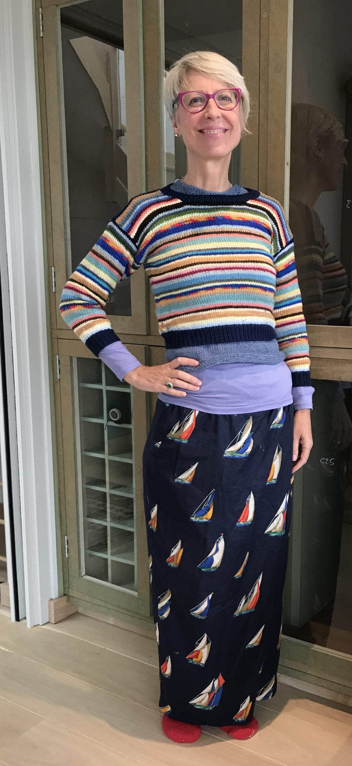
I am not sure I want to wear these colours and the yarn is not top quality. And I have now got alot of sweaters. And I bought it for Ted. But I quite fancy doing the job. What do you think?
And I forgot to mention that the cupboard behind me is Nick’s new cupboard in my sewing room. This is due to be painted soon. I will share some pictures in a week or two.
Vogue 1977 Late summer jacket – the pocket challenge
As you may remember I am making a linen jacket, based on this wonderful 1937 Chanel jacket, modeled here by Coco herself. I am using a 1990s Vogue pattern by Ungaro – Vogue 1977 – which is not a perfect match (the collar and darting in particular), but it works well enough.
Chanel was a woman who knew how to accessorise.
In the marvellous photos below, taken in her Paris apartment, Coco Chanel wears an interesting hair band. Her widow’s peak is emphasised as her hair is pulled back and decorated with a bowed, black satin ribbon. Her earrings are round and bold, floral, with a large pearl lighting up the middle. She wears more than one necklace – one that includes pearls, or maybe poppers; another is basically a chain with various attachments. The jacket is embellished with two brooch clips that look like little hands. On her wrists she wears bulky plastic (or maybe ivory) bangles, with a chain bracelet, and cigarette. But the nicest accessory of the lot is unobtrusive and really perfect. Have you spotted it?
It is the handkerchief she has popped into her top right hand jacket pocket. This detail is borrowed from menswear, but in this case is utterly feminine and beguiling. And it draws the eye to the tremendous pockets, which is what this jacket is all about. Despite their origins in work or military wear, on this jacket the four pockets are essentially decorative. The upper pair are slightly slanted upwards giving a sassy look.
I have been staring at these images for a few days now. Just like the Napoleon Six challenge I have been trying to interpret a look from a few photographs. Oh for a technical drawing, even if I can’t have the pattern!
I enjoy interpreting vintage or modern designer photographs, working out how the garment was made. While I have got a basic jacket constructed, the key element of this Coco jacket is the pockets – four patch pockets artfully placed and beautifully attached. They have an unusual, stand out quality to them and I assure you they are not easy to interpret.


The lower pockets are short and rather wide, wrapping around the side body, but standing proud and slightly open at the top. The effect is to create a little width at the hips, making the waist appear smaller. The upper pockets are widely spaced too, almost covering the breast and creeping under the arm. These pockets are soft, not interfaced, probably applied by hand. Pattern cutter Jay helpfully wrote:
I’m seeing the Chanel jacket as fairly unstructured. There’s shaping, but it doesn’t read as having the typical array of inner canvas pieces. My favourite features in it are the pockets (quite soft, bluffed on), the high buttoning with rounded revers and collar, and waist shaping…Bluffed on is just the way of stitching patch pockets from inside the pocket, but now I think about it Chanel probably hand sewed them on – either way without top stitching. Isn’t the top pocket interesting, both for position and shape?
I wish Jay was here to help me with this task, both the pattern cutting and the bluffing (lovely word). And thank you to Annie, and Elle and others who have given me pocket advice. I love the tip from Make it Anywhere – to make sure your pockets match stitch them both together with a basting stitch, turn and press. The pressing marks ensure that you have identical pockets!
Having got the jacket made to the extent of setting the sleeves in (but as yet unhemmed), no shoulder pads, unlined and unbuttoned, I auditioned several pockets.
Firstly I used pattern paper, running back and forth to consult the photos. I tried various sizes, depths, widths and angles. I pinned them on and gazed at my efforts. Eventually I made up pocket toiles in white cotton and pinned these in place. I then, second picture, tried on the jacket with the pinned pocket shapes (and my son’s swimming shorts…). At this stage I was feeling a bit exasperated, mainly because my jacket has a narrower front than the original. As you know my husband is a bit of an expert is wardrobe design! So I got him to consider the proportions and give me a second opinion. The original pockets were discussed at length. Nick even screen shot and magnified the photos and peered at them intently. At this point we admitted my jacket is rather different to Chanel’s – my buttoning is less high and I have two prominent darts in the front which I owe to Ungaro. So, inevitably, (like the colour) it is a compromise.


I have decided to have the lower pocket standing away from the jacket, lining it up with the grain of the jacket. Looking at my photograph above I think the pocket may need to be shallower. You can see the sleeves are rather long – deliberately so – I am hoping to unbutton them and fold them back to create the cuff similar to the one you see in the Chanel picture.
Jay and Annie both suggested bluffing my pockets on. This involves machine sewing them on from the inside – it is not a technique I had even heard of before. And while Annie suggests it is easier than it looks and sounds, I went with the hand stitched option. Although the stitches are obvious I like the effect. Now all I have to do is line the jacket and do the buttons/holes. I am thinking dark brown rather than black, and maybe getting some 1937 (or thereabouts) buttons.

I hope to be wearing this very soon!
How do you feel about colour or style advice?
There are some people who like feedback and information about their performance at work, or how they are doing as a parent. I am one of them – provided the feedback and critique is offered in a kind way. I feel I can learn a lot from how others see and perceive me. But many people – probably the majority – do not really appreciate a critique of their behaviour or appearance. Even a polite request to not talk loudly in the Quiet Carriage of the train, or to please prevent their children running around in an art exhibition, are treated as an unacceptable violation of our freedoms.
So any kind of feedback – at work, to family and friends and to strangers – needs to be very carefully posed. It can only really help us when it is aimed to help us, rather than put us down. But most especially in matters of style and dress I would always move with great caution. While I can’t help thinking certain things (inevitably having been trained as a colour and style analysis ), I have to be exceptionally careful not to offer gratuitous advice eg your hair colour is really too deep and has an aging effect. Some people really want a trained eye and a second opinion, but many people are perfectly happy with their image and style and I wouldn’t dream of challenging that. Ceci writes:
I always enjoy these color posts…..so fun to imagine starting over with the right colors! I suspect actually doing it would require some self discipline.
When I do a colour consultation I offer my client the information on what I believe is their best colour palette but I always try very hard to help them see for themselves the impact of my choices and opinions. As they look at themselves in the mirror most people can appreciate, with their own eyes, that some colours enhance their colouring and others do not. Usually they then wish to replicate this effect. The best (let’s not say “right” Ceci!) colours will take away shadows and make any lines and wrinkles less visible. They will calm a reddened complexion, brighten a sallow one, make your eyes look whiter and your skin tone fresher. This is not hyperbole – I have seen it hundreds of times and the best shades just make a person look younger and healthier.
Sometimes my advice conflicts with people’s personal opinion. I find this comes from three places.
- But I love mustard!
Firstly we all have a range of colours we like. I really love the terracotta, peach, light orange, ballet shoe pink shades. I also love strong, vibrant orange! But these warm, yellowy shades don’t suit me nearly as much as the bluer, purpley reds and pinks. If I try an orangey lipstick it really looks nasty, whereas even purple looks quite acceptable (although a bit much for everyday). I therefore avoid wearing coral, tan and orange but I find other ways to use them in my life. My logo at work for example is an energetic, youthful orange and I love it.


2. Half my wardrobe is navy!
The second reason why people reject certain advice is that they have got used to wearing a certain colour – for example black – even though it is not their best colour. Again I usually try to show the impact of black on their complexion. In short when we are doing colour analysis we are looking for naturally occurring colouring in the face/hair/eyes. Black hair is sometimes nearly black (or very dark brown) and people with this feature will generally look good in black and should consider it as their best (but not only) neutral. Usually they will look just as good in the darkest navy, charcoal and brown and sometimes choosing these shades is more exciting and stylish than black. But they will look sensational in black.
On the other hand a very fair or red-haired person will rarely look their best in black. But sometimes we want to wear black and why not?


Although I feel Nicole Kidman looks better in lighter shades, she also looks sensational in a black dress. Her darker make up (lipstick, blusher, eye shadow and mascara), worn with silver jewellery support the icy look she is cultivating and she absolutely gets away with it. However I think she looks even more wonderful in lighter colours. Actresses have personal stylists, make up professionals and hairdressers that help them change their look and image as they take on different roles. And models will be chosen for a range of reasons and sometimes they are paid to model clothes which markedly conflict with their natural colouring and the clothes works well in terms of impact.
3. I would never wear lemon!
But the third and most important one is we probably don’t want to be wrong. We don’t want to be told what to do. We may think this colour analysis stuff is like crystals or homeopathy – hocus pocus for the gullible.
In fact change of any sort involves loss, and generally calls forth resistance. This is why learning new things is hard and can be scary. We don’t necessarily want to change our opinion. This is why most of us struggle with criticism which is often perceived as an attack.
So when I give colour and style advice I always try to show how someone can suit say emerald-green rather than pea green, or ochre rather than lemon. All colours are available to all of us but there are usually better and less good versions. When I am showing people colours they often say – I never wear yellow, or I don’t think I have any pink in my wardrobe. And I usually reply – this shade of that colour suits you and maybe you could try it? When I first took advice on what colours suited me two were put forward as being “flattering” for my cool-light-bright direction – lemon and mauvey-pink. I had never worn either of these shades and didn’t instinctively gravitate to them. But I went into my local charity shop and pulled out a couple of second-hand t-shirts and blouses and, in exchange for a few quids, took them home to try. And now both these shades have a place in my wardrobe.
The issue I find often is that many people restrict their wardrobe to just a few colours they feel confident with. A colour analysis can open your eyes to new colours that you may not have considered before.


So back to Ceci’s point – I offer advice for those that want and welcome it – but only when asked or specifically commissioned. I trust the process I use, and my own eye, but at the end of the day the information is only what you want to make of it. Some people (me included) do this with conviction and never wear the less flattering colours again (I admit I have black underwear and a pair of trainers). Having a wardrobe full of cool palette items means everything coordinates and blends together nicely. No discipline needed. I do have one peach dress which I wear occasionally.
Others just change the emphasis a little, or gradually.
Late summer jacket; adapting Vogue 1977
When I decided to make a version of a 1937 Chanel jacket I covet, I chose a “modern” (1997) pattern as my starting point.
The best thing would have been to draft a pattern from scratch, using my personal blocks and working carefully to create all the design features I love in this jacket. Another idea would have been to start with a vintage pattern from the era and make changes to that. In the end I went for the 1997 Ungaro pattern. It is somewhat dated, of course, but it is a well drafted, old-fashioned, fairly classic, but relatively simple unlined jacket without lots of tailoring, padding or structure and I thought it had a “feel” of the original. By the 1990s the pattern companies were creating easy to construct items that were not yet fully dumbed down (as I feel a number of modern patterns are).


The punch line is I really, really enjoyed making this jacket. A nice straightforward pattern, clear instructions and a really quick process. They suggested using nylon knitted fusible interlining throughout, except for the sleeves. I didn’t do this. I only interfaced the collar and facings, and I am so glad I didn’t over structure the jacket. It is fairly firm anyway, as a result of using a meium weight inen fabric. The dying project adds body too (I have always found this – do you agree?). The collar (with a stand, an upper and lower collar with slightly different dimensions so that the seam is hidden perfectly) is nice. The cuff is well designed and straightforward while also requiring proper button holes. Just a great pattern.
Of course to get it to look more like Coco’s surgery was required.
- I reduced the length of the jacket by 3 inches to take away that 1990s look
- I recurved the hem to resemble the 1937 jacket
- I slimmed it down through the waist and torso by relying on the size 6 or 8 cutting lines (I mainly made up the size 10)
- The front bust darting on V1977 is rather distinctive – two long shaped darts and a little easing at the side seam. I thought about this for a while. Chanel has one short underbust dart in her jacket, but I left the darts in. I wanted to see how they came out. They get the bust fullness into exactly the right place – giving a blouse-like quality to the jacket.
- I redrew the button positions increasing from three to four and placing them, more or less, as on the Coco jacket
- I knew the sleeves would be too long for me, but left them as designed (regulation length!) so I could fold them back
- I didn’t cut out the collar or pockets initially as I knew I would want to toile them. To do this I use a firm cotton or calico and attach the piece with a basting stitch.
- When I toiled the original collar I just really liked it on me and felt the proportions were right. It isn’t that similar to Coco’s but I thought her slightly oversized collar (and very high break) might look a bit weird on me.

Toiling the collar
So in summary by retaining two of the original Ungaro features – front darts and collar – I have a hybrid look. But one I really liked. I may make a further jacket and change the collar and dart to make it even more similar to the inspiration picture. This would also give me a chance to produce a lighter pink jacket, or maybe white or light taupe/stone/grey instead.
The sewing instructions rely on flat felled seams throughout with decorative top stitching (nooo!). The armholes and various other seams are bound with bias binding. Vogue suggest covering the shoulder pads (mine are grey!) in the lining fabric and attaching them. I will be lining the jacket (I am sure Coco would have lined hers) with the pink viscose I dyed simultaneously dyed.
Once I have done the collar and sleeves I will have to tackle the patch pockets: Chanel has four whereas Ungaro has just two. I am not very good at patch pockets and always find the construction problematic. I will leave them until the whole jacket is made so I can get the size, shape and placement right. Then it will be a matter of adding the shoulder pads, lining and button holes. Give me a week.
Elizabeth Zimmerman yoked sweater knit along – the stunning results
I have been waiting, with a huge sense of excitement, to reveal the results of the knitalong.
First let’s start with Sue Stoney. Sue is a master knitter, and highly productive across a range of craft interests. I love her blog and her work. I met Sue in the flesh last year and she really is the kind of person you would love to have as a friend. Open, generous, funny and creative. A true artist and expert she created a pattern in the yoke (having quite enough colour in the sweater itself). I love how she got her sleeves to coordinate and the jumper is roomy enough to wear over other clothes for walks or camping. My only disappointment was that she didn’t pair this with her lime green flared cords (only joking – her grey skinnies are perfect!). All the details of her experience on her blog, of course, over in Perth, Australia.

Karen @super77karen is based in Scotland (I think), and is a very witty person. She chose a grey yarn, although she swears this is a departure from her usual colour, which is navy. “I am navy, with navy, accented with a spot of navy. I’m a bit colour clueless. Mostly I would like to look invisible, but a bit stylish”. While she shied away from doing the colourwork, she did consider a band of light grey at one point. She nevertheless created a really nice jumper. She says her’s is “the polar opposite of Sue Stoney’s ‘fabulous, joyful sweater'” (above). Karen isn’t quite sure she has finished yet, but wanted to be included in this post. She is thinking about the ribbing at the neck and if she should redo it (why? it looks fine to me!). She is planning to leave the cuff and hem unfinished, allowing a little roll. But she is not finally decided. I think this is a nice finish and want to try it myself at some point. She worked really hard on those underarm seams, providing five close up shots on her instagram account (she only has 18 posts overall). She said that the “current, underarm, fresh air arrangement is quite comfortable” and I think she has done brilliantly.

Now let me introduce you to Felicia. She is an intermediate knitter from Vancouver, Canada – very able but needing a little reassurance. I was so glad to be able to show her how to do an EZ “make one”. She also found a great solution to the neckline by increasing less than every other stitch on the final round. Well done Felicia. I know you are pleased with your jersey. I would be too. I really like the way the decreases become a simple but dramatic design feature. I also love the garter stitch finishes at neck, hem and cuff. She is already making progress on a second one!

Helene, who is also in Canada, is another expert knitter. She also sews wonderful clothes and has excellent taste. She is kind, generous and active on Instagram. Here is her lovely sweater. You can’t go wrong with the primary colours – red, yellow and blue – but the touch of toffee really gives an extra bit of interest. The moss or seed stitch and red edging also shows a woman very confident of her style. Lovely work!

The next one has never been seen before on the internet, but it is a beauty. Michelle writes “the interaction and involvement have been fun…it’s interesting to see people’s different interpretations – I’ve stuck fairly closely to the original”. I just love this sweet pink sweater which I know will be fun to wear with so many different skirts and trousers. I think Michelle’s colour scheme is great. She has used just two colours with her pink – a deeper red and white. The combination of deep, medium and light is always successful and she looks so pretty in this shade of pink with her gorgeous grey hair, don’t you think?


And one from me. It actually looks better with jeans than gym kit, but I love this. I am not sure about the neckline which doesn’t really work – the pattern is a little light for a hem finished edge, but I am leaving it like that for now and may go back to it. I have worn this jumper alot as it is both neutral and lively. Personally I love the strong teal, with the red and lemon – but I think the red needs to be more dominant and defined. Nevertheless it came out nice and I am enjoying it. I really like the strong line around the shoulders – reminiscent of all the off the shoulder and Bardot style tops that are in the shops at the moment, without the embarrassing slippage or bra strap reveal.

We have more sweaters in the works. I am looking forward to hearing from Giorgia, Maggie and Kerry. There will be a part two to this post. One or two lovely people are thinking about it – Kim, Helen, Nina, Shelagh, even Lois who gave me the idea of a knit along! If you would like to make something like this – really it is not difficult, everyone even beginners managed it, and it is fun to knit – here are the instructions.
Late summer jacket – getting to the right shade of pink
I am looking for a medium weight pure linen, in pink that is both very light in shade, and cool (blue undertones). For a summer jacket.
I have found lots of nice smokey pinks, shell pinks and bright pinks. And even a few good (for me) pinks in blouse weights. McCullough and Wallis has a heavy “jacket” linen in pink, and I dropped into examine it. It has a nice weight and I liked the colour, but it was too grey in reality. And, as Jenny suggested there is nice one at Merchant and Mills – third picture. I think this one might be a bit peachy – it’s always hard to tell on a screen, but my experience of linen tells me that the underlying yellowness will come through if the fabric is not first bleached. As ever, even when you make your own clothes it is a compromise – I found nice light greys and other neutrals, and a light jacket in taupe or stone would be very useful, but I still had a desire for pink.


So I considered getting the right weight in white and dying it.
Simply Fabrics of Brixton had some pure white heavy linen that I planned to buy. But when I got there I realised it was probably more suitable as a furnishing fabric. Luckily Leo located some lighter weight white linen, and a couple of metres of white viscose lining. As you probably know, because viscose is made from cotton it dyes in a similar way. I wanted to be able to dye the lining and fashion fabric together.
The next thing was to take advice from my friend and dye expert Marijana of Sew2Pro. Marijana often makes wonderful clothes in inexpensive plain cotton and then dyes the garment. Although I love the dying process I have only ever done it in a bucket or a sink – by hand. I have got fairly even, but not perfect, results. When hand dying I put the garment in the machine at the end and it does get rid of the remaining dye, and often evens it out. Marijana swears by the washing machine method. Have you ever tried it? I had of course wanted to, but my husband was against it, believing that some residue would remain and would ruin his shirts or whatever. And as dye stains permanently, and in its powdered state it is very concentrated, you can probably understand Nick’s anxieties.
In our conversation Marijana was very reassuring. She said that if it dyes your next load they give you your money back (£3.89??), “or a new washing machine or something”. And that she hadn’t believed it either, but that she had done it many times. So I ordered the dye, and the salt (which is just salt really), and washed my 4 metres of fabric to remove any finishes. I didn’t consult my husband I just did it!
You put the powder in the bottom of the washing machine drum, and cover it with the salt, then you put in the clean damp fabric. With the 4 metres I had more than the package suggested could be successfully dyed (one pair of trousers). It suggests if you are dying a duvet cover two packs are needed. I figured my two fabrics were about equal to one duvet cover but decided to risk it. I was after a light pink so I hoped this would work for me.


I glanced inside the machine while it was dying. (Observant readers will know what I was wearing that day!) It looked fairly pink. A fact that was confirmed when the fabric came out. I laid it, damp, on the floor and while the process was very successful – strong, non-streaky look – I think the colour is a bit deep. Even after drying off in the sunshine it is a shade or two deeper than I had planned. All the pinks in these photos are different, as is the light, and none of them is “true”. The viscose is a little deeper than the linen. Even though I wanted very light pink, I much prefer these to the yellowy Merchant and Mills, and the muted MacCulloch and Wallis.


I now have two options. Procure or produce some lighter pink linen (I am sure the lining would be OK) or use this medium pink – which is a colour I like very much. But it may be a bit too pink and girly for a work jacket. Although men do still wear pink shirts sometimes they seem to be out of fashion at the moment. If I used half a packet on the same amount of fabric I might get the colour I want. But it takes all day and four cycles on your machine – washing the fabric, dying the fabric, washing out the dye and washing out the washing machine. Then drying and pressing the fabric. As I haven’t toiled the jacket I might just go for it and see what happens. Sometimes I spend so much time trying for just the exact right shape, colour, design etc and then end up disappointed in some way.
Have you ever tried to get a colour you want by dyeing?
Andrew Wyeth, his New Zealand sweater and my efforts
This story starts with Andrew Wyeth one of the most famous American artists who died a few years ago. His most well known 1948 painting – Christina’s world – depicts his disabled neighbour crawling towards a house. It’s an extremely well know picture and I admit to liking his work which has a brilliant, restrained sparseness to it as well as being incredibly realistic.

Now I had also seen a few photographs of one of America’s best loved artists in his wonderful Shaker style home, and in many of these pictures he is wearing what look very much like hand knitted sweaters. His personal style seems to be somewhat Beatnik with narrow trousers, with a tunic length jersey over a closer fitting polo neck.


Anyway you may want to know more about him!
Helga, above, was also a subject, clothed and unclothed, in dozens of his paintings. One of my favourites is of her is wearing a brown polo neck jumper. It looks well worn and comfortable. Her hair looks a bit greasy and plaited for convenience rather than looks. Her face, in repose, is sensitive and reflective. I love her colouring. Don’t you find this a stunning portrait? So soft and restrained. Every hair and line of her face individually rendered. And the construction of her jersey – the knitting, the neckline and shoulder seams – is so accurately recorded you feel this man knew something about knitting.

So to get to the punch line.
I was rather taken with this 1996 photograph of Andrew Wyeth by Harry Benson “wearing one of several New Zealand sweaters knitted by his wife Betsy”.

It is a wonderful pattern and looks great on Wyeth.
Zimmermann’s book Knit One Knit All describes how to make it. Some of the photographs are a bit fuddy but this is a jersey with enormous potential. The knee length version includes a Guernsey motif on the body and sleeve, and was knitted by Mrs Wyeth.


I pounced on the pattern as it did something I had been imagining – knitting a jersey in stocking stitch in the round, then separating for the armholes and continuing in garter stitch so that purl stitches could be avoided. And of course Elizabeth had already invented this jersey but with a wonderful detail. Inspired by the Rangitoto volcano of New Zealand, she decreases the front and back down to a single stitch. For front and back we then pick up stitches along the gently sloping edge and knit back and forth in garter stitch, using short rows to make the jumper fit well around the neck both back and front. The neckline is very nice.

I really like this jersey, which has lots of possibilities. I think a sleeveless version might be nice. Or even a short sleeve version. In the end I just knitted it up, more or less as described, in my bargain cashmere/merino wool from Colourmart. I finished it last weekend and wore it for work – and I love it. But I want to play with the basic pattern a bit. My yoke is much more modest that EZs, and my short rows are not done very professionally so there is an inadvertent lacey look. It has gussets which I don’t really approve of. So there will be another one.


Next time I will make the sweater a bit closer fitting so the front column is neater with lesser overhang on the dropped shoulders. I think this DK yarn is better with 4.5 mms needles rather than the 5 mms I used. I like the sleeveless look. Maybe a version with shorter sleeves. I am going to play with this pattern a bit and try a couple more versions. It has the wonderful clever design that I so enjoy. I am wondering if any of the men in my life want a blue, cashmere version.
You must be logged in to post a comment.