

Uniform dressing update
I was going to wait until the end of November to update you on the Uniform project. The thing is I started early (I couldn’t wait!!) and I have some results ready to share with you.
Did I enjoy it? Was it liberating or boring? How did the navy corduroy suit fare?
First things first. The navy corduroy suit was a RTW item, bought on-line without trying on. It arrived a day or two after I ordered it, and I put it on immediately and wore it all day long.
The next day I made a few alterations
- 5cms removed at CB waist, and tapered through to the hip line
- added an extra belt carrier as just three is not the right number
- reattached the buttons on the button fly (why?) as they were not sewn on effectively
- moved the buttons on the cuffs to get a closer fit around the wrists
- I considered changing the buttons on the front of the jacket and trousers, but they were quite nice IRL. If I get bored with the suit I may change the buttons.
I wore the suit everyday. Trousers and jacket. And of course I took the jacket off sometimes as it was pretty warm – either outside or in a heated office. So mainly it just looked like dark trousers. I do know lots of women who wear black trousers nearly every day, so this was not that unusual. And of course many men have a navy suit and maybe a grey suit and they get away with wearing just a few items day in, day out. So what I did was not that different from how many people dress.
I enjoyed it very much indeed. I especially liked putting the suit over a chair at night and putting it on again the next morning. This was the best bit, in many ways. It felt completely stress free. I knew the outfit would work whatever I was doing. It is like a Babygro – complete, in and of itself. Of course it needed a top, and shoes etc. But it solved the what to wear problem completely and effectively. I am not sure anyone noticed I was wearing the same thing. If they did, they didn’t comment. Well one colleague did – he said “Why are you dressing like an architect?”. I think it was a complement in that he noticed the graphic, structural, pared down look of my outfit. But when I started to explain the Uniform Project he glazed over straight away. “Too much information?” I asked and he burst out laughing. The net effect of the uniform project for me was that it, sort of, took clothes out of the equation. Of course positives and negatives, but overall i liked the reduction in noise, variety, change, thought. The Obama quote is appropriate:
“You’ll see I wear only gray or blue suits. I’m trying to pare down decisions. I don’t want to make decisions about what I’m eating or wearing. Because I have too many other decisions to make.”
I don’t want to compare myself to a President, but I think I devised this project to help me deal with work overload. I am carrying a great deal of stress at the moment and this has impacted on my productivity outside work. Many evenings I am reading a book, watching Netflix or listening to a podcast – usually but not always with a knitting project. There are times when you want to lower the pressure on yourself, and if you find yourself in this position adopting uniform dressing may be a good plan. Given the level of my job I couldn’t just adopt “weekend dressing” ie jeans, T, jumper. But this outfit allowed me the comfort and ease of weekend dressing while still appearing relatively sharp.
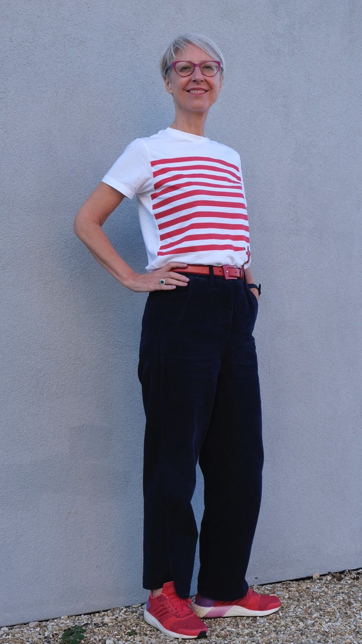
Lots of followers and IG friends have asked for a day-to-day account of how I styled the suit. I have a few photos below to show the sort of things I did. These were taken at the weekend with some of the tops I wear for work. These pictures to some extent expressed by intention to boost the suit for a stylish outcome. And I did wear versions of these looks for work.


Here is another group


I hope these images show the kind of versatility of a plain, neutral trouser suit.
However I despite the notion that maybe I would have some fun with the suit, subverting it by “pimping up” the outfit, I actually had little inclination to depart from the obvious. What I thought most days was “can I wear yesterday’s jumper again?” And most days I wore plain navy socks and shoes as well.
The first few days I wore colourful belts. Then I cracked it. Fascinated by uniforms as such, I reached for an ancient Girl Guide belt in traditional brown leather, and an interesting clasp. I tried this on with my trousers, the hooks hanging down over the pockets, begging to carry something for me. Originally I think I had a pencil, whistle, compass and literally a thing for getting stones out of horses hooves. I have just left them empty at the moment but they could carry my headphones, my house keys or even a small camera. My husband says I have become an eccentric. I am beginning to think he’s right. Maybe I have always been one. But I am a happy eccentric.

Still life photography
Still life experiments
When I made my book I wanted lots of photographs of people, to illustrate its central message of dressing for your colouring. That meant I had to learn the basics of portrait photography and I was pleased with some of the images I managed to produce. As I discussed before I found getting a good background was helpful and around Kings Cross we have some bill boards in strong colours – just perfect to ask someone to stand in front of. With the background resolved I could work on getting my models to relax and be themselves.


To date I have found taking interesting action pictures of moving objects or people (the dancers of Stroud) pretty much impossible and to be honest arranging objects prettily (“styling”) and in such a way that I could reveal all the elements at once proved a lot harder than it looks. So given the chance to learn from Irving Penn I went to Waitrose and bought some interesting fruit and vegetables.
Colour
One of the things I love about fruit and vegetables is of course their colour. Nature has such an amazing array of shades and all of the colours below make me feel happy – those purples are gorgeous and the bluish pinks and reds of the mango just thrill me to bits. I love the unusual yellow carrots, the green chilli and basil, the lemon with a green “blemish” and the bulbous orange pumpkin. And together, on a black background I just loved the simple “flat lay” composition.

Shape
My next photograph focused on shape. Using a piece of turquoise children’s drawing pad I lined up ovoid shapes from a tiny quail egg to the large mango. They kept rolling together and I found it hard to keep them in the right place in this somewhat regimented arrangement. You can see the shadows creating a wave movement from left to right.

Texture
For Vogue Penn combined some photographs of food with jewellery. So I tried that with some textured vegetables – gorgeous cavolo nero (eaten with linguine slightly later), a nobly lemon, the pumpkin and some ornamental gourds with my best ring.

I also bought some colourful carrots (which were later turned into light pickles), using dark blue sugar paper to contrast nicely with the orange.

Finally I made the photograph that I could submit for my project. I took many versions of this picture, using black backgrounds at first for more drama. It took a few days so the loaves changed. This still life food photography can get in the way of eating, but it also provides recipes, inspiration and needs consuming!
First Irving Penn’s photograph. Then mine. I had the advantage of a prettier loaf, and of course my salt is in a pot, but I think I got the essence of the photograph.


And I thought you might like to see an out take while we tested the light, the settings etc! (you know what happened next, don’t you?)

Uniform dressing – November challenge
There has been an ongoing discussion in magazines and the press about the idea of “uniform dressing”, especially for women. After all men have a uniform, especially for work. That would be the navy or grey suit, worn with a white or blue shirt, black or brown shoes, a belt and sometimes a tie. While women, traditionally in the west, have been the ones allowed far greater latitude in style and colour.
I have written about school uniform before, and I do find the idea of limitation, uniformity and formula very interesting. In this blog and in my book I have discussed the idea of the capsule wardrobe – a limited number of clothes that all get worn because they are interchangeable and work for all occasions. I am not very keen on “occasion(al) clothes” which fill the racks in our large stores because I think they can be uncomfortable and lack authenticity. If you are lucky enough to go to a wedding or the races or an important event I always think it is better to make or buy something that reflects your core look, rather than something that conforms to an expectation.

The appeal of uniform
- A “signature style” that people associate with you
- An opportunity to downsize your wardrobe
- Ease of putting a look together
- greater opportunity to wear your accessories
- Finding an outfit that really works for your lifestyle
- Knowing you will be comfortable in it every day, what ever happens
- Lower bills on clothes and laundry
I have been thinking about this for a long time, especially since I discovered this, the story of a woman who wore one dress for a year. She was trying to make a point about sustainable fashion and I was very interested in the concept.
Uniform dressing appeals to me partly because I am getting a bit tired of thinking about clothes.
It’s ironic, isn’t it? I find fashion fascinating as a phenomenon. I love looking at styles, and fabrics, textiles and catwalk collections. I have always had a love of clothes and making them. I still do to some extent, but as I noted previously I have this “peak stuff” feeling now. I live in the West, I have a well paid job and a comfortable existence and I have enough of everything I need. I feel I dress well, always appropriately, often with verve and style, authentically and comfortably. I just look at what I have and feel overwhelmed and dissatisfied with the space it takes up and the weight I feel I am carrying. The Kondo approach spoke to me and while I am not Gandhi or a Buddhist monk with very few possessions I would like to go in that direction.

Right now I am just tired of the constant need to change and spend.
I am not especially green or virtuous, but I am sickened by consumerism. I don’t want people ramming things down my throat – new must have “to die for” items. I don’t want to “invest” in clothes (which implies spending lots of money). I just want to be happy in my skin and my second skin (outfit) and move in society in a way that pleases me and others but doesn’t have to showy or ostentatious or new, new, new.
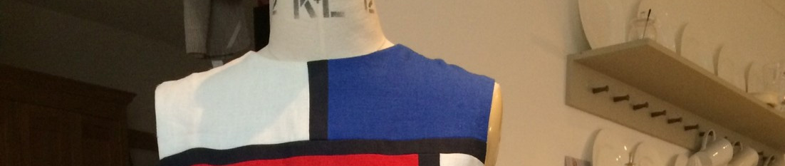
So I am going to give uniform dressing a go. Uniform dressing is close to the capsule wardrobe idea, but avant guardedly minimalist. I am going to buy something as the mainstay as it is not a titilating make. My basic item will be a trouser suit in navy corduroy. I know I could easily make this outfit. The trousers are very similar to my basic trouser block (Winifred Aldrich), and the jacket is really an adapted shirt. It is made from soft cotton corduroy (in Bulgaria), lined with cotton/viscose lining, has slightly interesting buttons, lots of pockets a simple collar and cuffs. It has relaxed, boxy style that is classic but relatively up to date. It comes from Finery, which has a 40% sale on at the moment.
I plan to wear this trouser suit for a month (week days only; at weekends I will wear jeans and hand knitted sweaters as per usual).
I guess the main downside of uniform dressing is that it is boring. If that is how it is for me I may wear one of the two items and bring in a fresh skirt or jacket, but at the moment I will try to stick to the one outfit for the whole of November.
Most of my tops will go with this trouser suit as navy is one of my favourite neutrals. I can wear navy trainers, but also any of my other shoes if I want to jazz it up. I expect the November weather to be cool and maybe wet but it is unlikely to be too warm to wear this.
I will report back when I have done my challenge.
Does uniform dressing appeal to you? Or do you think it is pointless and boring?
Irving Penn – fashion photographer
This week, in Photography 2, we are required to learn about a famous photographer. I chose Irving Penn (1917-2009), one of the world’s best fashion photographers. The image below is of Lisa Fonssagrives, a super model of her day. Born in Sweden and trained as a dancer, she had a real understanding of how to pose to show off her costumes and form. Penn liked taking her picture so much he married her, in London, in 1950.
It’s an interesting picture. Penn pioneered taking pictures of models where the main thing was the garment, not the background or props, as was the norm at the time. By showing the backdrop he is also taking away the artifice and giving us a little jolt. The model is not going out to a dance, she is standing on mottled paper, in a studio in Paris, barely lit (if at all) with flash or lights. “We don’t call them shoots here,” Penn told journalist Jay Fielden in 2009. “We don’t shoot people. It’s really a love affair.”

I chose to research Irving Penn, known most famously, as the supplier of covers for Vogue. He did 165 covers, more than any other photographer, over 66 years! An incredible achievement.

He took pictures of models, fashion, flowers, famous people’s portraits, studies of working men, shots of Mexicans, travel photographs, advertisements (Clinique and Issey Miayke); and he was also an artist and painter.
Have a look at his portraits. He apparently spent several hours with each person, until they stopped posing and became themselves again.
“Sensitive people faced with the prospect of a camera portrait put on a face they think is one they would like to show the world. Very often what lies behind the facade is rare and more wonderful than the subject knows or dares to believe” (1975).
For my project I decided to focus on his still life – an area that I struggled with when I took pictures for my own book. He said that “photographing a cake can be art”. He produced a book of his still life photographs but it is rather expensive. Instead I created a Pinterest page. Many of his images are funny – they make you think. The glorious photographs of food – abundance stacked on a table, or the ingredients of a dish such as mozzarella and tomato salad, or salad dressing – recall 17th century art. By taking the components of traditional still life paintings – such as skulls, fish, jugs and bountiful fare – he also subverts them and makes us do a double take. As he says:
“A good photograph is one that communicates a fact, touches the heart, and leaves the viewer a changed person for having seen it; it is one word, effective”.
He turns cigarette butts into art so that we notice their frail paper wrappings, their subtle brands, the impact of lipstick and spittle, the grinding down of the burnt tobacco – we look in a new way at something that was previously categorised as rubbish. His photograph Aphrodisiacs features an oyster (naturally rich in Zinc), an erectile dysfunction drug capsule, a Spanish fly and of course money. It’s funny, tells a story and is of course perfectly composed and shot.

As an artist he also had a great interest in print making, investigating 19th century methods to provide greater control and using platinum and palladium metals rather than the cheaper silver as a key ingredient to get the most luminescent images. He spent hours creating hand-sensitised artist’s paper (stuck to aluminium sheets so it could withstand several coats and prints), and in the dark room perfecting his technique rather than seeking the limelight himself.
He preferred to take photographs in the studio where we could control the environment, and reduce the background noise. His composition, somewhat novel at the time, focused in on the object, stripped of its context. When working on the couture collections for Vogue, he used a daylight studio with an old theatre curtain as a backdrop. On his many trips abroad for Vogue he focused on making portraits of the people he encountered in natural light. He would use contained spaces like garages or barns to create a makeshift studio, a neutral space, so that the subject would come to the fore. This is how he worked to overcome the cultural barriers between – for example Mexican farm workers or Japanese Samurai.

Penn died in New York, in 2009, at the age of 92. In his later years he tidied up his collection, saving the very best prints which he made into books. He also set up The Irving Penn Foundation to preserve the photographs and his legacy.
Next week I will show you the still life photographs that I submitted for my homework.
How to make the Skirt of Joy
As summer ended I wanted a bright little skirt to bring joy to me, the wearer, and the viewer.
Back in Spring 2014 Chanel had included a beautiful fabric, based on colour charts from 1900.


One of my favourite bloggers Karen from Fifty Dresses found a textile that is very similar to this, and made a stunning dress.
So these ideas were in my mind as I looked a small piece of white denim I had been given by a vendor who was unable to fulfil my order. So this skirt was virtually free!
I used a very basic A line skirt pattern. It is McCalls 7938, a 1960s Courreges pattern. I made up the coat from this pattern as part of SWAP but I didn’t like it. Sarah has written a wonderful post about his designs.

I cut out a size 10, used a washable felt tip to draw in the four darts and set the two pieces next to each other so I could more or less get the design to match up. I could have taken a little more time and drawn some horizontal lines across the skirt to ensure it lined up. No matter – it was a quick project. You can see the centre front in turquoise felt tip. And my bare legs…

I started at the bottom with the greens, gradually adding white or blue to change it subtly. Then I did the pinks and reds, and so on. I chose colours I like to wear – the cool bright shades. Most colours look good on white or black. I included some neutrals too – greys, taupe and blue grey. As a result this skirt will go with all my tops. Then I put in a zip and that was it. The facing, hem and seam allowance are all left white so there is never a show through problem.
Easy peasy, lemon squeezy.
For those that want more information the paints I use are Permaset. They are water soluble, and then are fast when fixed with a hot iron. The colours mix well. On a hot day I wore the skirt with one of my table cloth huipils.

Now it is colder I have worn it with a jumper – my Autumn League pullover.

And with a Uniqlo down jacket.

Cultural Appropriation in fashion
There has been quite a row for a few weeks now on Cultural Appropriation. Most notably here in the UK when popular chef Jamie Oliver called a rice dish Jerk Rice, and was criticised by Dawn Butler an MP of Jamaican heritage. Now as anyone knows Jerk is usually chicken, or other meat, cooked by Jamaicans at home and often served with rice (and peas). It is spicy and, if you are lucky, it is tender, tasty and perfectly seasoned. I have made it myself, having been shown how by several friends over the years. While I like it my favourite Jamaican dish is curried goat – this wonderful, delectable meal was laid on by my daughter’s mother in law Faye at Ted’s Christening party. For my mother (then 84) it was a first taste, and she loved it.


Oliver was criticised for “cashing in” on someone else’s cultural heritage and also getting it wrong – “jerk rice”??! I remember a Peter Kay sketch where an old working class English man says “garlic bread”??! The first time you put two unlikely ingredients together it can sound a bit like a joke (egg and bacon ice cream for example).
Of course in one respect people were amused by the charge. Surely we all take from other cultures when we are cooking or eating. Tea (like many things), for example, does not grow in the UK but it is now regarded as a British staple. We appropriated it from the Chinese in the 17th century. As well as our menu (which might have otherwise been barley, potato and bacon stew three times a day), our language has been brought in from elsewhere. Without the Germans, the French and the Italians our language would be quite different, and certainly we have the benefit of so many words, and so many varieties of meaning, that we owe to settlers, travellers and invaders. Only the other day I found myself using bungalow, guru, karma and yoga in normal conversation – what a delight these words are. Many of you will know they are of Hindi origin, learnt and appropriated by the British when they ruled India. See this nice article.
And then of course we need to consider clothes – starting with the Indian origins of pyjamas, dungarees, bandana, cummerbund, and of course khaki Jodhpurs. French words like pret a porter, a la mode and haute couture are almost everyday, especially when admiring your chic, petite silhouette. Not just language of course but clothing and style. Baseball caps were never worn in the UK when I was growing up – we didn’t have baseball – but now we have the hats without the sport. While complete outfits rarely translate elements seep in – Nehru collars, kimono sleeves, harem pants, French knickers – and so on. In recent years “African prints” – what my friends of Nigerian origin call Ankara – have been widely used by white girls. I have a special Kente scarf, woven in Ghana, that I wear in London. I have been stopped several times by delighted Ghanaians who recognise their fabric and are pleased to see it paired with a very British, purple woollen, winter coat. I thought this yellow jacket which our Prime Minister wore in Nigeria, designed by 27 year old Nigerian designer Emmanuel Okoro, head of EmmyKasbit, was wonderful. (I cannot say that about her dancing, but no one is perfect). I love those military uniforms too, don’t you?

In the British Isles we of course have lots of cultural heritage of our own – the Kilt of course is Scottish. Tartan is very popular the world over. English country clothing is very much in evidence in the country – Wellington boots, waxed or tweed jackets, flat caps, brogue shoes, corduroy, checked shirts, headscarves, lots of greens, browns and sludgy shades. Wales has its fabrics – and styles of dress. There was an English lace, silk and leather industry – all producing beautiful items associated with traditional (and more modern) designs. Like all designers I plunder my own history and culture all the time, as well as seeking inspiration from elsewhere. All creativity is to some extent an act of appropriation – you “take” inspiration from whatever is around you, from your travels, from your peers, from seeing films or photographs, from music, from books etc. Clearly all this is not only OK, but absolutely essential.
So what about the issue of people taking something from rare or endangered cultures and making money from them? Here are a few examples that created anxiety or uproar: Sikh turbans at Gucci, native American headdresses at Chanel, sacred Inuit motifs by Kokon to Zai, Cara Delevingne wearing corn rows.
Of course it is perfectly understandable that Sikhs find the use of their style of turban as a fashion item disturbing or offensive. Seeing a non-Sikh in a turban has a jarring and slightly shocking effect and this is what fashion often aspires to achieve. Something with religious or sacred meaning is often protected by believers, although the widespread use of crucifixes is tolerated by the Christian church as generally harmless – but then they probably feel secure and protected in most Western settings. Context is everything. The British were the first and most successful imperialists – dominating, appropriating (stealing), desecrating, enslaving, annexing, and extracting. Is it surprising that people whose families and Peoples were turned into commodities occasionally take offence?
Oppressed and marginalised groups can often feel angry by their culture being taken and commercialised. Unlike the big companies they don’t have trademarks or intellectual property lawyers to protect their culture and creativity.
I understand why Dawn got cross and I welcome the discussion. But as people who make our own wardrobes, without commercial considerations, let’s not get paranoid. Seek inspiration everywhere – Russian military wear, Chinese New Year, Arctic fishermen, American sports, Mexican colour palettes, Indian bandanas, French fishermen, Inuit anoraks, cooks trousers, sports wear, 1960s Italian films, Beethoven and Welsh dancers. Whatever you see or love is something to be inspired by. take it and to make it your own. As an artist or a designer we need to push our own creativity and style. But always do it respectfully with a learning attitude and a sense of fun.

Here is a useful article from The Week.
What do you think?
English (and Welsh) country dancing
Back to school for Photography 2
Last week we had to produce six photos, so I looked up local events. I found the Stroud Folk Festival was scheduled. We had actually been along the previous year and I knew it would be a good opportunity to take colourful, lively photographs.
A few things you need to know first.
- Clog dancing is great fun. Working people throughout the UK used to wear clogs to work. These were wooden soled leather shoes that enabled the wearer to walk though wet and dirty conditions without getting water logged shoes. Although associated with the Lancashire cotton mills, where I am from, they were equally popular in different industries and areas.
- Morris Dancing is a particular type of English country dancing, dating back to about 1450. There are many versions but what we watched included Cotswold style, Border Morris, and Welsh Morris dancing. And there is a Lancashire version too.
- There is a local tradition of “black face” Morris Dancing. This has proved controversial – see this comprehensive Wikipedia entry.
Clog dancing
Contemporary clogging is fun to watch – not dissimilar from tap dancing – and if you get the chance do participate do give it a go.

The Welsh version is somewhat different. Mererid, who is only 14 and also accompanied the Welsh dancers on the fiddle, was very impressive and accomplished.

Morris Dancing


The Musicians were very talented and energetic – supported in this case by a man in sheep’s clothing. As you know the Cotswolds is wool country, and this group were the local Stroud team, supporting the ladies in their red, white and green outfits.
Gwerinwyr Gwent
Perhaps the most interesting group for me were the Welsh dancers. Their beautifully made outfits in Welsh flannel were handmade to fit and I loved all the details down to the brooches they wore to close their scarves.


Blackface
The modern blackface dancers have adapted to worries that this old tradition may be misunderstood. Nowadays they have introduced more colour and more modern approaches.


Finally
Some outtakes.
Nick and I practiced at home first, trying to understand how to set the camera to capture the movement of the dance and get good, in-focus shots of the group. Here I am prancing around with some tray cloths. Although I look quite serious we laughed our socks off. And then we were ready to drive to Stroud, find a good parking place, and get cracking. Unfortunately it rained all day. We managed to find a great shop that made Falafel sandwiches with five balls in them.


Stroud is a nice Cotswold town even when there is no folk festival to enjoy. They have a Farmers’ Market every Saturday and some nice antique and charity shops. Towards the end a dear dog, wet from the down pours, seemed to enjoy the spectacle.

Colour analysis – what is your main colour direction?
What is this all about?
When we do a colour analysis we try to put everyone into one main category of colours Deep, Light, Cool, Warm, Bright or Muted. Most people will suit one better than others, although usually they have a secondary colour direction too. If we can help you identify which one (or two) palettes is most complementary for you – given your hair, eye and skin colouring – it an make it easier to choose outfits or fabrics that enhance and work with your natural colouring.

When I had my book launch my friend Giorgia did quick colour analysis for our guests, which was much appreciated and enjoyed. At the time I thought – how could you give people a very quick idea, of what the palettes look like against their face. So I got some cheap canvases and painted with specific palettes.
Well these are my paintings, some of them inspired by 20th century artists (can you guess who was in my mind?). Each one is painted in a colour direction.


Traditional colour analysis uses what they call “corporate drapes”. This allows the consultant to show someone how they look in the chosen colour direction at one go. I don’t have a set, but they look something like this.

Mixed drape for quick colour consultationsTo my mind there is something very bizarre about draping the client in a multi-coloured cape. I couldn’t do it. I think the capes look like a rainbow skirt, or something you might put on for a new age dance festival. So although I did think of sewing my own version, I tried something completely different. I decided to use a painted surface to give an idea of a colour palette.
Like the “corporate drapes” they have a limitation, but they do give a rough and ready feel, and maybe they would help a client get an idea of what colours they are attracted to, which is often related to what suits them (but not always). I know Nick always says he likes natural colours – by which he means softer shades. So no surprise that he suits the muted palette best. On the other hand I am attracted to bright shades, and while bright is my secondary direction my main cool palette is bright and I rarely wear muted shades, although I do love my neutrals.


If you look carefully you maybe able to see my colour coordinated slippers. I made several pairs of these in various colours to give to my helpers on book launch night.
Recently my friend Lyn Bromley asked her colleagues (what is the collective name for colour consultants? – “a rainbow” perhaps) – what was their favourite palette. I said mine was warm even though I don’t look good in warm colours. I think I am just contrary and always want what I cannot have. I always wanted curly hair too. Of course the cool colours are really my best colours.


As a painting I like the muted one the best. These are the colours we have mainly used for decorating. They are so easy to spend time with and are useful in creating a calm interior.
Which colour direction do you like the best? On you? Or in your home?
Over the next few weeks I will share more of the themes from my book launch event – Nigerian head ties, origami, making slime and make up.
Autumn League pullover
I love everything about this jumper. Choosing it, knitting it, thinking about it, washing it, and of course wearing it. The Autumn League sweater, details here.
Yarn
The turquoise yarn I used is splendid. It was a special offer from Colourmart yarns – a “heavy” double knit merino yarn available in just one colour. I chose it because I love turquoise blue. Although at first I knit it on needless that squashed the yarn, I finally realised and changed my ways. With a fairly chunky 5mm needle it came out perfectly, with a 4 or 4.5mm needle for the ribbing.
It has heft and weight and has a kind of elasticity and drape that is solid and wearable and perfect for this coolish but still pleasant weather. I have worn it with one or two layers of Uniqlo long sleeved T and I feel comfortable and cosy without being hot and bothered.
The pattern
I was unfamiliar with the top down/seamed knitting approach but it was a nice change from the Elizabeth Zimmermann bottom up/unseamed knitting that I had been practising. A change is always as good as a rest I find, and I love learning new things.
I was a bit surprised by the idea of knitting the jumper as a big cross, as it were, with just the yoke constructed in the round, and then only after the back and forth for the built up back neck had been completed. I don’t really enjoy stitching knitting together, especially as by then I had completely run out of wool. In fact the long tails, evident in the photo below, were all carefully incised, knotted together and used to finish the front half of the neck band. I had to use some beige wool to complete the inside, as it is a folded over neckband.

The instructions are well written I think – all the problems I had first time round were of my own making. But I ripped and re-knitted, and I am happy with the outcome. I can see there is still a loose end – now fixed – but of course this gives a semblance of authenticity. I washed it with a cold wash in the machine, and it all evened out nicely.

Most of the feedback I had to my first post suggested I should have knit the body in the round, but do the sleeves back and forth and then seam, as promoted by Karen Templer. So I decided to have another go.
Autumn League, version two
This time I used a very nice cotton/cashmere yarn, again from Colourmart, in a “dirty white” – a very light, bluish grey. The Two Wands pattern is knitted in a grey cotton (see top photograph) so I guess that was the idea in my mind.

Alterations
Second time around I wanted to do as many of you suggested, and that was to knit the body in the round, but leave the sleeves to be seamed at the end. I did one pearl stitch at the side “seam” which is a nice effect. This time the finishing was fairly quick.
The main amendment I made to the pattern was to divide for the sleeves much sooner, at about 6″ rather than 10″, which meant that both body and sleeves were slightly narrower than the blue version. Knowing full well what sort of stitch numbers I used for my Zimmermann (DK) sweaters I knew I could get away with a body circumference of 180 stitches and sleeves that went from 60 stitches to 40. And so it came to pass.
The other idea I want to mention is the use of traditional needles for the initial part of making the sweater (before it is joined up to knit in the round), and for the sleeves. Using long solid needles rather than circulars (if you happen to have the right size) means the knitting is much quicker and easier. I find doing purl especially fast with long needles, tucked under the arm exactly as my Mum taught me about 50 years ago.
Final tip is making the folded over neckband. The designer’s advice is to bind off, then sew down. Using a Zimmermann technique i sew the live stitches down as it provides a flatter seam. Take a piece of thinner yarn, in a contrast colour, and using a blunt needle transfer all the stitches on to it, removing the circular needles. Now fold the neckband in, matching the stitches so that the collar is evenly distributed. Pin and then using a long tail from the knitting loop into the last stitch and stitch down every stitch. This time I left the contrasting yarn in, as it created a nice contrast inside.


Design-wise my grey version is less “boxy” than the turquoise one, especially as I made the body longer. I haven’t yet soaked/washed this one so things might change, but this photograph gives an idea.

I am planning a third Autumn League, this time in pink merino.
And finally I must share one more photograph, this time from Helen of Cut it out and stitch it up.
Helen is a very good knitter (designer and seamstress too) and has done a few EZ sweaters which you can see on her blog. She was mildly embarrassed about arriving late to the striped raglan party, but who cares? She looks amazing. Big round of applause Helen, and thank you so much for joining in.

Finally Finished Frida-ing
This week Kathy S from Illinois visited London with her daughter in law and we were able to meet up for a visit to the V&A Frida Kahlo exhibition. It was a treat for me to go again. Following my first round up of the Dress like Frida sewalong even more friends have come back with their wonderful outfits.
First I want to share some photos from Barbara who is based in Port Stephens, Australia. This whole outfit is full of joyousness – the flowers (from an old T-shirt that she stuffed and attached to a hairband) and the strong red/yellow/blue colourway in her half circle skirt, enhanced by the black backgrounds is very Frida. She also made her own sandals. Well done – this is such a happy look.

And then there is Lara, who didn’t manage a skirt or trousers, but found a suitable monkey, which is far more important. He’s a lovely sock monkey too. I must make one of these with some sensational socks.

Next up is (another) Barbara from Vancouver in Canada. She is coming to London to see the exhibition and I am hoping to meet up with her next month. What a marvellous top in a Frida print. Love the way you have Frida centre stage there, looking thoughtful in a garden of Fridas. Nice pockets and coordinating skirt, and tremendous jewellery. Very artistic and beautifully executed Barbara – in your bamboo bower.

Lauren Harris of @selassew made the next gorgeous outfit. She used a Liberty floral and a Style Arc pattern, and the Japanese rectangle skirt from Studio Faro. I love this skirt, and funnily enough always envisaged the folds at the back! But why not at the front. And I love yellow and turquoise together – so bright and cheery. Well done Lauren.


And I am honoured to have Lisa (@sew_what73) and Judith Rosalind (@Judithrosalind), founder of @sewover50 in the collection. They both managed just a huipil, but aren’t they both gorgeous? Lisa included a lovely Indian block print and some jazzy home-made bias binding, and exhibited her top on a bright hanger next to a gorgeous turquoise door. And Judith’s huipil is made from beatiful old French nightdresses. The embroidery and basic shape is preserved through the clever reconstruction. I love the loose, classic look of this top. Like all the participants they took to the challenge and recycled, or used interesting off cuts, and made a garment that was absolutely in the spirit of Frida.


And finally I got some portraits of me.

For me the final Frida Portrait had to have an interesting background that reveals something about me.
I chose a portrait on me when I was about 22 and living in Manchester. It was painted by a man called Paul Smith, who was an art student at the time. He started with a pencil drawing, then used wax crayons for the second version, finally moving to oils for the third portrait. He gave all three to me. I have lost the earlier two, but remember the wax one melting slighting when displayed too near a radiator.
In front of it is a French antique mechanical toy novelty. The man is an apple picker, and you can make the apples fall from the tree. Nick bought it, and he has a few similar objects around the house. Next to it is a jug I bought at Heals soon after Esme got married. She was given a gift voucher which she sold to me, and I bought two jugs for flowers. Behind my head is a standard lamp, based on a peony. This was made by a local craftsman in aluminium and copper especially to fit in to our Cotswold home. We had lots of pink peonies at our wedding and they are one of my favourite flowers (with roses, sweet peas, hollyhocks and delphiniums). The cabinet drawers contain knives and forks, and white table napkins and candles. It was made by a friend of ours, in maple, designed by my husband Nick, but based on American Shaker designs. I love the joints, the knobs and the simple, elegant design. Finally – the chair. This is an antique (1880) covered in Liberty fabric. I love the look of it and it is nice and deep and fairly low. 
The clothes were made as part of the #DresslikeFridasal. I am wearing a blue silk huipil, with an old Chinese embroidered skirt panel from the 1930s or earlier. My skirt is a gathered cotton skirt made with cotton fabric I tied dyed with Indigo. The scarf is hand-woven, courtesy of my friend Bridget. The jewellery is Chinese or Indian, and from the Oxfam shop. And the pom pom Alice band.
In the final picture I have the pastel pom pom Alice band on, and a different shawl. This is actually another embroidered table-cloth I found at my Mum’s.

We are back at college this week so I hope to have some interesting photographs to show you this term.
You must be logged in to post a comment.