


Monochrome dressing
Monochrome is popularly understood to mean wearing black and white. So ubiquitous is this look that it can be relied on to turn up in large numbers at everything from a provincial office to a middle class wedding. Once reserved for prison officers and waitresses it is now the architypal needs-no-thought-or-effort look. I, for one, ache for a change in the fashion.
Actually to compound the problem this look is also misnamed. Monochrome means one colour – shades of white or black might qualify, if they were colours. But they are not – they are really an absence of colour. The Monochrome look is perfect for people who need a subtle but interesting look. It’s the first choice for people with muted colouring and good for lighter and warmer shades too. Here I am wearing another of my self-drafted Curvy-Pencil skirts with plain Uniqlo T-shirt and M&S cardi. Not only are the three items almost exactly the same shade of turquoise/bluey green, there is an absence of pattern too. What stops this looking too much? Firstly I would suggest that the belt (turquoise with silver) and the shoes are not quite matchy-matchy. The outfit would look wrong if there was a fourth or fifth element in the exact same shade- for example turquoise tights – ergh!). My purple glasses also bring in a second shade. The buttons on the cardi are dark too. I think wearing silver jewellery rather than turquoise (the rock, or plastic) is really important again to provide a little bit of movement for the eye.

I also like to combine Monochrome with layering. Wear say a long sleeved T, a cropped or ahort sleeved one on top and a skirt or trousers in one shade – mid and deep purples, or varieties of deep and light grey-blues. You can also use a plain or patterned scarf or tie to add another layer of a similar shade. Here is a photograph from Hellomag.com that shows a male model (looking “cool” with an unlit cigarette in his mouth) wearing four of five shades of warm brown that beautifully co-ordinate with his own warm brown hair and beard. Here the colours are more clearly differentiated than in my turquoise outfit and we have a variety of textures – the Aran sweater, the slightly furry coat, the smooth fabric of the trousers and the leather bag. But the white shirt (and artful cig), and the dark brown buttons and, I think, shoes, again serves the purpose of making the monochrome work better by providing a contrast.

Here is another nice monochromatic outfit which would work well on someone with light-cool colouring. The model is wearing a light bluish green shirt, a white jumper, mint jacket and light blue coat (with the blue lining revealled by turned back sleeves) with a greenish-blue beret. All the shades are a very similar tone but just different enough to make our gaze move around. The black zip (and her dark hair) actually provides some interest and prevents it looking too sugary. These pictures are just for inspiration!

Here’s a nice everyday interpretation by Nancy Biji who works for Notting Hill Pathways. The close fitting dress and matching bag in a deep pink looking stunning. By keeping her tights and shoes in black, to echo her lovely long hair, we see how elongating and slimming a single shade can be.

Rules with Monochrome
If you want to do monochrome well, here is some guidance:
- don’t assume it’s just black and white – try colour
- neutrals work very well for this look but, again, try colour
- look for slight differences in colour rather than buying a matching set from one shop or range
- if the colour is very similar look for different textures or textiles eg knitted wool with cotton
- introduce a small amount of another colour to set it off (eg lipstick, buttons, shoes)
- consider the accessories – they can contribute to the look
- generally this is a discussion of plain colours but you could try a pattern
- if you do it in pale blue or similar pastels it’s probably best to avoid travelling by tube.
Monochrome palettes


Printing on Fabric – how to create unique cloth for your projects
Marilla Walker has launched a fabric swap on her blog. This requires participants to print a metre of fabric and send it to another blogger. I have signed up because I love printing fabric. This dress which I have on today (it’s still boiling in London) is the reason why.

I wanted to try to recreate “Blades” the iconic DVF fabric in order to make – the iconic DVF wrap dress.

Had I wanted an absolute replica I may have resorted to bidding on eBay for a genuine piece (approximated $1000) or I might have tried to get a firm like Spoonflower.com to print a similar version ($26.50 a yard for jersey, plus tax and postage). But I am like the Granny in Goodness Gracious Me, who always claims she can “Make it at home” for a fraction of the cost. 
Meera Syal as Ummi. Picture from the Guardian
The fabric I used – Adult Ed cotton – costs around £2.50m. But of course making the fabric took me weeks of labour!
I downloaded images of Blades (based on blades of grass), used tracing paper to copy the design, transferred it to a piece of Lino, and cut out the white sections of the pattern. Hard work, but good for the biceps! Once completed I used Permaset ink in Red to transfer the image to the cotton.

After the lino printing is complete it is left to dry, then ironed with a hot iron to fix the colour.

As you can see the print is roughly similar to the original, but of course the pattern register is far from perfect. But I didn’t even try to get a continuous pattern, and you get see marks on the fabric where the block printing starts and finishes. Block printing is a traditional and rather ancient approach (going back around 3000BC) and to me this is its charm. It is the kind of thing you can do at home. The ink is not especially even.
But the main problem with my project is that, try as I might, I could not get my lino to print effectively on my chosen and appropriate fabric, cotton jersey. The DVF iconic wrap dress is designed for a knitted fabric – albeit silk rather than cotton or viscose. I tried various techniques on cotton and viscose jersey but the ink just didn’t absorb. My tutor suggested trying mixing powdered procion dyes into a binder instead of the commercial ink, but the effect was even more patchy. In frustration I used the lino block on woven cotton and the results were very good. Unfortunately most DVF patterns call for a knit rather than a woven so my project was in jeopardy.
On this occasion I threw caution to the wind and made up Vogue 1553, a pattern I had already successfully made up in jersey. Unfortunately, as every child knows, woven cotton doesn’t stretch much. As a result there was insufficient ease over the bust. The dress is really closely cut around the arms. It looks fine but I had to deploy a little trick. I stitched on the buttons with shirring elastic. It now has just a little bit of give.

Why is blue everyone’s favourite colour?


Blue is the most popular “favourite colour” beloved by “pop starts” interviewed in girls’ magazines. At least it was when I was a girl. Probably now everyone says black is their favourite colour. Or maybe something more “interesting” such as Parma Ham.

Why do we love blue so much – blue skies, the sea, blue eyes, jeans, blue ink, indigo, cornflowers, blue bells and forget-me-not? The best explanation I have seen is that it is hard to think of a nasty blue. Bright or muted, dark or light, cool or warm blue – personally I feel I could wear any one of these shades and not offend anyone (myself included). You cannot say the same for yellow, or green for example. What about the feet of a Booby? No-one knows why they are blue?

It’s a colour just about anyone can wear for work and formal occasions. It is associated with intelligence, professionalism and trust. It is a conservative colour and is often associated with organisations like banks who want to reassure us that they can be trusted with our money. It is also a political colour for the right in the UK, although in America it is the other way around. On the negative side blue can be associated with emotional distance. I am afraid I always associate a navy suit and white blouse as the “uniform” of a care home manager. And while we love to wear blue those who put it on their walls at home are often dismayed at the way it absorbs light and feels cold. Incidentally I would recommend Farrow and Ball Light Blue for a lovely kitchen colour.

Blue is such a useful colour – both blue jeans and a navy suit are ubiquitous parts of everyman’s wardrobe. Because just about everything goes with blue. At its most striking blue looks great with its polar opposite, orange. Although not everyone can wear orange it looks pretty good on most of those with deep, bright and warm-bright colouring. But with complementary colours pay attention to proportion using a 1:2 ratio for example. And if you are wearing say a navy halter neck with orange trousers add a third colour, or a pattern with navy and orange in it, or bring the blue back in with your shoes. If orange (0r orangey-tan browns) are not in your palette consider teaming red or strong pink with blue. The strongly contrasting look is not good for people with light, muted or softer warm colouring. Here blues are best mixed with more harmonious colours like purples, or greens – colours which adjoin blue in the colour circle. Navy with turquoise, light blue with deep blue, forest/navy/white; shades of “airforce” (muted) blue; pinky purples and blue purples with blues.
Blues work well with pastels and neutrals too. Try those muted blues with grey or pink for an easy-on-the-eye look. Brighter blues look fabulous with white – like a Delft tile, or clear yellows. A deep navy suit looks amazing on a person with deep colouring, with a light pink or blue shirt and a tie in a deeper, bright shade. Black and navy is very smart on deeper colourings too, especially for evening. If your neutrals are warm-browns there are lots of blues that look perfect alongside, and warm blue looks gorgeous with cream.
So let’s see what blues flatter each colour direction.
Deep v Light?

Cool v Warm?

Bright v Muted?

“Something old, something new, something borrowed, something blue.”
Have you got something blue?
Pink – is it just for babies?

When I was a girl pink was not the go to, obvious colour it is today for little girls. My first recollection of the colour pink was my mother talking about “shocking” pink. And in fact there could not be a bigger contrast than baby pink, little girl, shell-like, pretty pink and full-on, sexy, outrageous shocking pink. Fashion designer Elsa Schiaparelli saw pink as a radical, rebellious colour and called her signature colour Shocking Pink.

Diana Vreeland, the former editor of American Vogue, described pink as “the navy blue of India”, implying it was the ubiquitous colour that was worn almost as a neutral in India. With the brightest sunshine, Indian silks and cottons are often dyed in the strongest hues. It has always impressed me how even the poorest Indians have a sensitivity to colour and design. Here is the interior of a tiny flat in Mumbai inhabited by a widow and her daughter. It’s as stylish as anything you might see in Elle Decoration.

Here is an image from Africa. The Owambo people of Namibia base their traditional costume on pink, and women prize beads made from pink snail shells.

Christian Dior, the post war French designer, wrote that “Every woman should have something pink in her wardrobe; it is the colour of happiness”. Pink is a colour associated with youth, empathy and approachability, and innovation. But of course the association with femininity which Dior recognised can make it a slightly challenging colour for work. But these days pink shirts for men must mean women can wear pink for work without undermining their authority. And many jobs, mine included, have to be approachable as well as authoritative. I tend to agree, and believe that every woman, and man for that matter, can wear pink. But of course the best pinks are the ones which flatter our colouring and make us look younger and fresher.

The pinks can be divided up into our usual categories, indicating that there is a pink for everyone, but it has to be the right pink.
Deep or Light?

Cool or Warm?

Bright or Muted?

My Pink Wardrobe


The fabric illusionist – how different fabrics create different effects
The fabrics you choose for your garments have a huge impact. Let’s look at a range of similarly-shaped dresses and skirts in plain fabrics. (All images from Hobbs.co.uk).
1. Colour
Light v Deep
Many people believe that black makes you look slimmer and smaller. And this is true. But black can also make you look pasty and washed out, if your natural colouring is lighter, warm or muted. However you don’t need to resort to black to enjoy the slimming effects of darker shades. Any darker shades will make the wearer recede, whereas lighter colours make you stand out. A plain navy dress, with dark tights and shoes may be a good look if you are troubled by your weight, but consider using one of your lighter shades near your face, or one of your other colours for accessories like a belt or bag. It is worth noting that a straightish dress in a single plain colour will have an elongating look. If this is worn with tights and shoes in a similar colour this will give the longest, slimmest illusion. The same effect can be achieved with say trousers and a blouse, both in the same shade, again with matching shoes. This is quite a boring look, but if accessorised well it can work, especially for formal occasions.


Warm v Cool
It is also true that cooler shades recede while warmer shades make a person look bigger. An orange dress, or pant suit for that matter, will make your body appear larger, while a blue dress, for example, will have the opposite effect.


Muted v Bright
Bright colours again magnify the body, whereas more muted shades have the effect of making you appear slimmer. If you suit brighter shades rather than muted ones and you want to appear slimmer combine the brights with deeper or cooler shades.


2. Texture
Texture also has an effect on how “bulky” the figure will appear. A knobbly tweed will make a man look wider than say a superfine wool jacket, and here we see a smooth light blue wool skirt compared to an embossed black leather one. These photographs also show the elongating effect of wearing a matching top and neutral shoes compared to a strongly contrasting black and white outfit with several horizontal lines (collar, waist, hem, shoes).


Also a firmer fabric with a lot of structure will stand away from the body and create its own silhouette. While a stiffer fabric covers figure faults it is a bit like the highest common denominator – you will look as wide as your widest part. On the other hand a very soft clingy fabric will drape itself all over all your curves – spectacular if you have a very good shape, but not so nice if it reveals rolls of fat. For most of us something in between is best – like Goldilock’s bed we want it neither too firm nor too soft but something in between.
Now let’s turn to pattern, or combining colours in a dress. This will produce a much more interesting look and will allow some creativity into your wardrobe. If you know what colours suit you a patterned dress containing these colours “does the work” for you. Have a look at my Pinterest pages to see some inspiring colour palettes which work with each colour direction. Patterns can also disguise figure faults very effectively as they break up the silhouette somewhat.
3. Scale
An important “rule” to bear in mind when choosing a patterned fabric to make into a garment is to consider the scale of the pattern. Small, petite men and women should choose small-scale patterns – a narrow pin stripe, or a ditsy pattern. A large man can choose a much wider pin stripe than a short, slim man. A larger woman needs a bigger pattern – the ditsy print will actually make her look larger. However if you are a bigger person who wants to wear a smaller print, or vice versa, this should work if the colours are not too “contrasty”. The same thing works with tartan or plaid. Tartans are lovely and great fun to sew with but consider the scale of the check in terms of your own scale first – a larger person needs a larger scale.

Although the scale of this Marimeko print is large, worn with simple accessories and neutral shoes by Sylvie it makes a very nice hot weather outfit. Sylvie is French and an ace knitter. She also makes quite a lot of her own clothes so we like to talk about our projects over lunch from time to time.
I bought this Japanese fabric online, but I wish I hadn’t. On a computer screen it is hard to gauge the scale – I prefer to hold the roll or piece up and drape it across my body. This allows me to check the colour and see what the fabric would look like made up into a dress (or whatever). In the flesh I think the scale is too big with this fabric. Underneath I am wearing a Hobbs tartan skirt I “refashioned”.
It is usually true that vertical lines lengthen and slim, but stripes don’t always do this. There has been a surprisingly large amount of academic debate and experimentation on this subject. My view is it depends on the spacing between the lines and the amount of contrast in the divisions between the colours. Certainly if you use a horizontal stripe put the darker stripe across your thinnest part – usually the waist. I like stripes even more than tartans – everyone seems to wear Breton type tops these days, with the stripes running horizontally, and they are a very flattering look for all body types. For an interesting story about Breton tops see here.
4. Proportion
I tried to make and wear a 1950s dress with a large sailor’s collar and a full skirt, made up in a pattern with a white background. It makes me look unpleasantly huge because the proportions are wrong on me. Especially the collar.

Such a sweet textile though – I love it! (Or does it look took much like an Emma Bridgewater tea-pot?) Maybe I can salvage it for something else – I printed the different colours on white sheeting with a tiny lino-print. Petite, narrow shouldered people need smaller, neater collars and other accents (pockets, belts etc) whereas larger people need larger accents. Also bear proportion in mind when choosing or making clothes with obvious design lines eg the waist position on a fitted dress. We tend to like uneven ratios such as 2:3 or 3:5.
The four key colours approach – a simple to use colour system
A full colour analysis will provide you with a comprehensive palette of suitable shades that will help you build your wardrobe in such a way that everything you wear will enhance your personal colouring. In the meantime this four key colours approach will stand you in good stead. Its very simple and very useful. Here is what you do:
- Carefully assess you natural colouring in terms of hair, eyes, skin and lips
- Base your wardrobe on these colours or similar/harmonious shades
Here are some examples

- hair – light brown, with golden tones
- eyes – bright, blue-grey eyes
- lips – light bluish-pink
- skin – peachy/creamy with a few reddish brown freckles

Katie’s Four Key Colours: reddish and yellowish browns, grey blues, light creams. and peachy pinks


- hair – bright grey
- eyes – deep blue
- natural lips – bluish red
- skin – tanned

Amy’s Four Key Colours – white to charcoal greys, any blues, blue reds and pinks, cool browns


- hair – deep, bluish black
- eyes – deep brown
- lips – reddish
- skin – porcelain

Nhi’s Four Key Colours – deep blues, browns and black, cooler whites like oyster, silver and beige, cool reds/pinks/purples.


- hair – black
- eyes – deep brown, whites are almost pale blue
- lips – purpley
- skin – rich brown

Obi’s four key colours: black, deep browns/purples/blues combined with white and other light/bright shades

Although a more detailed colour analysis can go much further and indicate the full range of shades that will work for you, this Four Key Colours approach will always work well and can be relied on, with the eyes being the most important of the lot. Incidentally Katie, Amy, Nhi and Obi are all wearing colours which suit them, instinctively following the Four Key Colours approach. It can be a bit limiting but it ‘s nice to know it always work. For me grey and grey blues (hair and eyes) are my go-to colours and I always feel happy in them.

- hair – ash blonde/light grey
- eyes – mid blue-grey
- lips – pinky-purple
- skin – light pinkish
-

And Four Key Colours for me!

An International Evening at Notting Hill

Here’s Amy. Hello! Amy and I work for the same Housing Association. She is in the Communications team and she does lots of things, but once or twice a year she becomes a Party Organiser.
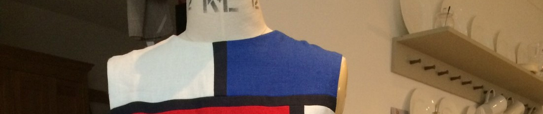
Notting Hill Housing is an amazing organisation. It’s primary role is to provide affordable homes for low-income Londoners, a really important job that gets ever more challenging with the average home in London now costing around £500,000. We still rent out homes in Notting Hill for less than £100 a week, and sell shared ownership homes for couples earning around £40,000 a year between them. But it is also an organisation that understands all its successes are down to the sterling efforts of its staff. As we build and manage more homes, and make more money to support our social purpose, we need to sometimes spend a little time celebrating together. Every year we, or Amy, Nick Mawley and Johannah to be precise, organise a summer party. The sun always shines, there is plenty to eat and drink, Micah Watkis (Housing Officer extraordinaire) is the DJ and our communications team put on wonderful “themed” events. Last year the theme was the 60s – because we were celebrating our 50th anniversary. Many staff members dressed up in genuine vintage numbers, some bought outrageous eBay outfits, and I wore my 1964 YSL Mondrian dress.

This year the theme is “International” – partly to celebrate our diverse staff and customer group – but also as it offers lots of possibilities with the theme. International music, food, games and outfits. Notting Hill staff love fancy dress parties. Over coffee and at the tea-points, at lunch time and on the way to the tube they ask each other “what will you be wearing?”. I started with a clear idea. I bought a few pieces of African fabric at Brixton market, and I planned to remake last year’s dress, but to use African fabrics for the colour blocks instead.

I would have used that red on the right, the navy with yellow for the blue, and the yellow and turquoise for the yellow. I would have done it. I may do it. But right now I can’t find the pattern. I am going to have to move to digital patterns soon, mainly due to the storage problem I have with lots of bits of paper in a small flat. In fact today I am going to sign up for a Burda course which I hope to do with my friend Suzie Kemner of DesignOmatic, but I am having problems with the site at present. I will let you know how I get on.
Here’s another idea. When I was developing the Mondrian dress I made a toile. Well I made several, truth be told, but this is one of them (not pressed, and not finished). I was trying very hard to produce a dress where all the shaping went into the seams and I achieved it with this dress, made with my own dress block rather than based on the YSL one (it’s such a long story). This dress fits pretty well and could be completed with say some African fabric sleeves, or I could use the patterned fabric for the hem section instead of the white. I could simply produce some bias binding and finish it at the neck, arm holes and hem with a bit of colour.

Or I could do something completely different. I have quite a lot of cloth. And my deadline is Friday 15 August.
What do you think? I saw someone on the tube wearing a nice long skirt in ethnic fabric. Ideal for this weather. What about a mix and match effect, using a range of fabrics? Another alternative would be just to wear a head wrap with something more British and ordinary? Or maybe make something more African in its shape – like a tailored jacket with a long skirt? A relaxed over shirt to go with jeans? A maxi dress (many of these African patterns are quite large-scaled – one yard = one and a half peacocks)? Trousers? Here are some patterns I already have, but I could manage a simple new pattern in the time. There are too many possibilities here, but I would welcome any feedback or suggestions you may have.

Whatever I make, I will be using my beautiful new shears. In June I celebrated 10 years at the Notting Hill Housing Group, and my colleagues very kindly gave me just what I wanted – a new very fine pair of engraved tailoring shears. I said it was a nice company with great people – what a thoughtful present for a keen dressmaker.

The three sins. Or the dress with the hole
The story of the hole and the three sins

Why did I go into Misan Fabrics in Berwick Street on Thursday evening and buy a piece of cloth that had a large hole in it?
Well, I liked the fabric colour and design – a sort of damask effect on a quality cotton-mix jersey. Very soft, a vibrant shade of pink, and a bargain. That was what swung it. £12 for the piece, and certainly enough, said Margarida, holding it up against her skinny body, to make a dress. Just ignore the hole! It was hard to ignore the hole. It was quite a big hole. Easily big enough to put your head through. But, she wheedled, that is why it is so cheap! And it’s so lovely! And the colour suits you so well! This from a girl who had accidentally booked a flight to Portugal from Birmingham rather than London. So it came home with me.
I can’t really imagine why anyone would cut out a hole in the middle of a piece of fabric. Maybe something nasty happened here and rather than have a big stain the manufacturer got the shears and cut the stain out. It wasn’t even symmetrical so was even more wasteful. Making holes in fabric – the first big sin. But I suppose selling the butchered remant to an adventurous sewist with a penchant for pink was some sort of absolution.
The second sin was mine. In order to make a lovely Diane Von Furstenberg dress with sleeves a number of crimes against the Reader’s Digest Complete Guide to Sewing would have to be committed. Can you count the errors on my layout?

Novice sewists look away now! Qualified sewing teachers- please don’t report me to the authorities! Here is the full shameful list
- shortened the dress by two inches
- jettisoned the belt and scarf
- decreased the width of the dress front and back by about 1″ (as a b36 pattern this should have been OK)
- (not measured carefully)
- compromised the seam allowance at back shoulder and CF hem
- not one single pattern piece was pinned on the correct grain
- neck binding and sleeve on the cross grain
- dress front and backs slightly off grain to accommodate the pieces
- by putting the pieces top to toe the pattern goes down the front, and up the back
- cut two neck bindings by mistake
- the crude folding on the sleeve pattern isn’t very impressive
- all these changes should have been done correctly, measured and trued on pattern paper. The neck and shoulder alterations are reckless
- complete disregard for pattern matching across the front or back of the dress
Pattern Review for Vogue 1547
The third sin was Diane’s but I will get that.
I am a complete sucker for DVF dresses. I have a few patterns and I love them. The all have the fit and flare shape that I like,”closely fitted” on the bodice like a T-shirt, with a swingy, slightly exaggerated skirt. They are often designed for jersey fabrics. The Vogue Designer Original series has the dresses made up or illustrated in DVF fabrics in vibrant, colourful patterns. I really like wearing 1970s designs like these which I find feminine and elegant and easy to wear. I love the long-sleeved version and the self belt too (next time). It’s a “below mid knee” number. Even with two inches off the hem I put a three-inch hem on it, and this was my only hand sewing. I started the dress with a hole before work on Friday and finished it before we went to friends for dinner on Friday evening. The joy of the overlocker is that making a jersey dress in a few hours becomes an easy pleasure. I didn’t baste a thing.
My verdict on the pattern? It’s a close fit, but it’s a nice fit, The shaping in the CF and CB seams – common to many DVF patterns – make the dress. I don’t love the neckline finish. It stands a little proud and its my fault for cutting the band (twice!) on the cross grain. It should be stretched to fit so that it contracts a little. It also requires a hook and eye, for goodness sake. It didn’t really work for me. So this is my penance for my sin of layout compromise.

The only issue I have with Diane, and her sin is this – she specifies a back zip. I wanted to leave it out. But I worried about the close fit, and putting it on with sleeves. I needn’t have worried. I pulled it off without unzipping when I got home. Drat! Next time….And there will be a next time, because this has all the makings of a perfect dress.

Mother and Daughter outfits – keeping it in the family

There is something comical about making an identical, or closely matching outfit for yourself and your daughter. In this picture we see how Butterick appealed to the “aww” factor to sell not just one, but two patterns, so that “mom” could sew up two complementary yellow and orange summer frocks. Maybe there is a more sinister thing going on here. It might signify a self-indulgent desire to create a mini-me. It could mean that you want a pal rather than a kid. Or that your baby is just another designer accessory. But many women want to produce a girl so that they can dress them up, in their own image (to an extent). It’s true, isn’t it? Even if you are a feminist, or actively oppose gender specific baby-wear?

On the other hand it maybe just that you love maroon woolies and can’t really imagine dressing yourself or the kid in anything else. There are professional photographers who ask families to come in matching outfits, feeling it lends harmony to their composition. This is from the same school of thought that asks all your wedding guests to conform to a strict dress code. Back to family fashions – maybe its just a feeling of fairness. I remember my mother’s one serious attempt to make clothes for us at home involved a pinafore skirt for me and dungaree trousers for my brother . In cream with appliquéd red hearts. Crickey!

But it can be a little bit more practical than that. Certainly for the home dressmaker there is always the temptation. You have a small piece of fabric left over after a project and it cries out to be made up for someone smaller. Like your little girl. Or your little girl and her doll, or teddy bear, Alice. Occasionally you can love a fabric design so much that you go back and got another piece just to make it up again, but knowing you don’t need two items in the same fabric end up getting out a continental pattern magazine, tracing off and sewing up a jump-suit for your daughter. At 8 months pregnant, enormous as a mountain, it is surprising that you could get behind a sewing machine.

The thing is – this is what happened. Here is Esme in the matching jump suit. I don’t know if it is unbuttoned or if I thought a plunging neckline would suit a four year old, but there you go.

Looking at these two pictures now a few thoughts occur:
- I still love the fabric – blues, and turquoise with red, pink and white are just so appealing to me, and actually a good choice for my (and Esme’s) cool-bright colour direction
- the scale is huge and probably too big even for the enormous woman I was at that time. But maybe it is OK?
- for Esme the scale is definitely too large, but it still looks pretty cute
- George, in contrast, looks a bit too manly in a navy blue polo neck
- I am fairly sure I traced the girls’ pattern from a Dutch pattern magazine. At the time I attended a class called Making Clothes for Children and Babies, in Battersea, run by ex-nun Jo Johnson.
- I don’t think I used a pattern for my tent dress. It looks like I adjusted the bodice and then gathered lots of fabric to cover up the bump that was soon to be Augustus
- I am certain that my father took the photographs. This is because the carefully ironed and folded tea towels in the first picture were undoubtedly my mother’s doing
- the picture was taken in Caldervale Road in Clapham in July 1990
Have you ever made matching outfits for family members?
Smocking for adults – 1940’s blouse is finished!
What an interesting project this has turned out to be. A quirky embroidery pattern – Briggs transfer P621-D677 “Smocked Blouse” – has allowed me to recreate a look that might have been worn during or after the war. The exaggerated shoulders of the era are complemented by a small waist, defined make up, rolled hair and neat earrings.
The design and pattern

Apparently this Manchester-based company made embroidery patterns under the Penelope brand that were also supplied as Occupational Therapy for disabled ex-service people following the Second World War. They were available to buy separately but many of the patterns were sold originally in Needlewoman and Needlecraft magazine which seemed to thrive during the 1940s.The blouse pattern itself was more a vehicle for displaying embroidery skills and selling embroidery cottons and wools rather than a particularly clever design. It’s not really a designer item – more the kind of thing most women would more or less be able to draft themselves at home, and make up from a fairly small piece of fabric.The layout is given for a 36″ piece of cloth.
The most important feature is the iron-on smocking pattern, printed on one side front, and then separately for the other side. These tiny, perfectly spaced dots, are the guide for gathering the cloth at regular intervals, prior to embroidering them with the coloured smocking embroidery thread. In order to preserve the pattern I used a washable felt tip pen and a ruler instead, but I have used these iron on guides previously (on the wrong side of the fabric) and they are just great. You can see the pattern is fairly simple, and I traced it off and made no alterations. I wanted the authentic look. For current taste the blouse is perhaps a bit too blousey – its pretty full across the body, being tucked firmly into the skirt for waist shaping. The collar is long and pointy, the sleeves full, pleated and nipped in at their hems. The blouse does right up to the neck with a press stud.
 The fabrics and materials
I chose a fabric with a distinctive waffle weave as I had hoped to use this instead of the ironed on dots. After experimenting the size was too petite, and actually the grain line was with the CF not with the top of the yoke, so I had to abandon that plan. But I was very pleased with my purchase from Simply Fabrics. The cotton is light, it’s a nice bright white and it was just perfect in terms of weight for this project. It was highly obedient throughout the whole process of construction. My embroidery cottons were not the finest quality – I bought a selection on Clitheroe market for a low price. I chose a set of colours to go with a range of skirts I already have – bottle green, navy blue, brown, red, and two shades of turquoise. I used some dear little Liberty’s buttons that Bianca gave me for my birthday. Although the background is light yellow rather than white the tiny floral print picks up the blue, red and green.

Construction
The first task was the smocking. I measured out 1/4 inch squares with my washable felt tip, and gathered up the “quills”. I didn’t do this quite correctly (only reading the instructions after I had done the job). In addition I decided against the proposed colour scheme, using colours I happened to have. Also I simplified the smocking pattern as I wanted to do it while watching the cricket at Lords. I told myself that I would make the blouse again in silk, with more subtle colours, following the smocking pattern to the letter. I often do this when making compromises or mistakes. I think “oh well, I will correct that on the next, better version”. Still despite the departure from the instructions I made a reasonable fist of it, and still managed to watch India begin to take England apart.
Once completed I could make up the garment. The instructions suggested back-stitching the smocking onto the yoke! I was surprised to see this. I wondered if there was an assumption the whole item would be sewn by hand. Most other seams are specified as French seams, but I did this on the machine. Also I went over the back-stitching with the sewing machine. No interfacing was suggested, but I couldn’t contemplate button holes without a little support. I created machine button holes. As is the case with many older patterns the instructions are sparse – the assumption being that everyone would know how to “space 5 buttons with corresponding button-holes down fronts”. No interfacing was specified for the collar so I left that out.
The other thing I left out were the “pair of sleeve supports”, which are not currently on sale at my village haberdashery. In fact there isn’t a haberdashery any more. And I don’t live in a village. But to be honest while I like puffed sleeves I didn’t need to have them overly jutting. Instead I just put four box pleats into the sleeve instead of simple pleats. This gave a little more structure.
I got enormous pleasure out of making this “smocked blouse” – working with a crisp white cotton gives a special pleasure – and really felt in touch with the type of woman who might have made it up in the past.

You must be logged in to post a comment.