


African fashions at Notting Hill
Very few staff at Notting Hill wear anything other than modern contemporary clothes for their work. We don’t have uniforms or a dress code. But when it comes to dressing up for parties our teams really like to push the boat out. Here is a selection of African fashions they were proudly wearing last week.

Sherefe Jemal works at our Extra Care scheme at Penfold Street. She is originally from Ethiopia, and we have talked about the food a few times. There is an Ethiopian restaurant in Kings Cross so I can enjoy injera for lunch, if I fancy one. But this was my first experience of Ethiopian dress. I enjoyed looking at the weave, the strong contrast between red, orange, yellow and black, set off against snowy white. The unique head dress, necklace, earrings and bracelet is beaded in similar Ethiopian colours and symbols and perfectly complement the dress. I have since had a look at Ethiopian styles on the internet, but would love to visit the country one day.

Here is Sumbo Adedeji from Notting Hill Pathways, wearing a lovely Nigerian dress. I love the subtle grey of this outfit – her neon mobile looks somewhat out of place – and the subdued tones of the outfit. This makes it look very modern and fashionable. Sumbo has put together a great outfit, wearing black sandals, beads and bracelet and two deep blue fabrics on her head – a plain one and a tie dye one. Her striking modern spectacles really set this off.

I love Audrey Vanderpuye, Property Management Officer, in this dress from Ghana, made with the famous “Dutch Wax print” fabrics that can be seen stacked up in Accra’s Makola Market. They can also be found in Brixton and many other parts of London. Here the traditional fabrics have been made up in an international style – a long, fitted dress. The insertion of lace into the bodice and the bias bound arm-holes provides a nice deep red frame for Audrey’s beautiful face, topped off with a big lace flower brooch.

This is an African dress at its exuberant best, made for her mother and modelled by Betty Margai, a Housing Officer. Although the dress is short it has so much drama in its draped sides, its voluminous sleeves and ingenious design (it is tied around the body). Betty who makes alot of her own clothes has arranged a neat head-wrap to coordinate and I love the leopard espadrilles – making it a modern and stylish outfit. Again by choosing somewhat neutral shades – deep indigo and beige – the dress looks contemporary and suitable for a British weather.

One way to tell a Nigerian from a Ghanian outfit is the head wrap. Can you see how large and showy these are? The Yoruba women’s “gele” are made from stiff damask type fabrics, pinked at the edges, and the idea is to get it stand away from the head. I think they look sensational, and have the same effect as wearing a big hat. Lots of drama, drawing attention to the face and giving the wearer a real sense of status.

Here is Emmanuel Njoku-Ama, one of our accountants, wearing a traditional outfit consisting of a full length wrap, topped with a knee length shirt. The beads, hat and walking stick are very much part of the outfit. The bright turquoise and orange work so beautifully with his deep colouring and the hat and stick ensure the outfit is very masculine and grounded despite the gorgeous, ornate, textured fabrics that make it up. Simply stunning.

Isn’t this just such a sweet, elegant outfit on Oluremi Alli? I love the way the bold green print (light, bright, deep and cool) works on this outfit, complementing Remi’s deep skin and eyes wonderfully. But it is the proportions that work especially well. The shape is almost an inverted triangle with the greatest width at the shoulders, topped by a large headdress. The ruffles on the shoulders, the sweatheart neckline and the gele all serve to focus us in on her beautiful, confident but slightly reticent face. She has carefully chosen lovely silver jewellry too, which reflects light and keeps our focus on her face. But as our gaze moves across the circles and ruffles we see the slimmest hips and the most elegant bearing, complemented by silvery, pointed shoes. This outfit is an absolute delight.
The last of the summer dresses
This week I made a yellow dress. A primrose yellow. It expresses perfectly the moody weather we are having – the last remaining weak rays of summer sun, with sticky days and squally showers. Light cool yellow, combined with grey. I love this lemony yellow and think it is a beautiful shade; an easy way to wear yellow if your colouring is light and cool. The grey print on this dress makes the yellow appear more muted from a distance – but light, muted yellow is said to be a shade that suits everyone. I made it for an important lunch event and I needed tights, a grey cardigan, a cotton scarf, my grey flannel jacket and an umbrella. But I got to wear my sunglasses too. But the core of this outfit is a light summer look and I shall take it on holiday with me during September when we go to Spain.
Unfortunately constructing this dress turned out to be very hard work, all of my own making. It took ages and it is not entirely satisfactory. Usually my makes are uneventful, especially when I have made the item at least once before. I am competent enough to make up a garment that fits and looks nice, nine times out of ten. But sometimes I don’t think it through properly and things go horribly wrong. Some readers have said they like to read about disasters, so here goes.

Style, pattern and alterations
I used a pattern I had made before. This time I wanted a sleeveless dress. Reusing a pattern is normally a great idea, as this means it has been tested (or proved), both in terms of fit and making up. However, the downside is you switch to auto-pilot and your concentration fails. Then it is stressful as you have to undo and redo.
Previously, with the green dress, I added an inch to the length of the torso, just above the waist. While the fit was pretty good I found the under bust seam was just a little bit high, and that I would rather have the additional length above the bust-line. I slashed the pattern and pinned the shoulders together. I found I needed an additional 4cms of depth in the bodice piece (front and back). As a result it is far more comfortable and looks decidedly retro in the bust area (perhaps 1940s nightdress rather than youthful 1970s dress).


But unfortunately this alteration created a new issue that I should have anticipated. The surplice (wrapped front) is too low and slightly more revealing than I want. I fixed this by tacking the wrap together. Yuk.
Construction
The construction was not straightforward. With a sleeveless dress there is always the question of how to finish the neck and armholes, and the pattern proposed and supplied a pattern for interfaced facings. With the green dress I lined the bodice to avoid facings, and it worked perfectly. This time I decided to line the whole dress – skirt as well as bodice. As I try to be economical I used two pieces of left over fabric for the lining – one recycled from the pirate outfit (muslin) and the other the left overs from my recent printing swap experiment (cotton shirting). This worked OK, although the muslin is much lighter and more flexible than the shirting. Unfortunately the problems didn’t stop there. Lining the wrap feature of the bodice gave me a major problem which I should have foreseen. The surplice is attached to a straight edge of the front piece, creating an issue with the lining. I had to do quite a lot of unpicking. I solved it, but not very well, by treating the lining as lining for the back, and underlining for the front. I overlocked the lot (six thicknesses in the centre) in the end. It is OK but not so pretty inside. And I did the hem, in which the fabric was attached to the now-attached lining and underling, badly and had to redo it.
Conclusion
I hate it when a project doesn’t work. It is my own fault for just not thinking it through. It is still a wearable dress but I spent two or three times longer on it that I should have, with a suboptimal garment at the end, and a feeling of anger and misery rather than joy. I was close to throwing it out, but I like the yellow Turkish viscose off-cut that I got in Simply Fabrics for about £5. And I do love a bit of happy yellow when the summer starts to seep away.

International cross dressing – is it politically correct?
According to a recent Guardian article it is not acceptable to the indigenous people of North America for young ravers to wear feather head-dresses. I can see their point. The beautiful, ancient, treasured and rare garments are regarded as sacred and powerful. It is a bit rich to see a semi-naked youth cavorting on drugs with one atop his skinny frame, or a pretty girl wearing one with a jeans jacket. I am grateful to Tim Morton (@TimMorton2) for bringing this to my attention.

However I think there are four things to bear in mind when considering such questions
- fashion and art have always taken inspiration from anywhere and everywhere. You can’t ban this if you believe in freedom of expression
- sampling, being inspired by and ripping off ideas can be done badly or well, and you and I can be the judge of that
- crude or childish “fancy dress” is obviously based on stereotypes but banning them is probably going a bit far
- there is something positive about taking from the past, or from other cultures, in that you learn about and experience something which may challenge your preconceptions
And it is this final point that I feel quite strongly about. I did dress up as a “squaw” when I was a kid, just as my brother wore a “cowboy outfit”, and we ran around the garden attempting to kill each other. The Glasto-type youth are just overgrown kids that haven’t really thought it through. But even as a small child I wondered how the “squaw” managed to attach her baby to her back, and what her dress was made of, and how she accrued the feathers. I wanted to make and wear the moccasins on her feet and I wanted to have long, glossy, black plaits.
There is something about the challenge to “walk a mile in my shoes” – it implies you get to understand the world as I experience it. But I always took it literally. As a kid I was always putting on high heels and staggering around in mules. I even customised my sun glasses with a flower. And dressing up in your parents’ and grandparents’ clothes is just such an important part of growing up and really does give you insights into how others walk, live and feel. Oh the feeling of that Malibu collared bed jacket on my check – the swishy long blue nylon night dress – being Bridgette Bardot in a Rochdale rockery.

Over the years I have found a good way to get to know other people is to seek to understand them through the food that they eat and the clothes that they wear. To people who say “I could never eat snails, frogs’ legs, pie and mash, dog, horse, raw fish…” I would only say, try it! And the same with clothes. I have had a lot of fun in being dressed in a sari, a kimono, a Tibetan gown with outlandishly long sleeves. Here I am in Mumbai in a Kurta (tunic) and churidas (leggings) with a matching scarf. I actually felt less conspicuous dressed like this for a meeting with a women’s housing organisation. I would have felt uncomfortable in an obviously western outfit. But going to a shop, Fabindia, and spending an hour or so looking at the amazing choice of fabrics and styles, learning a bit about where and how they were made, carefully matching a couple of outfits helped by knowledge (and thankfully English-speaking) staff. The history associated with proudly wearing locally made textiles rather than imports was a key part of the Ghandian freedom movement which I discovered more about at the Ghandi museum in Mumbai.

When I thought about what to make for our international evening at Notting Hill I decided I would make an African garment. I used authentic textiles and I dressed in a way that I felt was respectful and honourable to the traditions. Certainly wrapping the head-dress was something I just went with rather than asking for advice. but my friends assured me it looked the part. Of course I got more than one double take on the bus – white woman/African dress – but I felt proud, and statuesque, and I really enjoyed wearing the outfit, partly for the insight into how it feels to walk along in a loud print, a cotton ensemble, with a head wrap. The sort of steps you can take. The need for a straight back. To be stared at. Good lessons.
At the party there were lots of people in their own national dress, but quite a few, like me, culturally cross-dressing. I thought they all looked wonderful and I know they enjoyed themselves.


Yellow
Yellow, or “Lello”, is Ted’s favourite colour, the first one he recognised and described. This may be why

As a result of his affection for yellow I made him a dressing gown in soft yellow wool from Simply Fabrics. I used a vintage pattern, Simplicity S.137. It used a surprisingly large amount of fabric – somehow I thought I was making dolly clothes – (1.5m), but was such fun to make. I made view 1 – with raglan sleeves, a shawl collar and pockets.

And here it is, on the boy. Doesn’t he look like a proper gentleman in his full length yellow “robe” with its glamorous shawl (tuxedo) collar?

Yellow has nice associations like sunny, happy, bright, enthusiastic, but it can be seen as unserious in a business environment. But like red at work it can be a great colour for a tie, or a belt. If I wear a formal grey business suit with a white blouse I invariably reach for my yellow belt (and perhaps a scarf with yellow in it) to ensure it has a little individuality and style. The light yellows work well for shirts and blouses and go with the neutrals, especially all the blues, but of course the right shade of yellow looks great with grey, brown, camel and cream too. The stronger yellows make nice one-piece dresses for summer, but its probably best to wear neutral accessories with them. If your colouring is bright you can include another bright accessory – in shocking pink or cobalt blue for example. The warm yellows – like cantaloupe and light apricot, and muted yellows like “maize” are perhaps more wearable (on the right person), and will complement the rest of your wardrobe. Many people avoid yellow, feeling it is a difficult colour, but once you know the right shade for you, it is a lot of fun.
Yellow can be described in the six main ways.
Deep or Light?

Cool or Warm?

Bright or Muted?

International Evening with Notting Hill Housing Trust
I mentioned our Notting Hill Housing Party – the summer party with an international theme. What did I wear in the end?
Pattern Design and alterations
I decided to use a 1950s Butterick pattern for a “fitted over-blouse”. Although the blouse is fitted with darts (two in the front and one in the back) it looked a lot like some of the peplum tops that have been in fashion for a surprisingly long time. I never bought one in the shops mainly because they all seemed so short in the body, and the last thing I wanted was a flare coming out from the mid rib position. But I was hankering for this shape. In addition to it being delightfully retro with its square neck and asymmetric opening I thought it had something of an African vibe about it too. So this was the pattern I chose for my top.

Unfortunately the pattern was missing the sleeve and the pocket, so that determined the view I could make up – view C. Of course I might draft the missing pieces another day. I measured it carefully as it is advertised for a 32″ bust, but there was plenty of ease. I added two inches to the length above the waist and did not shorten the hem, thinking I would judge the length when I made it up. I repositioned the seven buttons.
Fabric choice
Many African printed fabrics have very large motifs which work best on a head to toe (literally) outfit. If you wear a floor length skirt, a fitted jacket or blouse and a head wrap you can do these large scale prints justice. If you make a skirt or top you need to chose a smaller scale pattern.
Equally the colours can be a bit strong for fair-skinned Brits. Many of the greens, oranges,purples and yellows look best under strong, bright sunlight, against the darkest and brightest complexions. British tweeds, linens and suitings often reflect our climate and environment too – muted purples and greens, soft greys and deep blues. So if you cross cultures with your fabric choices you need to pause and consider what you are doing. I chose a nice white, cerise and denim blue Ghanian “wax” print with shaded tumbling blocks that measure around 1″ square. Additionally the shapes and underlying check in the print was quite angular and geometric which I felt would suit this rather angular shaped over blouse.

Construction
The pattern matching was fairly straightforward with the obvious checks on the pattern. I lined the over-blouse with a bright blue synthetic lining, and acquired seven matching pink buttons for 5p each from Simply Fabrics. They are a bit cheap and slightly sharp, but the colour is perfect.

So far I have worn it with my pink trousers and with deep blue jeans, and it works well.
For the party I felt it needed to be a bit more showy. I had thought about a long skirt, with lots of shaping, or draping. But in the end I had ten minutes before I had to fly. I did something very quick, a bit slipshod (it’s not even hemmed), but hopefully still authentic. I took my remaining cloth and I cut it in two. One piece I tied around my waist. The other I wound round my head and tucked it in.

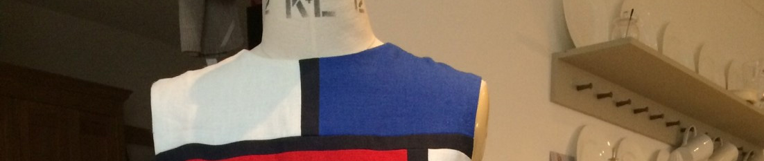
Men’s style – photographing your Board
It’s the annual report time of year and it will easy to find pictures of your company’s Board – arrayed in dark business suits for the investor or customer to appraise. Getting six to 12 people to look like a team can be a challenge for the professional photographer hired for the occasion. It can be a bit of a minefield for him or her. How to deal with the hierarchy (CEO, and the others), how to deal with the height and weight differences, where to put the women – at the back (thereby minimising their contribution) or at the front and risk making them a token? Do you include furniture – the iconic board table or the comfy chair? Do they perch or a table, or knee down? if you don’t have props you have a long single line and that is not good for publication. Here is random selection.
I work for the Notting Hill Housing Trust, where we are governed by a Board that consists of Non-Executive (people who have other jobs but spend a day or two a month governing the organisation) and Executive (the full-time, staff leadership team) members. We too have to conform to the practice of including photographs on our website and in our annual report and accounts. It’s not a bad idea for customers and investors to be able to see who they are buying from or investing in. So here is Notting Hill’s Executive Board photograph.

Taken by professional photographer Richard Townshend , it shows that we don’t all wear jeans at Notting Hill. To an extent we are all dressed up. We don’t all wear suits and ties everyday, but knowing we were going to have our picture taken, we all chose our most “professional” outfits.
Let me introduce the senior team, left to right,
- Paul Phillips (looks after the money),
- Andy Belton (looks after our commercial portfolio),
- Mark Vaughan (looks after our social portfolio),
- me (the boss!)
- Andrew Muir (looks after the organisation),
- John Hughes (builds new homes).
I was quite surprised to see this photograph. We are all around the same height, and of apparently medium build. And with four blue suits (one is nearly grey), five white shirts and three red ties you might wonder why we are all dressed the same. In case you are interested we all have cool colouring, except Andrew who is light and warm. I know this as I work closely with them, not because any of them have had their colouring analysed! We are quite a “blokey” team.
Could this team look just as authoritative but also a little more individual?
- Andrew is wearing grey, albeit a blue-grey, and his shirt is a little muted. He could wear a slightly lighter grey or blue suit if he wanted, and maybe try a more adventurous tie – a pattern, or more orangey, or a narrow vintage tie perhaps.
- John is the “trendiest” on the team and his suit is really a nice shade of blue. He has chosen a strong blue-red for the tie which works really well. But as John suits deeper shades and I think he could have chosen a darker shade of the same blue for his shirt, and worn it without a tie. Or even worn a Liberty print shirt in deep colours (blue and brown for example).
- Mark is wearing a black tie which I find odd as I associate a black tie with going to funerals. Mark could choose a deep tie in a more interesting colour – deep red or purple perhaps. As a younger man I think it would be fine to leave the tie off. I like to see the shirt cuff showing, and this looks good on Mark.
- Andy looks smart in a grey blue suit with a subtle stripe. This is a very traditional, reassuring look and Andy has chosen the right scale of pattern in the suit and tie – fairly bold but not too big. Andy’s cool colouring can stand more contrast and brighter elements and the tie John has on , for example, or any bright colour, would be a bit more interesting.
- Paul has quite light colouring and might reflect this by wearing a lighter colour of tie – light cool yellow, pink or purple for example, silver cuff links and maybe silver framed glasses.
By making a few small changes the team could achieve a more differentiated look, and still appear as professional and capable as they most definitely are.
And me? I am wearing two self-drafted items. My VW-inspired jacket, and my curvy pencil skirt. I am wearing a Hobbs silk blouse that I got in the Shelter shop in Clitheroe, with a pink belt and blue shoes.
In the following photograph we are at our Annual October Awayday at Ashridge with our nine Non-Executive Directors. Here we are dressed in what you might describe as “smart casual” or possibly weekend wear. It looks like a composition in blues and browns.

Green – it’s not just about the environment


Green is harmonious, approachable and empathetic – like pink, and trustworthy like blue, which it is close to. But it is also nature’s colour – the colour that transforms sunshine into sugar – the greens of grass, trees and leaves. Green “blackboards” were introduced as green is much easier on the eye than black. Apparently we can distinguish more shades of green than any other colour, which may be true – certainly the blue-greens and the yellow-greens seem like two different colours to me. Green is associated with nature and a walk in the country – outdoor outfitters love to make everything from jackets to hats and socks in khaki, forest or leaf. Green can be seen as boring and bland, although possibly acceptable on a Springwatch presenter.

Yet certain versions of green are desirable, sexy and lithe. I love the dress from Atonement, worn by Keira Knightly. It’s warm Absinthe green glows in the moonlight, as the actress smokes outside in her supple, bias-cut satin gown.

Green can work brilliantly with its polar opposite red, or if that is too strident try it with pink. Avocado and shell work nicely together. The colours that sit next to it in the colour wheel are the ones that make it up – blue and yellow. Patterns that include these shades, with green, can look very pretty. I love the combination of dark green with white, navy and dark brown.Try dark greens as an alternative to navy blue if you suit deeper shades – very smart with white or pastels. The muted greens look super together, perhaps layered with reddish brown accessories. Everyone can wear green and it works well with other colours in your wardrobe. Using gold or silver or rose gold with the right shade of green can be stunning. Here are the six main flavours of green, to help you plan your wardrobe, shopping or dressmaking.
Deep or light?

Cool or warm?

Bright or muted?

Virtual colour analysis Part 2
Remember Joyce, from Sudbury, Ontario? I attempted to analyse her colour direction based on four photographs she kindly sent me. I concluded that she was Deep rather than Light, Cool rather than Warm, and Muted rather than Bright.
I took the view that she had a Muted primary direction. On the secondary colour I went for Deep rather than Cool. Since then Joyce has sent me a range of photographs of herself, without make up, wearing some of the clothes in her wardrobe. The photographs I like the best are those where the muted colours are clearly cool rather than deep. So I would now revise my view slightly to say that cool muted shades will flatter Joyce better than deep muted shades, making her colour direction Muted-Cool.
Joyce has kindly dressed in a range of her Muted-Cool wardrobe. In the first photograph she has a deep blue denim jacket, a cool pink shirt and some blue-grey beads, silver earrings and a cool pink lipstick. I think she looks amazing – her eyes in particular really look so blue.

I believe that the muted and cool shades really help integrate Joyce’s colouring. Here she is in grey with the same pink shirt and a silver necklace. What do you think?
 I really like Joyce in these shades and I love the way her eyes are enhanced. The colours she wears in these pictures, and the ones below, match and pick up colours that are already present in her complexion and features. Here are four more looks in her new colour scheme. I am so grateful to Joyce who was open to making a change, and also being a guinea-pig in our experiment.


You may say that Joyce is a beautiful woman and she would look nice in anything. But here are a couple of less good colour schemes so you can compare them. I have chosen a green that is both bright and warm, and shiny too (Joyce will look more beautiful in matt shades).

And here is a not very flattering red that is too warm and deep, decorated in gold which is much less attractive on Joyce than silver.

I want to thank Joyce for working hard with me, trying on her wardrobe and photographing herself. She is also a really good sport allowing me to comment and critique her colours on Fit and Flare. I hope this has been useful. The main lesson I have learnt is that is it really hard to get this right at such a distance. A proper colour analysis needs the person in the same room, not on a different continent!
Do you wear Red? Or does it wear you?
Tinie Tempah can wear a red suit, but he is famous, and black. The rest of us, probably not. Red can be powerful, dynamic, assertive and successful. It is the colour of blood, fire, danger and passion.
Once I was given a red nylon (“sexy”) nightdress that I found so embarrassing that I pushed it back into its box for fear it might escape to torment suburban housewives everywhere. I hope the Oxfam shopper and his wife enjoyed it. And in a similar vein I once mistakenly bought red, knee-length boots in a sale. (I know. I took them back). As well as being associated with tarts, those that wear red can be seen as aggressive and demanding. Red with black is the ultimate drama look for adolescents, vampires, and assorted circus performers. Single-handedly it uniquely stands apart in a sea of ordinariness, and shouts out loud.
Red was the colour I struggled with most – there seem to be so many versions of red – cherry, scarlet, tomato, pillar box, wine, raspberry, watermelon, ruby and blood. I could never quite make up my mind about it. I knew I suited clearer, brighter (non-muted) shades. But I didn’t really understand the difference between warm (orangey reds) and cool (bluer reds), especially in terms of lipstick. It’s hardly surprising that many people steer clear of red as if you get it wrong it is quite uncomfortable. But actually everyone can wear red. It is worth persisting as it is a colour that brings life and energy in its wake.
I made up Style 4666 in a lovely piece of red linen, in just the right shade of cool, bright red, that I got in Goldhawk Road. I made version 2 with short sleeves and went with the white collar and cuffs. For the button I tried white, and I tried red. But both looked wrong. In my button box I found a solitary fabric button in “greige”. When I tried it I thought it did the trick.

In this photograph I have found a narrow greyish belt to go with it. By using white and a neutrals (brown shoes, clear tights, silver jewellery) rather than accessorising with red I think I created a look that was smart rather than overpowering.

Red clearly works well with neutrals. You can put it with white and navy for the traditional nautical look, although it is a bit predictable. Red with white and yellow, or navy and pink is more fun. In fact red with pink can be wonderful. I like to wear a red skirt, say, with a purple, yellow or green top – these combinations seem youthful and fun to me. But it can look a bit too strident. This is when I would use a navy or grey jacket or another tone of the same colour to calm it down. Alternatively use red as an accent colour – maybe a jacket over a dark outfit, or a handbag. Red trainers or Converse type shoes with jeans look nice on longer legged people. Men sometimes need a red tie, or scarf to make a suit or coat come alive.
Let’s consider the six versions of red that help us to choose which shades best complement our colouring.
Deep or Light?

Cool or Warm?

Bright or Muted?


Matisse Cut-outs – amazing inspiration for screen, block and digital printing
If you are in London, or England, and have the opportunity to see the Matisse cut outs exhibition, do go. It is on until 7 September 2014. It is astounding and beautiful. If you love colour you will explode with joy at this sensational late life work of a master, who was ill and disabled but managed to produce this work as perhaps the pinnacle and joy of his career. There is a good review by Laura Cummins here. She writes:
Matisse grew up in a textile town in the industrial heartland of north-eastern France, the son of a draper and grandson of a linen weaver. He was always at home with material, surrounded by swatches, understanding their fluidity, weight and drape. His paintings (so full of fabric) sometimes seem to be woven together, the colour passing back and forth through the composition, and his cut-outs involve pins, swatches, fitted shapes and pieces made to measure.

I am sorry I can’t share more pictures – taking them is forbidden and I got into trouble. I also bought some post cards, which I have photographed. These three (and the exhibition is extensive with so much to see, over 130 pieces including stained glass), especially stood out to me. They all have a white background, which was very deliberate for Matisse who felt it made the colours stand out. White is being used as a colour, which I find very interesting. They are also enormous. The parakeet and the mermaid, below, took up a whole wall in his home and he made it while he was recuperating from a major operation and could not work in his studio. His assistants helped with painting the paper that he cut out, and in pinning the pieces in the right spot. There is evidence that he changed the arrangement hundreds of times before he was happy with it. The sea forms (corals or seaweed) dominate, with blue pomegranates.

The second two were commissions for ceramic pieces. Again the ill, ageing artist worked and corrected, worked and corrected until he and his clients were satisfied.

I hope to use these ideas as inspiration for my textiles class next term when we will be doing screen-printing. These shapes and colours would work well with block printing too. And with digital. Applique? And no doubt patchworkers, knitting designers and potters could interpret them too. They just make me gasp with their beauty.
Here is a colour palette inspired by Matisse.

I will go again. As a member at the Tate I can take two people (no queueing, and free of charge). If you would like to come let me know.
You must be logged in to post a comment.