

Who is the coolest politician in Europe?

This question was put to me on Twitter by my good friend Clive Turner, the CEO of Plymouth Community Homes. As Housing CEOs go he is fairly cool, with his navy suit, decent cufflinks and watch, and easy-going open-necked shirt. I am not sure about the rubber wrist band and lapel badge though, Clive. And clearly his office was designed by someone with an office supplies catalogue with it’s nasty blue “CEO” chair and light blue horizontal blinds.
I didn’t know the answer to Clive’s question. But when he said “Yanis!”, the penny (or rather the Euro) dropped. The man in charge of Greece’s Finances is an interesting case study. Is he cool? He thinks he is! His expression is direct, confident, strong – sexy even.
I cannot find a photograph of this 53 year old guy in a tie. Here he is at his first EU meeting as finance minister. He looks to be wearing a kind of Austrian-style black boiled wool jacket with red melton on the back collar, and some jazzy detailing on the breast pocket. Teamed with a navy damask shirt and a wry smile. All around him are men in traditional grey suits and ties. Yannis Varoufakis, with his shaved head, pink exercise book and white iPhone looks somewhat out of place. He has previously worn this jacket with jeans and a variety of shirts. He has chosen to wear this somewhat eccentric mandarin collar jacket for a number of photo opportunities, so it is obviously a favourite.

Let’s do a little analysis of what he has in his wardrobe. The first picture shows Yannis before he was famous. Loud silk shirt (no tie), thick black hair. John Travolta. The second image is from his website (spot that jacket!) wearing a slogan T shirt in another bright shade. And the third picture is Yannis in a comfy striped T giving a speech. In my opinion with his dark hair, eyes and tanned complexion he can certainly wear bright and deep colours, and he looks nice in the dark shirts that he often favours.


This is clearly a man who enjoys making a statement with his clothes choosing strong colours, rebellious T shirts, and an unconventional informal jacket. At heart he is an academic, and this is how academics dress. Influenced by spending alot of time with teenagers – youthful, casual, approachable and comfy – but very confident in his brain power and view point. Someone used to a captive audience. But he treats their eyes as well as their ears by wearing something they can talk about, or relate to.
I admit I like the man. He speaks perfect English and is very self assured with incredulous broadcasters. He is brave and a natural leader with a compelling democratic mandate. And, his clothes tell us, he is unafraid to be himself. He is not going to conform to the European Central Bank and he is not going to conform to the dress code. I think he is cool although I don’t endorse all his sartorial choices.
When he turned up at Mr Osbourne’s door we saw something we are not used to – a Euroleader in a casual brightly coloured shirt, no tie, and untucked! Albeit a little bit tight and crumpled. George on the other hand looks tidy and pulled together, slim and youthful, if rather staid and dull.

And just to finish let’s have a look at the jacket he wore that day (but managed to take off for the formal photograph above). The Independent said: “Greek finance minister Yanis Varoufakis rocks up in London to meet George Osbourne in an edgy jacket”.

I think it is a Barbour jacket, beloved by the upper classes and actually worn in London, over a suit by city boys on a daily basis. It is not a jacket I would describe as “edgy”. But hang on a minute. It looks very shiny, doesn’t it? Rather oily? Maybe this is what makes it look “edgy”. Barbours are not really shiny jackets, except when they are brand new! Yanis is wearing a box-fresh Barbour! How we Brits laugh – the shame of it. Do you think Yannis wanted to conform, so he bought a British upper crust jacket, not realising it had to be distressed and patched – matured for decades first?

The Midi skirt
After the sun the rain. After the mini-skirt came the midi-skirt. You might wonder how the pattern companies made their money. Selling a simple A-line skirt with four black cutting lines printed across it for five shillings and five pence. View 2 – pink with spotty tights – was a novelty in the early 1970s when the world had got sick of the mini. A more luxurious skirt, long and elegant with elegant fitted jackets or floaty blouses was what we craved. I remember as a teenager getting a lined, black wool, A line, fitted midi skirt and feeling very grown up.

The skirt was introduced by the design houses, who had to keep reinventing fashions to keep the public buying continually changing fashion. Fashion is essentially about making what we own seem dated and dowdy and what is available desirable and new. Here it appears the midi-dressed staff (or customers?) are getting a lecture on the new length.

And apparently there were riots in the streets! Young women did not want to conform to the new trend. They loved their teeny-tiny skirts! They wanted their knees on show and the opportunity to run about without constriction. So they organised protests.

Or did they? Were the young women in the typing pool having a moan about the new ugly length, the cost of the items, the tyranny of fashion? Did an enterprising young photographer on the news desk think it might be fun to photograph their pretty legs? Can you imagine what happened? Kenny, talking to the editor, in a Cockney accent:
“I’ve been talking to Shirl – Why don’t we get those birds in the office to stand on the steps with placards saying “Up with the Mini”? Nice on the front page on a slow news day?”
The Mirror ran the “campaign”, to the evident delight of men everywhere. The Americans did it too – here in Florida where it is surely too hot for the Midi. Look at the men, standing on the sidewalk, enjoying the show.

Unfortunately the Midi-length – the below the knee skirt – still has an unfortunate reputation as old maid’s wear. A saggy midi skirt in brown polyester is probably as bad as it gets in terms of women’s wear. But as fashion loves change we will see longer skirts appearing again and again. Not long ago the Victoria Beckham pencil skirt was long, clingy and hard to wear (even by Victoria).


Current trends for below the knee are fuller skirts which work successfully on more moderate body shapes. These skirts usually fit on the waist, and are gathered or pleated to give a wide line at the hem. I have been thinking of using my knife printed fabric for a skirt of this type. The effect here is to make the calf look slimmer. This montage from The Sartorialist.

So who suits a midi skirt – one that ends mid calf?
- women with proportionally longer legs
- curved figures with a defined waist
- fullness in the lower half balanced with cropped, tucked in or close-fitting upper half
- take your leg shape and length into account when choose where the skirt ends – from just below the knee to just above the ankle
- if you choose a longer fitted pencil skirt this will emphasise the width of your calves so this skirt is best only on women with slim legs
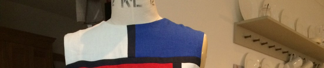
New Block printing project
The Tessellation project has been really good fun, but now I want to make a piece of fabric for a blouse, skirt or dress. I am inspired by the work of Roger Fry and Duncan Grant at the Omega workshop.


The use of geometric shapes and bold colours, and the fact that they turned their textiles into garments is very appealing and I am keen to get a design that I can use in my textiles class.
Also I have been thinking about Nick’s grandma’s butter knife. Here is some Andy Warhol inspiration.


And here are a few sketches I have done in three colours (grey, pink and turquoise) that might work as block prints.

I preferred the third picture with its lovely curves so I went back to the knife which Nick inherited from his Grandma. It’s pretty old and made of silver, or its silver plated; it has some hall marks and you can see that it tarnishes but the material that joined the handle to blade has been damaged by being in the dishwasher, unfortunately. It has a soft curved blade as it is for butter and doesn’t have to cut – just spread. So very different to the aggressive, killer knives used by Warhol. This knife is safe (but not dishwasher safe). Just to remind you of what it looks like.

I did a few sketches of the knife using a felt tip pen. I thought it might create a kind of stripe effect. The second picture is where I sliced the original drawing and reattached it, then drew in the joins. This is to make sure the repeat works when you print.

Last week I made a polystyrene block and printed two metres in light grey. I will print on top of this background cloth this week. It looks pretty murky and not very promising, doesn’t it? Not as nice as ChezSews efforts. But I think it will be fine when I have added some further colour. I plan to cut out a knife shape in lino and use this small block to overprint with some striking colours. Pink and yellow? Mid blue and pink? Navy and deep grey?

The circular skirt – who can wear them and how to make one

I saw these amazing circular skirts at the Women, Fashion, Power exhibition last month. initially I couldn’t see any link between novelty skirts and women’s power, but maybe I lack imagination. On the other hand these items come from are an interesting moment in history. One features ten pin bowling, the second jazz and music clubs, the third the Beatles. Perhaps they just show young women having their own taste and making their own decisions about what they did in their leisure time and how they spent their money.
This style of skirt was very much a thing in the late 1950s and early 1960s. In America they called them poodle skirts and embroidering cultural references on them seemed to be quite a thing. Not sure if it was such a British hobby although examples exist. To me the printed textiles are interesting – basically 1950s style pictorial prints, adapted (sometimes) into a border print. Exuberant and a little bit trashy.
However I really like circle skirts and they are very easy to make, requiring a little geometry and some measuring instruments. Pattern company By Hand London have produced a little app to do it for you. If you like the general look but don’t want to use (or wear) quite so much material try the half circle or quarter circle skirt instead.


This is an easy skirt to make, requiring just a waist band, a zip and a hem. No darts and no gathers. The picture at the top is a circular skirt made by my friend Lyn for her daughter Grace. She used a double jersey, omitted the zip and threaded elastic through the waistband.
- It can be any length from mini to full length
- lively all-over cotton prints are nice for summer
- plain medium weight cottons with a little shine
- wool works well but probably avoid plaid
- silk velvet ballerina length or longer would be a nice evening look with a leotard type top
- suits anyone who has a defined waist line; you don’t have to be particularly slim.
- if you are taller or larger you may suit a wider waistband; keep it an inch or less if you are petite.
- if you want to make the skirt stand out a bit wear a 1950s style petticoat.
I haven’t made one for years, but if I get the right fabric I plan one for the summer. If you have a circular table cloth you could adapt it easily!
“Sabre Toothed SWAP” – fun with a Demented Fairy
This “sabre-toothed Swap” started over on Pretty Grievances, where Ann – the instigator of Jungle January – got together with PennyLiberian to create an international collaboration. Where sewists would send a buddy a package of cloth and the partners would make up something to wear. A bit of a risk, but not too much of one as, let’s face it, animal print is animal print. Or is it? You can have fur, stretch, funny colours, dayglo, hot hippo pinks and yellowy brown hyenas. So while I jumped in – why not? – I was a bit scared about what would turn up. As it happens Demented Fairy (my buddy from Birmingham) sent me something very nice and the rest is history.
There was also the question of what to give her. I went to Simply Fabrics and found a very wide choice. I alighted on some deep red snakeskin, some very stretchy bright yellow leopard skin, and a very fancy fabric that can only be described as eyelash. In the end I came home with two pieces of very reasonably priced fabrics – one a lovely piece of silky stetchy Roland Mouret fabric, and a second colourful piece of stable cotton jersey. The second piece I gave to Lyn who made a DVF type wrap dress.


The Mouret fabric had been used to make stunning colour blocked dresses in his collection, and Demented Fairy took her inspiration from this, deciding to use the animal print as a detail in a jersey collection. As well as a set of underwear (yet to be completed) she chose to make – a dress, a skirt, a pair of trousers, a top and a jacket. We heard who our swap partners were on 11 January and she had the collection almost finished by the end of the month. She mixed the RM fabric with purple and green jersey fabrics she acquired at the Fancy Silk Store and Barry’s warehouse in Birminham.


DF has a straight body silhouette – high narrow hips, long slim legs, not much of a waist and fairly broad shoulders. She is a very experienced seamstress, and she knows what styles to wear to suit her shape. Here is a lovely photograph of the wedding of Demented Fairy to the gorgeous Dawn. Dawn’s dress was inpired by Lord of the Rings, DF’s own gown is inspired by a Gwen Stephanie dress and taken from a Vera Wang pattern. Both dresses made by DF herself. Sensational “updos” ladies!

For the SWAP DF chose to use Style Arc patterns which come from Australia. Some of their patterns are designed especially for the straight body shape and are often featured on Lara’s blog. Not good for my shaped body, but a godsend for women who struggle with making lots of changes to off the peg or patterns from the Big 4.
Twiggy dress #3, with added pockets and flat piping
Ursula skirt #3 or 4
Linda trousers #5 probably, made narrower, higher waisted and with added pockets and side seam flat piping


What can I say? – it is an amazing achievement and the Demented Fairy looks great in her lovely outfits. They are comfortable and flattering with just a hint of “grrr”. Super work. Well done.
How to make hand-painted silk linings
Last week a natty male dresser I know showed me his lining (shock). His jacket was lined with a football shirt! Not my cup of tea, but why not? Chanel used to line her jackets with silk and then make up a range of blouses in the same fabric to wear with the suit.

Posh furs were often lined with luxurious silks embroidered or woven with the recipients name, or patterns like sprigs of flowers. There was a vogue in the 1950s for men to have saucy pictures inside their jackets – that they could flash at their mates when out in the evening, and still look respectable for work. And even Marks & Spencer uses brighter linings these days – to allow men to express a little individuality.
I came to dress making most recently via painting on silk – making bespoke silk textiles using fabric paint. Once I had made scarves for me and all the women in the family I turned to making silk linings. What about matching blouses and dresses to the coat or jacket lining? I restarted dressmaking in order to be able to do this. Here are a few I made earlier.


If you too want a unique lining (and as my jacket is often draped over the back of a chair in an overheated meeting room) that will get seen, you might want to try doing this at home. My daughter Esme loves the most colourful linings, saying it is like wearing a Hawaiian shirt under the jacket. But they can be subtle and restrained too.
- Buy suitable silk. I use Habotai, shiny satin or crepe depending on the weight and quality of the garment. The price on this site is reasonable and they deliver for a fixed cost. If you use calico for toiles you can order large amounts and it is delivered for the same price at the same time. By buying white/ivory you will have very little waste as you use the same colour for all garments. I like the feel and quality of a silk lining and I am prepared to pay for it. After all a hundreds of small animals had to work really hard to produce it. Often my lining fabric is more expensive than the jacket fabric.

Habotai silk suitable for lining - Buy silk paint – red, blue and yellow is sufficient to get started as you can mix your colours from these three elements. The brand names I have are Setasilk, Javana and Colourcraft. The smallest ones cost around £2 or £3 each, the larger around £10.

Silk paint - Find or buy a nice brush or two. I have one thick and one thin, in fairly good quality, made specifically for silk painting from animal hair. I assume any good quality brush will do.

Painting on silk brushes - You can use gutta, wax and a frame if you want to, but this post assumes you are keeping it as simple as possible
- Cut out or draw the lining pieces with a fabric marker as it is easier, and more economical to just paint the pieces you want to keep
- set them out in pairs on a flat surface and paint them together to get a roughly symmetrical look
- I usually chose one colour similar to the fabric colour if it is plain, and then match three or four to go with it.
- Practice on an off cut to get a pleasing design. To check the colour allow to dry or press. Once dry you see a truer colour.
- Start with the lightest colour first, then allow it to dry.

start with the lighter shades - Build up the colours on top. You don’t have to let them dry but they will then bleed into each other which maybe an effect you want. You can dilute them for a lighter colour and a “wetter” effect. The red and pink were used undiluted, the green is very diluted and the light grey is diluted. I often use a “dirty” colour to pull it all together, but it can be nice to have the pure, vibrant shades too. I suppose with winter outfit in heavier cloth I usually produce a denser and darker lining.

deeper colours allowed to bleed - Even if they dry they still bleed but not as much. Choose a design that is quite painterly and not too precise, or move to using wax, gutta and frames.
- Go right to the edge. Although most will be sewn away you don’t want white bits to show (unless it is part of your design)
- Keep building up the colour until you are satisfied. I liked the way that the grey, green, red and pink had combined to create a sort of purply red, similar to my jacket.

Painted silk lining - Finally allow the pieces to dry, then press using a hot iron. Then make up your lining as usual.


Sewing With A Plan 2015 0.14
According to my Sewing with a Plan project plan the fuchsia jacket should have been completed this weekend. I started two weeks ago and it should have been finished by now. But I don’t think I can go out like this. No sleeves, pockets, buttons or lining. And those tacks look, well, a bit strange. What do you think?

Looked at from a glass half full perspective we have
- darts (including two extra ones at the back)
- interfacing,
- great tailors’ tacks,
- five fairly impressive bound button-holes,
- a reasonable stand collar (considering – see below). With pad stitching
- a hem with no visible stitching (hurrah!)
- the pockets, which I pledged to make perfectly, are ready to apply to the jacket. They are lined in pink silk. They are not perfect but I must press on
I have fallen behind due to being very busy at work. It has been a tough week putting together a great bid for a new town centre development, and preparing to present it effectively. Here are two of the amazing architects I have been working with – Scott and Rachel.

I have been carrying a lot of stress when a jacket like this needs a relaxed seamstress without too many demands on her time. But these are excuses. The real reason for my slow progress has been my ability to make mistakes that I avoided the first time I made this jacket.
The first problem was that I managed to prepare two left fronts. I only discovered when I kept looking for the right side in order to put in the button-holes. “Well that is the left front, the other one must be the right”. It is surprisingly easy to make this elementary error especially when the face and back of your fabric is very similar and your eyesight is a bit duff. Annoying, but not the end of the world. I unpicked the interfacing and darts, pressed the fabric gently, and repeated all the processes on the correct side of the cloth. Then I made the bound button holes – a process I really enjoy.
My second problem was more challenging. I created a grown-on facing, but this caused a problem I cannot, at this moment, fathom out. Somehow the facings, including the back neck facing, were something like 4 inches too short. And again, stupidly, I only discovered this once I had basted and permanently attached the inner collar to the facing, and found it didn’t fit. Not just attached but also trimmed closely to the seams. I found this error totally depressing. When I unpicked the facings, recut the right size, reattached them, and then sewed the collar it all actually went well. But I had dreaded it and procrastinated for four or five days. It needed concentration and a high degree of accuracy and I couldn’t bring myself to actually do it, taking the risk of making a complete and irreversible mess of it. The simple change to a facing treatment risked the whole finish of the collar – probably one of the most important aspects of the construction in terms of how professional it looks.
In the end, by giving it two or three hours of quality, relaxed attention on a Friday night, I am satisfied with the outcome. I am still behind schedule but I am now on the home straight.
A few danger areas still exist
- the pockets (making them nice and even, and square rather than rounded, and attaching them symmetrically and cleanly)
- the lining (choosing the right colour and inserting it accurately).
I have no worries about the sleeves, hems and buttons, although I don’t have any yet. I had planned to have the matching skirt ready next weekend, so I need to get a move on. I haven’t even chosen a skirt pattern yet, but it will probably be a vintage (1960s) one I have made before, a “TNT” pattern. I have three weeks “float time” in my project plan. It looks like I have blown one of them already. Let’s see if I can catch up without making a major error.
Men’s style: “Do Boris!”
I don’t get many requests with this blog, but I do get a few. One I have had from a number of people is to turn my analytical gaze on Mr Boris Johnson, the current Mayor of London, author of a new book on Churchill, Prospective Parliamentary Candidate for Uxbridge and South Ruislip, ex-Eton scholar, and possible contender for Leader of the Conservative Party.
Boris is an interesting fellow and someone I have got to know a little bit in his role as London supremo. We build houses for low-income Londoners so he is interested in what we can achieve. I have found him to be very amusing and genuinely interested in housing. But in terms of his dress – he is a disgrace.


On the left we see him in China promoting London’s interests. Those actors from the Bejing Opera with their wonderful costumes and make up must have wondered what this white-haired chap was doing with his thumbs in the air and his trousers billowing around his thighs. The jacket is the wrong length, the colour unflattering and the shirt collar curling up in shame. If you are going to promote London and the UK abroad you have to promote our fashion and style. You have an obligation to show case our brilliant tailoring, quality menswear and innovative fashion industry.
As for the cycling outfit – it is just nasty. While it is great that the Mayor promotes healthy transport options and wears a helmet, the overall dishevelled look is quite absurd. He looks bulky, crumpled and uncomfortable. He may even be wet through. Surely if you are a regular cyclist there is a case for wearing smart cycling gear and changing into a suit in the office? Can you really turn up at a serious meeting with a layer of sweat between you and your shirt. Half businessman, half cyclist with a rucksack, half delegate with silly badge (surely Boris could get into the olympic park without a ticket?) – and failing at all three.
In fact this “couldn’t care less” look is carefully cultivated. When a photographer is around Boris ruffles his badly cut hair so that it looks as out-of-place as possible. He drops his suits on the floor at night and rarely polishes or replaces his shoes. He tries to look a mess. I know someone who works for him who, when he was running for Mayor, bought him some new Paul Smith suits. She commented that his colouring is very light. This suit – messy and ill-fitting though it is – is the right colour for a man who is almost albino in his shading. The light grey Prince of Wales check, and the white open neck shirt have the beginnings of a good look for Boris. Compared to black or navy suits this one gives him a much better, integrated look and he should certainly wear light grey, light navy, or lighter grey blues. The best tie colours would be light turquoise, green, blue or pink. A belt would be good. As would a shirt that tucked in properly, and a waist band that lined up. Look at the shoulders and the sagging button holes – caused by not even using a coat hanger at night I believe.

In some ways taking very little interest in clothes might be an admirable quality in a politician and world leader. The constant media scrutiny and criticism means that whatever you do it will come in for criticism – so those in the public eye feel they cannot win. At one level Boris has decided to ham it up and look about as terrible as he possibly can, in an attempt to combat the carefully cultivated image approach that politicans feel compelled to adopt. All I can say is that Boris has a great sense of humour. He is ambitious, clever and has widespread appeal. You couldn’t become Tory Mayor of London without the votes of lots of people who are voting for the man, not the Party. Boris is individualistic, and gives out an important message when he choses a beige fleece, a black Beenie, black ankle socks and lily-white legs for the cameras. By deliberately choosing an unflattering and eccentric outfit he is rebelling in a way that connects with many.

The Shakers – why I love their style
I admit to having a real weakness for Shaker architectural design and furniture. I find the clean lines and commitment to simplicity speaks to me. Although every second kitchen is labelled as “Shaker” these days, no Shaker would recognise themselves in the fussy style, cream MDF and enormous round knobs. With mixer taps and wine coolers.

We have some modern copies in our home, which you might have seen in my photographs, which are faithful reproductions. We like the fact that their pared down classic style is at the same time both modern, and functional, and traditional. (Alcohol is medicinal, ahem…). We have also adopted peg boards throughout our home as an easy way of keeping our belongings off the floor and out of sight.
Do you think there is something in the Shaker approach to furniture that could influence our attitude to clothes design? Clean, uncluttered lines. Elegant curves and detailing. A limited colour palette. Wood and plaster. Lasting quality and classic style.

The Shakers were a religious sect founded in 1770 as an offshoot of the Quakers by an illiterate Manchester woman called Ann Lee. They went to America to escape persecution and set up a number of houses where the men and women lived communally but celibate lives. They took in orphans and converts and survived for a century or two, but have more or less died out. They lived a simple life, farming, making their own food, clothes and furniture and worshiping God through silence, dancing and devout living. Their wonderful furniture – simplifying Georgian design until it acquired a simplified, perfected form – was sold to bring income into the communities. They shared everything, and kept all their belongings out of sight in beautifully designed cupboards where the drawers get deeper as you descend. Even the knobs are beautifully designed, smooth and elegant.

Many fine examples survive and can be seen in museums throughout America. I would love to visit the community houses in New York, Massachusetts and Kentucky one day. In their architecture, use of light, carefully crafted furniture, and meetings for worship they dedicated their whole lives to the service of God. As Ann Lee preached “Do your work as though you had a thousand years to live and as if you were to die tomorrow.” It is not a bad thought to inspire contemporary seamstresses.

Although the Shakers believed that God was both male and female, and women took significant roles in the religious community, the sexes were segregated and the tasks assigned were traditional ones. Women would spin, cook, preserve, spin, weave, make brushes, sew, grow herbs and cultivate kitchen gardens, paint, clean and make clothes for themselves and the men. The Shakers designed many implements and tools, some of which are still in use today, including a particular type of wood-burning stove.

Here is an original Shaker sewing table. The drawers are just the right size for storing all the equipment you need, and the drawers on different sides would have allowed two or more sisters to work together.

Do you have a style, period in history or central idea behind your creative endeavours?
The key to making flattering clothes
When making clothes to fit and flatter your body you need to take body line (silhouette), proportions, scale, details, texture and colour into account. If you understand the impact of each of these factors on illusion then you can choose how you use this information. Not everyone wants to appear as tall and slim as possible – for example a tall slim person may not wish to emphasise their features. However we are generally trying, when creating our outfits, an illusion of balance and symmetry. We also want to create a harmonious look – this means that the elements of your outfit work together, but also that your fabric choices need to support the design choice you have made. Many women, when thinking or talking about their bodies, often emphasise their worst feature – my legs are fat/short, my neck is too long, my stomach sticks out, my thighs wobble etc. But actually it is a good idea to think – what do I like best about my body? Where do I want other people to focus?
Silhouette (the outside line)
The silhouette is the outside line of the garment and it is crudely either a square/rectangle shape, or more curved. It is a good idea to work with the curves or angles of your figure for the most pleasing look.
The degree of closeness to the body is known as the fit, and commercial patterns usually specify is something is closely-fitted, loosely etc so that you can decide what suits you and what you prefer. The more fitted the shape the more it emphasises the body inside – the less fitted the viewer will see the outline of the garment shape and perceive this first. For example a closely fitted sheath dress, especially if it is made in a clingy or stretch fabric will reveal or mimic your shape, whereas say a duffle coat will emphasise its own shape.
Stella McCartney has chosen a suit which emphasises the curves of her figure – wide, padded shoulders, a flared jacket with pockets that emphasise the hips and a very tapered waist, possibly achieved by corseting. The very narrow hem finishes just a few inches above her narrow ankles and the streamlined shape is supported by pointed shoes with very high heels.

Structure of the garment (interior lines)
While the overall silhouette is very important the lines within the garment are equally important. Look at the seaming on Stella’s jacket and skirt. Although one fabric is used throughout we can see how she has used seam lines to help create an even more tapered waist and hem line, and the pockets definitely serve to create width at shoulder and hip, narrowing the waist and thighs even more.
- vertical lines create height – the longer/wider a line the more it will influence the look of the garment
- pleats create vertical lines but they also add bulk (width)
- horizontal lines reduce height especially when they cut the body in two. Use a horizontal at chest or hip level to make the shorter half of your body appear longer (eg hip length top if you have longer legs)
- a diagonal line can lengthen, unless it is short – in which case it will widen
- curved lines have a more subtle effect and work well with more shaped figures.
Details
This includes the collar, pockets, the neckline, buttons etc. The small collar on the left gives some length to the face, but mainly emphasises the narrowness of the shoulders. The collar on the right both lengthens the neck and provides width at the shoulders and upper body, compared to the dark coloured skin-tight trousers.


Proportion
This means we play down any element which is out of proportion – for example women with wide shoulders could emphasise this by wearing halter necks to reveal their shoulders, or shoulder padding to build them up more. But it is more likely they might wish to balance the shoulders by putting greater emphasis on the hips of their garment. If your legs are relatively long and your body from the waist up is comparatively short then you could choose a longer line top, ending at the hips.
Scale, Colour and Texture
I have covered this previously. In the collar pictures above you can see immediately how the yellow and beige proceed, and the black recedes.
You must be logged in to post a comment.