I have just one week left to finish the first draft of my book.
In the meantime I have some book covers for you to consider! i have a favourite and a critique of the others, but I am keen to hear your reaction first.
I guess a book cover should look inviting, exciting, intriguing, drawing the reader in. But it also needs to explain what the book is about. Here is an interesting article on book cover design. I spent quite some time putting a Pinterest page together of book covers I loved, but I found briefing the designer very difficult. Although I make clothes and have a good understanding of colour I was way out of my comfort zone with this aspect of the project.
Number 1 is very personal. It includes a photograph of me with George in a sling,(in about 1988) outside Hole Cottage in Kent. We were going on an autumn walk. The picture was taken by my late husband John. On the back is a funny old fashioned Polyphoto booklet of me as (I think) a three or four year old. I gave the designer a pile of old pictures and he chose these two.

The second version is more “crafty”. He has used the colours of my logo, adding yellow to give a kind of retro look. This version reminds me of the NDS (Needlework Development Scheme) booklets that I have at home.

The third option depends on illustrations to make an impact. The drawings are just placemakers for now. The designer would draw several items I have made, plus a few objects that have significance. This is the most “modern” design I think.

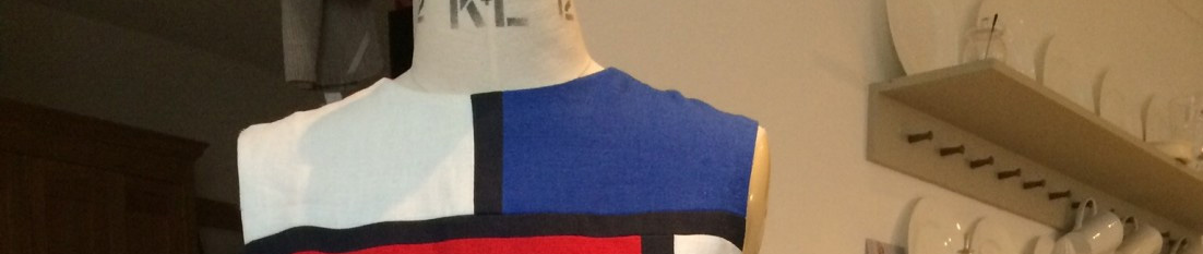
The fourth version is more abstract, taking colours and producing a mosaic. I did consider how this might be augmented by a piece of silk painting, knitting or crochet, inspired by the design, perhaps for the back cover.

Anyway I have my own reactions to these images which I will share next week. In the meantime I am very keen to hear your views. None of these is the final article – we are at the concept stage. The graphics, colours, pictures etc can easily be changed, so feel free to pick and choose, or indeed suggest other ideas.
Incidentally no 2 made me think of the NDC booklets that I have at home. I don’t even know if I want modern or retro to be honest.


I would be most grateful for your feedback.
Ellen
Some strong opinions which you may choose to disregard:
– the first one is generic and tells me nothing about the kind of books this is (and suggests a whole bunch of atttibutes which are not you! Could easily be about breastfeeding and vegan snacks as your awesome, sharp, insightful notes about dressing and style
– the second one is just…. meh. Looks like a kids workbook. Not the right vibe at all.
– illustrations will make or break three. Could work, overall clear concept and appealing in the way of Real Simple (which my husband mocks me for, as I can’t resist at airport newsstands). If the illustrations aren’t super stylish could be kitschy
– love number four. Clean, smart, modern, abstract and open ended. Also nicely retro. My clear favorite
Polly
Browsing in a book shop, I would be drawn to the first cover and would want to look at the back cover to see what the book was about.
The second cover gives more of a clue that the title is craft related and I also like the design of this cover.
The third one relies on the quality and interest of the illustrations so it is hard to judge from the place makers. I think the illustrations need to be cohesive because I find the grid pattern of unrelated items a bit disjointed.
I’m not keen on the fourth one, it could be about anything and would not stand out for me amongst other books.
Verona Woodhouse
I like 3 or 4. Agree with Ellen that 1 could be a breastfeeding book. It gives the vibe of some of the very old-fashioned photos in the La Leche breastfeeding book I had 20 years ago with some of the photos from 20 or 30 years before that. It was a life and sanity saver at the time, read 3 times on the trot cover to cover in the first few weeks of my daughter’s life, but not giving out the sharp vibe of your blog. The vignettes of you as a toddler are really cute, but don’t say the blog to me. 4 is really modern and would sit well on a bookshelf or on a book review blog/website, but does it need something to say an element of real making – scissors or needles or something – on the front, possibly small by your name. Otherwise it could be about arranging cushions, or eating fashionably, or yoga
fabrickated
Hilarious! Thank you Verona. Beautifully observed in so many ways. I will respond to the feedback separately.
Jean
So funny how different the reactions are. I clearly reacted most positively to the first one. I thought it was a photo of your daughter and so would be about your family. Two and three even though I am a craft person would not even have me pick the book up. Number two looked amateurish to me. Number 4 was appealing to me as a design but not sure I would make me want to pick up the book. Jean
Jessica
Hi Kate. Lifelong bookseller here, so felt I HAD to chime in! I’m going to echo Ellen here, at the risk of sounding a bit harsh.
1. Does seem like a parenting pamphlet. Nope.
2. This one just doesn’t look professional at all. It says self-published craft club book to me. Ouch!
3. This does have the most potential, but I agree that the artwork will be key. It’s also most like some current craft/art books I’ve seen (that watercolour illustration style) so don’t go too generic with the images.
4. I kind of like this one, but I don’t like the fonts or their placement in the box. Would people assume quilting with the squares? I’m not sure. I find the yellow quite clashing in all of the ‘retro’ covers.
To be completely honest, none of these covers really reflects my impressions of you from your blog. My sense of you is that you aren’t afraid of bold colours and pattern (see your silk painting), but you also approach fashion and style with a bit of a minimalist view, with a clear sense that there are principles (or even rules) that make some things work while others don’t. You have a great appreciation of sewing history, but you don’t strike me as retro at all.
At the risk of pushing my luck here, can I also comment on one more thing? The proposed title is Making Life more Beautiful, but in the cover blurb you say your philosophy is to get your money’s worth before you die. Perhaps there’s a more beautiful way to say that? You do strike me as a practical person, and you’ve often talked about getting the best use of one’s wardrobe, making it last etc, but I don’t think that’s your main interest. I might say that you seem to be seeking harmony—between how we feel on the inside and how we look on the outside, and between ‘beauty’, which is ephemeral and a bit wild, and a rational/scientific view of the world. Whoa—hope that helps—didn’t mean to over analyze!
fabrickated
Wow! Thank you so much Jessica. This is so very helpful. I agree I didn’t get the blurb right at the beginning. It took me a few goes to work out the through theme of the book, but I am getting there and I will reveal more on the content over the next few weeks. I love your “over analytical” response to the harmony/beauty question.
Linda Galante
I like the version with the illustrations the best as it tells me a bit about what’s inside your book. However, I must say….I had a very emotional response to the first one, as it tells a story on its own that’s much less about making things and more about life and family and creating. I’m sure your book will be lovely as your blog always is!! Good luck with your choice….
Claire MacPherson
I saw your post and thought you might find it useful to know my impression of the covers without knowing what you were actually writing about (being terribly behind on blog posts!)
1. I would think this was a mother/baby self-help type book. Not my kind of book but lovely photo!
2. Probably a specifically sewing or papercraft book, featuring projects with a retro twist?
3. A book aiming to make life more enjoyable in small ways through various hands-on making. A peaceful kind of book.
4. Not entirely sure. Potentially Marie Kondo-esque? Or contemporary fiction?
I subsequently checked out what you were up to and 3 was obviously my winner. ?
PetitePear
I was going to say something very much like this, but since Claire did it so well, I thought I’d just picky back!
Melanie
Illustrations are the best as they represent what the book is about. I love the photo of you with your baby, but it is the past. Same with retro. You have a contemporary style so these are not representative. I don’t have any suggestions but I feel that the cover should reflect your intelligent and sophisticated approach, which is such a rarity and is one of your main attractions, at least for me.
Elle
I agree wholeheartedly with Jessica. I don’t think any of these does justice to you.
Karen
I do like the picture a lot on the first cover but agree that it is not representative of your blog and therefore the book. I was drawn to your blog by pictures of you in the many examples of beautifully designed and crafted outfits. Your sense of style and craft does not really come through on any of these covers.
Ruth
For what it’s worth…
No 1 – too personal
No 2 – front and back are not cohesive. the front is ‘too’ crafty……..
No 3 – It’s OK but not Wow
No 4 – Best of the bunch, maybe bigger squares to avoid the optical illusion effects?
Whenever I think of you I think the Mondrian dress – what about your colours in a Mondrian pattern?
Annieloveslinen
How exciting this is, however, none of those say ‘you’ to me. I believe that some people might not recognise your blog name but might recognise your image because they’ve seen you before or because they like how you look. I know that am more likely to respond to an author image over artwork so I would suggest that your image be on the cover with a short description of what the book is about.
Some images of you that stick in my mind are one where you’re sat crossed legged and wearing pink and looking happy and pictures of you in your Mondrian, but you will have favourites too and it would be nice to see one contemary one on the cover.
Annemarie
I like three and four. Three is so “today”, it might be very “yesterday” in a few years.
Both one and two are pretty bad designwise in my opinion. I do like the idea of a personal photo and I do like the photo, but the color overlay looks cheap the way it is done.
eimear
It was only when I saw the cover options you chose, that I realised the enormity of your task – how to distill down the concept of your blog/book to a cover…..
I agree with a lot of the comments while the first cover image is truly lovely, it is ambiguous.
Can I ask why you chose those colours, to me the colours themselves can dominate quite easily. perhaps if each word of ‘make life more beautiful’ was in these colours and bigger but no squares in cover 4?
I like the NDC booklets – 1 and 3 as I like the juxtaposition of the small and the big, and also the use of negative and postive space –
the route I would take first is to get book covers and graphic styles you admire and distill it from there?
I realise this is probably absolutely no help really and I just gave you stuff to mull over. Sorry!
Kim
My choice would be 4 – if only because it’s bright enough to catch there, and intriguing enough to encourage me to turn over for more information.
Pam
Hi Kate – I might be your target audience – not actively creative but am starting a beginners weaving course on Monday!
I instinctively like 4, I would pick something like that up in a bookshop just because of how it looks but it might be a bit too general for the potential audience. So…
I did like the idea of some silk painting, weaving or knitted work picking up a motif – however could this not be used as the front cover with appropriate wording and fonts?
Whatever you decide good luck with the venture!
Chris
The 1st cover suggests mommy book/memoir to me. 2..the front I like but needs more than a scissors illustration, the back doesn’t work for me..a recent photo would be nicer. I like 3 the best, or a tweaked version of 3. I don’t think the retro photos make sense for the type of book you’re writing. Best of luck!
The Demented Fairy
I think most of us are picking up on similar points. Speaking personally [duh] I don’t like all the yellow, you are not retro, despite your love of vintage 60s couture [which is better represented by shocking pink and orange to my mind.]
I also hate, always, white print on a coloured background, it’s hard to read and doesn’t stand out. Of the four shown, only 3 would make me pick it up to look at it.
The whole retro notion screams to me of the young ‘indie’ designers and bloggers who embrace the 40s/50s look, it isn’t you. I’d want to see a pic of you in your working pink, or maybe one of the fab family pics where you are all eating and playing together. Cute as the childhood pics are, they don’t resonate with your themes here.
How exciting!
jay
I wasn’t bowled over by any of them (sorry for the brutal honesty, but I assume that’s what you were looking for). Obviously I was drawn to 1, because hey babies! but would I pick this up as being about making things? Probably not.
2 and 3 have too much of a craftsy air to appeal to me, and I follow your blog because although you are working in craft areas you have a design focus. I don’t think these covers reflect that. 4 is my favourite of the bunch, but the little squares look bitty to me. Could you experiment with the size and placement of them? Is there a photo of something great you made which could be used, perhaps a small section of the work, piece of knitting, fabric etc enlarged over the background?
It seems to me that though you like making things, you have an eye for fashion and style, which sets you apart from tea cosy knitters, clog makers, dirndl skirts and aprons sewists. I’ll duck behind the parapet now.
Kate McCarthy
My thoughts pretty much echo those of Claire McPherson so I would also pick no 3 out of the 4 on offer here.
Jená
The third option is by far my favorite: it most clearly conveys a sense of both “making” and “beautiful.” It is playful and inviting, presenting a variety of crafts and suggesting a foray beyond the kinds of making that a reader might already do. Beyond that, the illustrations themselves represent handmaking, a nice resonance with the content.
fabrickated
What a lovely lyrical comment Jena. Thank you so much.
Mary Funt
I’m in agreement with those who voted for choices 3 and 4. The photo in 1 might be good to include inside the book but not for the cover. I also think the yellow isn’t the best choice of color. Maybe another bright tone which doesn’t clash with your logo. The idea of adding illustrations on top of the geometric design of 4 might look even better. Completing a book in the short time you’ve given yourself is a daunting task but I’m sure you will get it done. You always amaze with your productivity. I thought the photo of you knitting with the headlight on was a perfect example of the lengths you will go to complete projects.
Joyce Latham
I choose the third!
Joyce
Su
Some of my comments are similar to what has already been said by others.
I know these are mock ups to express the concept of the cover and not the final cover.
I like #1 and 3 the best of the four of them. However #1 is personal and looking at it the potential reader may not be sure if it’s a current book or a memoir given the photos.
#3 is a cleaner look and easy to read the title.
Really dislike #2 with the “shadowed” font title overlapping the blocks of colour -even thought the font is the same for all mock ups this one is particularly hard to read.Yellow on blue/ blue on yellow is notoriously hard to read.
The mosaic cover doesn’t express creativity/ crafting to me, if this is what you want the cover to convey.
Lynn Mally
Well, as a minimalist myself, I like number four. However, I agree that it doesn’t really say what the book is about and I’m not sure that it would draw in people who don’t know who you are.
Su
What we’re buying is you, Kate. Those covers don’t make clear what type of book this is, it’s not just another ‘how to’ which no.3 suggests. That was closest, (while immediately conjuring up a dated version of ‘jam and Jerusalem’.) I agree with the comments above, a current photo of you would be much better. Maybe some of your very varied makes in the background would work – such a shame the iconic Mondrian could now be mistaken for anyone’s sewing project.
Sydney Brown
Oh, definitely #3. While I have read every page of your blog, that is the only cover that might make me pick up the book. I agree wither comments that the yellow does not belong with the other colors.
Lyn
Hi Kate,
This is such a tricky process. I remember being quite surprised when asked about ideas for the cover design, I thought that would be done for us! Here is my twopennuth!
1 – lovely pic, but as many others have said, it seems more like a novel to me, not a craft book.
2 – this one looks very homespun and I was not drawn to it at all, it’s not retro enough to be cool.
3 – I like this idea but it seems too neat, I love your vision boards you have up behind your sewing area for inspiration. They are eclectic and creative and I love that overlapping less formal layout rather than the neat squares. You have created so much in the time I have known you and this looks more like a step-by-step guide rather than the force of nature, many-projects-on-the-go-at-the-same-time person I know you are!
4 – I am quite drawn to this one, but I wouldn’t know what it was about before picking it up and reading the back.
Good luck in deciding!
Lyn x
ceci
Of the offered options I like #3 best. If I was designing something I’d think about using one of your silk painting designs as a background to a picture like the one of you in the cardigan that appeared earlier this week – so dynamic!
ceci
KS Sews
Definitely #3 for me; with high quality illustrations, I think it bests tells the story of what the book is about.
I’d also make the title and such larger/bolder.
Alison
I would have to say that out of the four images presented here, the only one I like even a little bit is #4, the color mosaic. That one is the only one that does not visually clash with your blog logo, and more importantly that does not tell a visual story that to me is at odds with how I feel about your blog, your writing, and through that, my sense of who you are. All the different covers are lovely, but they each tell a different story.If I saw them in a book shop at random, I probably would not pick them up (sorry if that seems harsh, not my intention)
When I look at cover #1, it appears to be a book about parenting, suitable for younger people, maybe to help them make good choices about a balanced life while raising their little ones. Neither of the charming photos seems to relate to the type of content described in the back cover text. I would rather see just a plain band of the transparent pink across the top to provide contrast with the title, rather than the stripes, and wish that the designer had used an interesting sans serif font, rather than a script font, for the actual title, since the rest of the text is sans serif. Mixtures of font types is a personal bugaboo of mine, particularly when doing so makes things look less readable
Cover # 2 is just not very appealing at all… The colored squares with text splashed across them are quite difficult to read, and the vintage illustration of the specialty scissors seems to have no connection with the rest of the design. I wish that the designer had thought to put the yellow rectangle behind your logo, so that the blue squares did not dissapear into the background, which looks a bit odd to me. Here the photos of you as a child seem even less appropriate, and since there are so many more adult images of you on your blog, I would think that would have been a better choice
Cover #3 looks much more “of the moment”, this is a style that I could easily visualise on a bookstore shelf. The text and title are easy to read, and are in a consistent font type. Personally I would make the title font a bit heavier in comparison to the “by Kate Davies”, but that is a bit nit-picky of me… My concern is that this looks a lot like a book of projects. I see a lot of books with this style of cover in our local bookstores. Adding a subtitle to the “Making life more beautiful”, perhaps something that mentions “thoughtful essays on integrating design and handwork into your world”, or other words to make it clear that this is not just another “how to make stuff” book
Cover #4 looks more classic to me, the differing colors of the mosaic give a feeling to me that the interior of the book will have a variety of topics inside. The only suggestions I would have to improve it would be to lose the script font for the title, and use a more classic font, and to have an author photo on the back cover of you as an adult, perhaps one showing you in action painting on silk, or one of your other creative activities
I hope that these comments are taken as my attempt to give useful feedback, which is entirely my intention. As an artisan/designer myself, I know how difficult it can be to come up with suitable ideas…
fabrickated
Thank you for taking so much trouble to respond at length Alison. I really appreciate it. I will respond with a second post soon.
Paloverde
I like the *idea* of number 3—if it could be done well and reflect the things the book is about. That said, I don’t think any of these is very well done and I particularly dislike 1 and 2. Additionally, I don’t see a need to stay with the colors of your logo. Many book covers have a color theme that doesn’t necessarily match what’s inside the book, or in this case, the blog the book draws from.
Bridget Carpenter
This is a great project and such great fun to follow and be invited into the development process. Thank you! Hmm, I had a different reaction to most people. To me it is the text on the back of the cover that is the problem. It doesn’t marry up with any of the images on the front. And it doesn’t tell me why I should buy the book. Am I buying it as a social historian interested in costume? As a maker looking for inspiration? Or as someone keen to learn how to get more out of a creative life? I wonder whether if you nail this question it will lead you to the cover illustration.
fabrickated
Bridget – thank you for commenting. Sorry the words on the back were just written fast so the designer could do a back page. I have new text, which I will test out soon. I will respond on the design separately.
Mags
Another vote for option three. I like the clear lines and it gives a better view of what the book is about. Love the photo of you though and would include it somewhere within the book.
alistair mcintosh
They are all very good – I would go for drawings of items you have made
Anita Steiner
I like #1 best for the colours, but agree the picture(s) should be current. With #4 the squares should be bigger and if possible somehow reflect some of the content of the book. I would prefer the writing to be in black as that is the most readable. Regards Anita from Basel
Maria
Loved the first one but think the picture really touched me as mother, however think none of them really illustrate fully what your book is about. It is definitely about you, your blog, your ideas, your creations. Number 4 was my least favourite as it could have been a book about anything. 3 was nice and two was a bit more illustrative and traditional (1950’s) style. 3 probably depicted what the book might entail most.
Good luck choosing. Hard choice.
Amanda
I think the illustrative style of cover three is very on trend and ‘now’ but don’t know if this could date it quickly?? Personally I think cover four is more timeless but this is your book that you’ve put a lot of hard work into and you should go for whichever really grabs you the most!
Judith
Hi. I think I would need to know a little about the content of the book first but my initial feelings are I like the 3rd and 4th options best. Much as I like the photos and I see they are personal to you I doubt think it would attract me to look at the book. .similarly the 2nd one. The 3rd and 4th feel as though they have more relevance to the title
zeddie
#3 is my choice as it looks professional, inviting and tells me what the book is about.
Jenny
Joining in what I’m hoping will be helpful when you read across 40 or so comments….
Love the pic of number 1 and it draws me in but not enough connection with the breadth and modernity of your writing and content.
Pic 2 dislike. Looks old fashioned and too much like a pamphlet.
Pic 3 is my favourite. It’s fresh, the actual drawings perhaps need to cross reference your content more. Not seen a blog post on flowers yet…. But I like the more varied colours that can coordinate with your logo but at the same time incorporate the bright cools with which I associate you.
Pic 4 my second favourite but screams patchwork to me but I’m a quilter…. and again I’m not a fan of the colour combination.
By the way personally I like the photo snaps on the reverse. I think they are rather witty.
Vancouver Barbara
The question for me here is “What Makes Life More Beautiful” for you? Is it the doing? – you seem like a whirlwind, constantly on the go trying different things. Is it the product? – You have made such gorgeous everything – sewn clothes, knitted sweaters et al, cobbled shoes, silver-smithed jewellery, designed and painted silk, consulted on colour and probably other things I don’t even know about. You’re always thinking of other people – especially in your job and of course, your family. You exercise daily. You blog brilliantly. You have a very disciplined life and as a result accomplish a huge amount.
I’d like to see some photos of you making the things you love that make things more beautiful. Out of all that you do what has made life most beautiful for you?
I find the colours in the mock ups crass. Do they even reflect your favourite colours – like pink!
While the covers have a certain charm, it seems to me that none of them reflect you now and they would not make me pick up the book. And having read all your posts, that would be a terrible loss to not know you in print.
Who has made the deadline? Do you have to accept it? Go for what you want. More questions may need to be asked and answered.
I applaud you as I do each time I read your blog.
fabrickated
Thank you for a very kind and insightful comment Barbara. The deadline is only for the editorial review which I have booked in. I will rewrite after that and I will be “making” the book after that. The book is due out in about May I guess?
Colin wiles
Number 4 is best. But put the picture with George on the back or on the inside cover, as it is swell.
Aida
This book is quite personal for you so I think that the cover should be personal too, from the 4 covers the one that drew my attention was the first one, I agree that you can’t tell the content of the book just from the cover but maybe you could work in that direction, keep it personal and also add information about what that is about, I love the picture you have there but I think that a picture of you wearing clothes you made that you think that represent your style and personality would be a great choice. The other 3 look very comercial and give the feel to me that there already exist similar covers and that there are nothing different from what already exists, As from the fonts if I were to choose from what I see in these 4 coveres I would choose nr. 3 as the others look crafty in my opinion.
Justine
I did comment on your IG pic, but have just read this blog post. Am sticking with no. 4. But it needs tweaking. Don’t love the colours….
I love the pic of you with the bub, but agree with everyone else that a more current pic would be better – something like the one you posted on 9 Sept last year. Your style is elegant and sophisticated and quirky all at the same time.
Re cover no 3 – to me this already looks dated. Sorry. If you go with that it needs to be done very carefully.
(& is this the final blurb??)
fabrickated
No, the blurb is just what I wrote early on as a rough idea. I have rewritten it now. Maybe I can try that out. I will respond on the images in a special post.
Jennifer Miller
Hi Kate, Here are my thoughts.
1. I was immediately drawn to this because it’s such a beautiful photo. It definitely belongs in the book – but not on the cover. It might be interpreted as a book on mothering, which limits the initial reader interest.
2. Didn’t like this one at all, it looks rather like an instruction booklet. Too dry. You are far too interesting for this one.
3. This is a lot like so many others, nice but it might not stand out. Would be nice if the drawings were actual photos of your creations…and please include that silver octopus somewhere.
4. Now this one stands out to me. However, the colors are a bit strong, the squares a bit small, and the title should be larger, and not in script. Perhaps if the color was less saturated and maybe fading toward the edge? It’s edgy and clean, which is good….but the point of the book is a little lost.
Whichever final cover you come up with, an edited version or a completely new one, it will certainly be marvelous, and make its way into many of our homes!